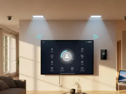

The clinical minimalism that once dominated the high-end residential market is rapidly losing its appeal as homeowners seek environments that offer emotional resonance and a sense of historical continuity. As society moves further into the digital age, the physical home has transitioned from a mere showcase of modern efficiency into a sanctuary that feels grounded and permanent. Designers are increasingly observing a departure from the stark, monochromatic schemes of the previous decade, replaced by a sophisticated movement known as modern heritage. This design philosophy prioritizes the use of retro paint palettes to instill character into architectural spaces that might otherwise feel devoid of personality. By looking backward to move forward, the current trend emphasizes that a home should feel lived-in and timeless rather than fresh from a factory. This shift represents a broader cultural desire to reconnect with traditional aesthetics, where colors are selected not just for their visual impact, but for their ability to evoke a specific narrative.
Restoring Character Through Nostalgic Palettes
Implementing these historic shades requires a nuanced understanding of how to balance antiquity with contemporary lifestyles to avoid creating a museum-like atmosphere. The objective is to make a residence feel as though its interior has been curated carefully over several generations, even if the structure itself is relatively new. This is achieved by pairing muted retro colors with modern furniture and high-tech finishes, creating a tension between the past and the present that feels vibrant rather than dated. Such a strategy ensures that the space remains functional and relevant for today’s needs while benefiting from the psychological comfort that familiar, heritage-inspired tones provide. This approach allows for the integration of bold architectural features with subtle, time-tested colors that have graced domestic interiors for decades. It is about creating a backdrop that supports a sophisticated lifestyle without the jarring coldness often associated with strictly modernistic design approaches.
The Strategic Return to Heritage Colors
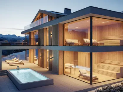
Heritage colors act as an anchor for the home, providing a visual weight that helps define the purpose and mood of each individual living space. Homeowners are increasingly gravitating toward these palettes because they offer a sense of security and stability in an ever-changing world. Unlike the trend-focused hues of the past, these vintage-inspired shades are rooted in historical architectural traditions, making them inherently more resistant to becoming unfashionable. When a room is painted in a soft terracotta or a dusty ochre, it immediately gains a layer of depth that cannot be replicated by standard, mass-produced neutrals. This connection to the past is further strengthened by the use of artisanal paint finishes, such as limewash or chalk, which add texture and a sense of hand-crafted quality to the walls. By focusing on these grounding elements, designers can transform a sterile apartment into a warm, inviting environment that feels deeply personal and permanent for the modern family.
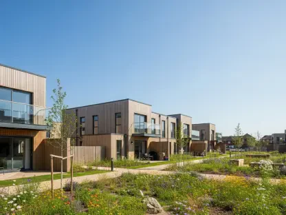
The Shift from Clinical Neutrals to Warmth
The evolution toward these nostalgic palettes marks a definitive end to the reign of cool, clinical grays that characterized the interior design landscape of the early 2020s. Today’s color selections favor warmth and depth, providing a more hospitable environment for social interaction and personal relaxation. Homeowners are no longer satisfied with safe neutrals that offer little in the way of emotional engagement; instead, there is a growing demand for shades that possess a distinct personality and a sense of gravity. These colors help define the energy of a space, whether it is a study intended for focus or a dining room designed for vibrant conversation. By prioritizing these warmer, more complex tones, the current design trend fosters a sense of belonging, turning a house into a true home that resonates with the occupants’ unique history. This shift toward soulful design ensures that every room tells a story through its color and texture, rather than just filling a functional void in the floor plan.
Strategic Implementation and Color Psychology
Green has emerged as a cornerstone of the retro revival due to its inherent connection to the natural world and its long-standing presence in classical interior architecture. Muted variations like olive, sage, and moss are being deployed to provide a soft yet substantial contrast to natural woodwork and stone. These specific tones are particularly effective in creating a transitional space where the boundaries between the outdoors and the indoors become blurred. In kitchens and hallways, these greens act as a neutral alternative that offers more richness and depth than traditional whites or tans. The popularity of these shades stems from their ability to mimic the patina of aged materials, lending an air of authenticity to any surface they cover. Furthermore, these greens are highly versatile, working equally well in rooms with high ceilings and abundant natural light as they do in smaller settings. They provide a calming influence that is essential in the high-stress environment of 2026.
The Enduring Versatility of Retro Green Hues
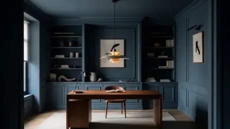
The resurgence of moody tones like deep plum and historical charcoal blue indicates a broader desire for dramatic interiors that prioritize comfort over starkness. These saturated shades offer a rich alternative to the standard neutral palette, creating a sense of luxury that is often missing from lighter-colored rooms. Complementing these moody tones is a wholesale rejection of sterile whites in favor of earthy foundations that include greige, cream, and rose-beige. These warm neutrals are being used to soften the sharp geometric lines often found in contemporary architecture, making newly constructed spaces feel more inviting and less imposing. Unlike the stark whites of the past, these tones contain hints of brown and red, which suggest a connection to natural minerals and clay. This focus on earthiness helps to ground the interior, providing a stable foundation that complements a variety of accent colors while introducing a sense of age and character to the home environment.
Future Perspectives: Grounded Residential Design
The shift toward retro-inspired paint palettes represented more than just a passing aesthetic preference; it signaled a fundamental change in how individuals perceived their living environments. By prioritizing color schemes that favored depth and historical continuity, designers successfully bridged the gap between modern functionality and classical elegance. For those looking to integrate these lessons into their own residences, the most effective strategy involved starting with one room to experiment with saturated tones before committing to a whole-house transformation. It became clear that the most successful projects were those that avoided direct imitation of the past, instead using vintage shades as a foundation for a personalized style. As the industry moved forward, the focus remained on sustainability and the longevity of design, ensuring that these chosen colors would remain relevant through 2028. Homeowners were encouraged to seek out high-quality paints that captured the nuance of these historical pigments.