
The primary challenge of executing a successful white-on-white interior lies in the delicate balance between clarity and clinical coldness, a distinction that separates professional execution from amateur attempts. While many believe that simply painting every surface the same shade provides a cohesive look, the reality is that such an approach often results in a visual “dead zone” where the eye finds no rest or interest. In the current design landscape of 2026, the focus has shifted toward high-tactility environments that use white as a canvas for shadow rather than just a bright backdrop. Mastering this art requires an understanding of how light interacts with different sheen levels and how even the slightest shift in temperature—from a cool blue-based white to a warm yellow-based cream—can fundamentally alter the mood of a living space. Achieving depth in these monochromatic schemes involves a disciplined layering process where every element contributes to a rich, multisensory experience.
The Subtle Science of Temperature and Undertone
Choosing the correct white paint is rarely about finding a “pure” white, as the chemical pigments and light conditions of 2026 make such a concept virtually non-existent in practical application. Every white paint carries a specific undertone—be it green, pink, blue, or yellow—that becomes significantly more pronounced when applied to large surfaces or paired with specific floor materials. Designers must evaluate these undertones under various lighting conditions throughout the day to ensure they do not clash. For instance, a cool white might feel refreshingly crisp in morning sunlight, yet appear gloomy in a north-facing space during the late afternoon. Building a successful palette involves selecting a primary white for the walls and then layering slightly different tones for trim and cabinetry. This intentional variation prevents the space from looking flat and instead creates a sense of movement that leads the eye across the room.
Beyond the selection of paint, the interplay between natural and artificial light sources dictates how these layered tones are perceived by the human eye. In contemporary 2026 design, the use of high-CRI lighting has become essential for maintaining the integrity of a white interior after the sun sets. Standard lighting can often cast unwanted yellow or green hues that muddy a carefully curated palette, ruining the intended effect of the monochromatic scheme. By utilizing smart lighting systems that adjust their color temperature, residents can maintain the warmth of their white interiors in the evening while preserving a bright, energetic atmosphere during the day. This dynamic approach to illumination ensures that the layered whites remain vibrant and distinct rather than blending into a singular tone. Furthermore, the gloss level of surfaces—from matte to high-gloss—further differentiates these whites through the way they reflect light.
Tactile Layering and Strategic Maintenance
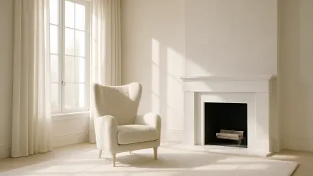
In the absence of a diverse color palette, texture must shoulder the responsibility of providing visual weight and defining the boundaries of different functional zones within a room. A successful white interior utilizes a variety of materials, such as heavy-knit wool, smooth marble, and breathable linens, to create a sensory experience that compensates for the lack of chromatic contrast. When light hits these varied surfaces, it creates a range of micro-shadows that add a sense of three-dimensional depth that is often missing in simpler designs. For example, a bouclé chair placed against a flat-finish white wall creates an immediate focal point through tactile contrast alone. This strategy is particularly effective in large open-plan spaces where the continuity of white could otherwise feel overwhelming. By mixing the sheen and weave of fabrics, designers can create a room that feels incredibly cozy and lived-in despite the perceived purity of the color scheme being used.
The evolution of the white interior transformed from a sterile trend into a sophisticated masterclass in lighting, texture, and architectural discipline. To reach this level of mastery, professionals prioritized the testing of paint swatches against the specific orientation of a building’s windows. They integrated diverse textures like linen and stone to ensure that the monochromatic environment offered sufficient sensory engagement. These designers also recognized the necessity of incorporating smart lighting to manage color shifts during the evening hours. Ultimately, the successful implementation of these strategies resulted in homes that felt expansive yet intimate. For those seeking to replicate this success, the focus shifted toward high-performance finishes that protected the investment while maintaining a pristine appearance. By applying these techniques, it became possible to create a sanctuary that stood as a testament to the power of subtle design.