
The recent evolution of contemporary interior design has marked a significant departure from the stark and often clinical aesthetics of ultra-minimalism toward a much richer and more emotionally resonant palette. In the current landscape of 2026, this transformation is led by the surprising yet triumphant return of orange, a color that was once relegated to the periphery of experimental or purely retro decor. Far from the neon or garish saturations that homeowners traditionally avoided, the modern application of this hue focuses on sophisticated variations like faded terracotta, burnt rust, and pale apricot. These shades are being utilized by leading designers to provide a sense of “gravitas” and warmth, effectively functioning as nuanced neutrals that ground a room while simultaneously injecting it with life. This shift indicates a growing desire for homes that feel curated and soulful rather than merely functional, proving that the right application of a bold color can completely redefine the atmosphere of a living space.
Selecting Mature and Historical Tones
The successful integration of orange into a sophisticated residential setting depends entirely on the specific depth and historical pedigree of the chosen shade, moving far beyond the vibrant or childlike tones often associated with the color. Professional designers now lean toward “sunset hues” provided by heritage paint brands such as Farrow & Ball and Edward Bulmer, which offer colors like “Dutch Orange” and “Malahide.” These selections are prized for their ability to mimic the natural, ambient glow of the golden hour, providing a soft radiance that feels timeless and mature. By selecting shades with complex undertones—often leaning toward earthier, browner bases—the result is an environment that feels grounded rather than experimental. This approach allows the color to act as a sophisticated backdrop that radiates a quiet strength, ensuring that the room remains elegant even as it embraces a hue that is fundamentally energetic and high-spirited in nature.
Applying these historical tones creates a unique psychological impact, fostering a sense of connection and optimism without the visual fatigue associated with more aggressive primary colors. When a room is bathed in a muted terracotta or a dusty apricot, the light reflects in a way that softens hard edges and enhances the natural textures of the surrounding architecture. This effect is particularly useful in creating a “grown-up” aesthetic where the color serves to highlight craftsmanship and material quality rather than distracting from it. The current trend prioritizes the use of these shades as foundational elements that can hold their own against diverse furniture styles, from mid-century modern to contemporary industrial. Consequently, the use of orange has moved from a daring accent to a strategic design choice for those seeking to create an atmosphere of warmth and stability, proving that when handled with care, even the most misunderstood colors can provide a sense of profound comfort and enduring style.
Maximizing Impact Through Architecture and Light
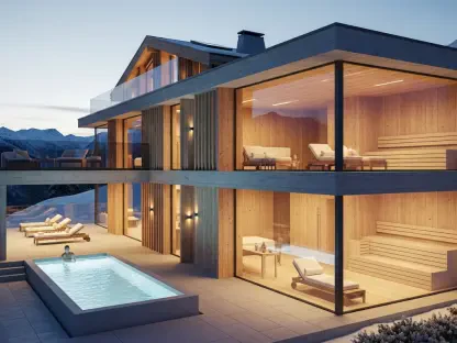
Strategically utilizing orange within the home requires an understanding of spatial dynamics, specifically how color interacts with varying levels of natural and artificial light to change the perception of volume. In areas that suffer from a lack of natural sunlight, such as windowless internal hallways or recessed entryways, a saturated orange can effectively function as its own internal light source, lifting the mood of an otherwise gloomy area. This is often achieved through “color-drenching,” a technique where walls, trim, and sometimes even the ceiling are painted in a single cohesive tone like apricot or soft rust. This method allows the boundaries of the room to soften as the color glows under ambient lighting, creating a sun-filled sanctuary that feels expansive and inviting. By balancing these bold surfaces with neutral architectural details, such as light marble flooring or dark wood doors, the intensity is kept in check while the space gains a new sense of architectural purpose.
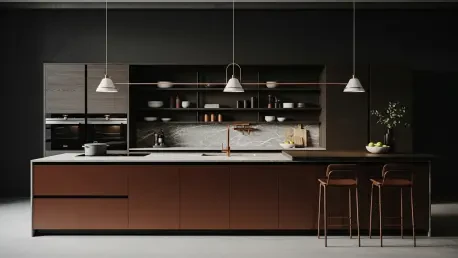
Beyond the walls, the application of orange to large-scale architectural joinery, such as kitchen islands or built-in wardrobes, provides a striking focal point that anchors the entire design scheme of a room. This approach ensures that the color does not exist as an isolated experiment but rather as an intentional structural element that guides the visual flow of the interior. Designers recommend that this boldness be echoed through smaller, tactile accents such as patterned rugs, cushions, or ceramic pieces to create a cohesive narrative for the eye to follow. This creates a sense of continuity where the vibrant energy of the joinery is grounded by recurring hints of the same palette throughout the space. By treating cabinetry as a canvas for these rich tones, functional environments like kitchens and dressing rooms are transformed into spirited areas that reflect a thoughtful and curated lifestyle, ensuring that the home feels consistently warm and intentionally designed from one room to the next.
Balancing Modern Pairings and Natural Elements
The contemporary approach to color theory has successfully dismantled long-standing rules by pairing orange with unexpected partners like deep pinks or rich, biophilic textures that enhance its organic qualities. Because pink and orange share warm undertones, they can be layered together to create an environment that feels both optimistic and profoundly comforting, especially when used in private areas like bedrooms or reading nooks. Furthermore, grounding these fiery or sunset-inspired tones with raw natural materials—such as unpolished stone, light oak, or lush indoor greenery—softens the potential harshness of the color and connects the interior directly to the natural world. This biophilic integration allows the orange to feel like an extension of the landscape, mimicking the colors of turning leaves or clay earth. Such pairings ensure that the vibrancy of the hue is balanced by the calming presence of nature, resulting in a home that feels sophisticated, balanced, and deeply rooted in a sense of place.
Homeowners who successfully transitioned to this palette discovered that the secret to a sophisticated home lay in the careful calibration of intensity and the selection of complementary textures. It became clear that starting with small, strategic interventions—such as painting a front door in a muted rust or introducing ochre upholstery—offered a safe pathway toward embracing the psychological benefits of the color without an overwhelming commitment. These early adopters observed how the introduction of orange facilitated a more welcoming atmosphere, fostering social interaction and a renewed sense of coziness. Future considerations for those looking to replicate this success involved prioritizing high-quality finishes that allowed the light to interact with the pigment in a natural way. Ultimately, the shift toward these warm tones proved that moving away from sterile grays allowed for a more personal living environment. This movement highlighted the importance of choosing colors that provided both a visual spark and a grounded sense of comfort.