
The adaptation of Elin Hilderbrand’s bestselling novel into the Peacock series The Five Star Weekend has introduced a sophisticated visual language that redefines the popular coastal grandmother aesthetic for a more discerning modern audience. This production features Jennifer Garner as Hollis Shaw, a high-profile lifestyle influencer whose Nantucket home serves as more than just a backdrop; it acts as a silent character that embodies the complexities of grief, friendship, and regional identity. While many viewers might expect the breezy, idealized interiors often associated with cinematic coastal retreats, this series intentionally pivots toward a grounded sense of “Nantucket layering.” This design philosophy moves away from the sterile perfection of high-end catalogs, opting instead for a textured reality that reflects the rugged beauty and historical depth of Massachusetts island life. The show masterfully captures the intersection of professional success and personal history.
Authentic Spirit: Balancing Local History and Rugged Landscapes
To create a “sense of place” that felt genuinely rooted in the Massachusetts coastline, production designer Scott Dougan and set decorator Barbara Cassel looked far beyond the typical tropes of suburban comfort. Their objective was to balance the inherent severity of the Atlantic coast with interiors that felt warm, plush, and inviting. This specific design philosophy embraces the harsh, sunbeaten textures of a coastal environment rather than sticking to a generic luxury look that could exist anywhere. By prioritizing the unique character of the island’s landscape, the team ensured the Shaw estate felt like a true retreat rather than a sterile showroom. This approach required an understanding of how light interacts with natural materials, such as weathered wood and heavy linens, to create a space that feels both protected and open to the elements. These designers successfully established a new standard for modern regionalism within the context of a high-end luxury production.
One of the most impressive feats of the production was maintaining a flawless visual consistency between the exterior locations on the actual island and the interior sets built on soundstages in Los Angeles. To achieve this seamless transition, the design team engaged in an extensive sourcing process that spanned both coasts, ensuring that the light and atmosphere matched perfectly across thousands of miles. They anchored the rooms with high-end finds from California antique shops, but they were careful to fill the spaces with authentic island accessories that could only be found in the Northeast. By shipping items directly from local mainstays like Nantucket Looms and the Hospital Thrift Shop, the team integrated specific sailing motifs and maritime artifacts that provided a granular, realistic feel to every room. This commitment to authenticity ensures that the domestic landscape feels truly representative of a historic island home, avoiding the artificial look of a standard television production.
Narrative Design: Integrating Art and Personal History
The decor of the Shaw residence is not merely a matter of style; it functions as a visual extension of the characters’ lives and their shared histories. A recurring “birding” motif appears throughout the home as a poignant tribute to Hollis’s late husband, featuring various gull figurines and a vibrant “American Flamingo” print. These elements serve as emotional anchors, reminding both the characters and the audience of the husband’s presence even in his absence. The creative team also drew significant inspiration from the art world, utilizing the works of renowned painters like Fairfield Porter and photographers like Joel Meyerowitz to define the home’s emotional resonance. These artistic choices help reflect the show’s central themes of grief and renewal through abstract landscapes and carefully curated objects that suggest a life of intellectual curiosity. This depth of detail ensures that the viewer feels the weight of the family’s history within the meticulously crafted walls.
By incorporating these high-art references, the production elevates the “coastal” genre from a simple aesthetic choice to a sophisticated exploration of character psychology. The choice of Fairfield Porter-inspired colors, for instance, brings a certain melancholic warmth to the dining and living areas, mirroring the protagonist’s journey through loss. Every piece of art on the walls was selected to tell a part of the Shaw family story, suggesting a history of travel, education, and shared passions. This narrative-driven approach to interior design ensures that the house feels like a home that has evolved over time rather than a space that was decorated all at once by a professional service. The inclusion of personal mementos alongside expensive artwork creates a tension between public image and private pain, a core conflict in Hollis Shaw’s life. This layering of meaning through objects allows the audience to understand the characters’ inner worlds without the need for dialogue.
Modern Refinement: Merging Professional Utility With Coastal Style
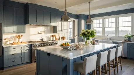
A significant part of the “Nantucket layering” involves a highly sophisticated approach to color and texture that defies standard coastal design conventions. Rather than sticking to the predictable whites and beiges that dominate modern shorefront properties, the show embraces a palette of bold blues and greens that reflect the actual hues of the North Atlantic. For instance, the use of Farrow & Ball’s Stone Blue and Benjamin Moore’s Cedar Path adds a depth to the walls that grounds the decorative accents. Furthermore, as the protagonist is a successful cookbook author, the kitchen serves as a vital character within the show’s world. It is designed to be functional and prestigious, outfitted with recognizable, high-performance brands like Wolf and Sub-Zero. This commitment to world-building extends to the recreation of famous local landmarks like The Chicken Box, ensuring the series feels fully immersed in its setting. The result is a professional-grade environment that maintains the high standards of a premier coastal retreat.
The designers successfully demonstrated that a truly effective coastal-chic aesthetic required more than just a specific color palette; it demanded a deep immersion into local history and a commitment to narrative-driven decor. By rejecting the tropes of generic luxury, the production team provided a blueprint for creating spaces that were both aspirational and emotionally resonant. Those looking to emulate this style should focus on the “layering” of textures and the integration of personal history into their domestic environments. Future design trends will likely see a move toward this grounded, regional approach, where the “sense of place” is prioritized over globalized minimalism. Homeowners are encouraged to source items locally and to embrace colors that reflect their unique environment rather than following a standard template. Ultimately, the series showed that the most beautiful homes were those that told a story, blending the professional with the personal to create a sanctuary.