
Renovating a home from the 1920s poses unique challenges, as historical elements must be preserved while integrating modern functionality and design. Picnic Design faced such a challenge with a home in Toronto’s Wallace Emerson neighborhood. The primary aim was to address the aging rear addition from the mid-20th century, which required extensive foundational work, including lowering the floor, expanding the basement, and reconfiguring the home’s layout for better flow and utility.
Designing Fluid Sightlines and Cohesive Flow
Open Concept and Visual Continuity
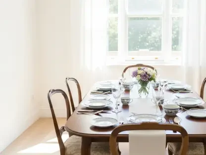
One of the project’s defining features was the creation of fluid sightlines connecting the home’s front and back—a key aspect of modern design that enhances both aesthetic appeal and functionality. Standing at the front door, one can now see straight through to the kitchen and living area, a design achievement facilitated by a black veneer feature wall and tall cupboards. This visual continuity is extended to a nook with a bench by the back door, creating a seamless flow throughout the ground floor. The highlight of this visual journey is a thick archway between the kitchen and dining room, which provides a distinct yet connected space, promoting a harmonious juxtaposition of old and new architectural elements.
The sense of openness not only makes the home feel larger but also allows for better light distribution, enhancing the overall ambiance. This reconfiguration also means that the once segmented rooms now communicate effortlessly with one another, a desirable trait in contemporary living spaces. The archway between the kitchen and dining room, framed with bold architectural lines, becomes a focal point that draws the eye and naturally guides movement through the house. This deliberate planning and execution are emblematic of Picnic Design’s skill in marrying functionality with aesthetic elegance.
Integration of Practical Design Solutions
Addressing the home’s exposure to intense afternoon sun was another significant aspect of the renovation. To mitigate the heat, the designers installed a Brise Soleil above the deck and master bedroom window. Additionally, blinds were incorporated in all west-facing rooms to manage the influx of sunlight effectively. This solution not only provides necessary shade during peak sun hours but also contributes to the home’s energy efficiency, reducing the need for heavy air-conditioning. These adjustments ensure that the home remains comfortable throughout the day while maintaining its visual appeal.
The practical design carried into the home’s interior as well, where careful consideration was given to high-traffic areas. By arranging furniture and functional elements in a way that promotes easy movement, the designers ensured that the homeowners would experience maximum utility from their space. Elements like the kitchen’s cabinetry and layout were tailored to provide ample storage while keeping the room uncluttered, a practical necessity for a family home. Thus, every design choice was informed by both aesthetic desires and practical needs, a balance that defines successful modern renovations.
Color Palette and Artistic Inspiration
Natural and Muted Backgrounds
The redesign drew inspiration from the homeowner’s Canadian art collection, translating natural, muted backgrounds with bright foregrounds into the home’s color palette. This artistic influence is immediately apparent in the kitchen, where a mix of white oak and dark black cabinetry finds contrast in a terracotta tile backsplash. These choices evoke the tranquility of nature while adding warmth and character to the space. The bathrooms also reflect this approach; light-colored appliances and wood cabinetry are juxtaposed against blue and green tiles, creating a refreshing and serene environment that seamlessly integrates with the overall design concept.
The selection of materials and color schemes was meticulously curated to evoke a sense of calm and continuity throughout the home. Neutral backgrounds allow for the art and personal belongings of the homeowners to stand out, ensuring that each room feels personalized and welcoming. The strategic use of color and texture not only enhances the home’s visual appeal but also creates a cohesive narrative that ties together the various spaces, reflecting a well-thought-out design philosophy.
Bold Foregrounds to Enhance Visual Interest
Renovating a 1920s home presents unique challenges, as it’s essential to preserve its historical elements while also incorporating modern functionality and design. Picnic Design faced such a project with a home located in Toronto’s Wallace Emerson neighborhood. The primary goal was to address the aging rear addition, which dated back to the mid-20th century. This part of the house needed extensive foundational work, such as lowering the floor, expanding the basement, and reconfiguring the layout to enhance the flow and utility of the home. The project required careful planning to balance the preservation of the house’s historical charm with the need for modern updates. By tackling these structural issues, the design team aimed to create a space that respected the home’s original character while making it more functional for contemporary living. The renovation allowed the homeowners to enjoy a more efficient layout without sacrificing the beauty and uniqueness of their historic property.