
The conventional wisdom that outdoor spaces must be a chaotic tapestry of every imaginable floral hue is rapidly giving way to a more sophisticated philosophy known as color drenching. This technique, which once dominated the most refined interior design circles, has now migrated into the world of high-end landscaping to provide an immersive experience. By focusing on a single, saturated palette rather than a scattered collection of colors, this approach allows for the creation of environments that feel both deeply curated and incredibly relaxing. Instead of the eye jumping from one competing plant to another, the viewer is enveloped in a cohesive atmosphere that maximizes the psychological impact of the chosen shade. This summer has seen a surge in homeowners embracing this method to simplify their outdoor aesthetics while simultaneously increasing visual drama. The result is a bold departure from traditional gardening that emphasizes unity, depth, and a commitment to a specific chromatic vision.
Visual Intensity: Establishing Artistic Intent Through Color Saturation
At its core, outdoor color drenching is about intentional saturation and the deliberate elimination of visual clutter that often plagues uncoordinated gardens. Experts suggest building what are known as color echoes, where various blooms and foliage work in tandem to reinforce a central theme rather than competing for the viewer’s attention. This method encourages a holistic view of the yard, ensuring that every element contributes to a singular, drenched effect that feels purposeful. When plants are chosen based on their ability to mimic or complement each other within a narrow tonal range, the garden gains a sense of professional polish that is difficult to achieve with a mixed border. This strategy moves beyond mere aesthetics; it creates a rhythmic flow that guides the eye naturally across the space. By adhering to this level of discipline, the landscape becomes a living art installation where the intensity of the color takes precedence over the individual novelty of a single plant.
A successful drench begins by treating garden boundaries, such as fences, retaining walls, and trellises, as the primary canvas for the entire landscape project. For yards that feature cool-toned architecture like weathered slate or silver cedar, a palette of steely blues and shimmering silvers creates a seamless transition between the built environment and the organic growth. This synchronization prevents the hardscaping from feeling like a separate entity, instead allowing it to become the foundation of the color story. Conversely, warm timber enclosures or terracotta walls benefit immensely from a golden drench, utilizing bright shrubs and orange-toned perennials to establish an energetic, sun-filled atmosphere that glows during the golden hour. By matching the background structures to the plant life, the physical limits of the garden seem to dissolve into a wash of color. This strategic alignment ensures that the space feels larger and more cohesive, turning a simple perimeter into an essential component of the design.
Structural Integration: Harmonizing Infrastructure With Natural Tones
Hard landscaping materials such as paths, paving, and raised bed edgings play a critical role in establishing the foundational color theme of a modern garden. For example, the distinct rusted patina of Corten steel can be masterfully mirrored by planting dark velvety coleus or glossy-leaved lobelia to achieve a professional, architecturally-led aesthetic. This technique involves identifying the dominant mineral or metallic tones present in the garden’s infrastructure and selecting plant species that repeat those exact shades. By matching organic textures with the stony or metallic hues of the landscape, the space gains a sense of permanence and unified design that feels intentional rather than accidental. This integration of the non-living elements with the flora ensures that even during the winter months, the color drenching theme remains visible and effective. It transforms mundane features like gravel walkways or stone benches into vital participants in the overall chromatic narrative of the outdoor living area.
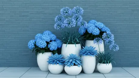
For those seeking a degree of flexibility, color-coordinated container gardening offers a versatile way to experiment with this trend without making a permanent commitment. Using pots and planters of varying sizes and textures within the same color family allows for a floral explosion that can be easily rearranged or moved once specific plants pass their peak season. A purple-themed container display, featuring everything from deep lilies to soft lavender gladiolus, provides a mobile focal point that keeps the garden looking pristine and intentional throughout the summer. This approach is particularly effective for urban balconies or small patios where ground planting is limited, yet the desire for high-impact design remains strong. By grouping containers of similar hues, one can create layers of height and density that mimic a traditional garden bed while maintaining the ability to swap out tired specimens for fresh blooms. This modularity ensures that the drenched effect stays vibrant and evolves as different species reach their full potential.
Design Principles: Mastering Seasonal Transitions and Depth
One of the most striking and sophisticated applications of this trend is the emergence of the Goth Garden, which utilizes near-black and deep burgundy tones. Maintaining this look requires a careful seasonal sequence, starting with dark hellebores in the early spring and transitioning to black tulips and bearded irises as the weather warms. By late summer, dark-foliage dahlias and plum-colored sedums ensure the saturated theme persists until the arrival of the first frost, providing a moody alternative to traditional bright palettes. This specific style highlights the importance of timing in color drenching, as the gardener must plan for a continuous flow of monochromatic interest across several months. The deep tones provide a dramatic backdrop for lighter garden furniture or architectural features, creating a high-contrast environment that feels both mysterious and incredibly chic. Choosing plants that offer dark foliage as well as dark flowers is essential for maintaining the visual density required to truly drench the space in these somber yet elegant tones.
Achieving a professional-grade result relies on three fundamental pillars of design: repetition, saturation, and layering, which work together to build visual complexity. Repetition involves using similar tones across different plant species and materials to create a sense of rhythm that leads the eye through the entire landscape. Saturation demands the selection of deep, rich colors that dominate the visual field, ensuring that the chosen palette is not diluted by too many competing neutral tones or bright green foliage. Finally, layering combines ground covers, mid-level perennials, and tall climbing structures to add the necessary depth and dimension to the chosen color family across multiple heights. Without these three elements, a monochromatic garden can risk looking flat or uninteresting; however, when applied correctly, they create a rich tapestry of texture and shade. This structured approach ensures that even a single-color garden possesses enough variety to remain engaging from every angle, offering a sophisticated alternative to the more haphazard layouts of the past.
Strategic Planning: Achieving Professional Results and Lasting Change
Ultimately, color drenching represents a fundamental shift away from the chaotic and often high-maintenance nature of traditional cottage gardens toward a more structured, style-led landscape. This approach significantly simplifies the plant selection process by providing a clear framework for decision-making, which reduces the overwhelming variety found at most nurseries. Gardeners found that by narrowing their focus to a specific color family, they were able to create a more impactful and professional-looking environment with less effort spent on balancing clashing hues. This methodology allowed for a higher level of personal expression and artistic flair, turning the garden into a true extension of the home’s interior design philosophy. By prioritizing a unified color story over individual plant variety, the landscape attained a level of serenity and order that was previously reserved for professional botanical displays. It proved that a disciplined palette could be just as expressive and vibrant as a rainbow-colored border, if not more so, because of the sheer intensity of the visual effect.
Homeowners who sought to revolutionize their outdoor spaces began by selecting a primary hue that resonated with their existing architecture and lifestyle requirements. They evaluated the light conditions of their yards to ensure that the chosen saturated tones would remain vibrant under both the midday sun and the softer evening shadows. By mapping out a planting schedule that prioritized seasonal continuity, they maintained the monochromatic effect from the first sprouts of spring through the final leaves of autumn. These individuals invested in high-quality mulch and hardscaping materials that complemented their chosen palette, which provided a clean background for their floral displays to shine. They also incorporated vertical elements like painted obelisks or matching trellises to bring the drenched color to eye level, ensuring the immersion was complete. Ultimately, the successful implementation of this trend required a departure from impulsive buying in favor of a strategic, long-term vision that treated the garden as a single, cohesive unit of design.