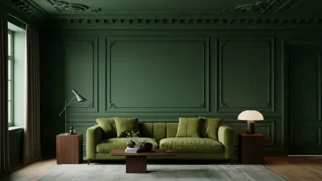

The transition from sterile, clinical environments to spaces that breathe has redefined the modern aesthetic, positioning nature as the primary source of inspiration for residential interiors. This significant transformation moves away from the monochromatic dominance of the past decade, where cool grays and stark whites often stripped homes of their inherent warmth and personality. Designers are increasingly turning to green not merely as an accent color, but as a foundational neutral that offers far more versatility than the beige or cream palettes of previous years. This shift reflects a deeper cultural desire to integrate the tranquility and growth of the outdoors into personal living environments, fostering a sense of connectivity that feels both grounded and restorative. By using green as a primary tool, modern spaces feel alive and dynamic rather than just decorated, providing a psychological anchor that resonates with the human instinct to seek out organic elements within the built environment.
The psychological appeal of this verdant movement is rooted in the concept of biophilia, which suggests that humans possess an innate tendency to seek connections with nature and other forms of life. In a digital age where screen time dominates the daily experience, the introduction of leafy hues serves as a vital counterpoint to technological saturation. Green functions as a bridge between the architectural rigidity of a house and the fluidity of the natural world, offering a sense of renewal that traditional neutrals simply cannot replicate. Because green occupies a central position on the visible spectrum, the human eye requires little to no adjustment to perceive it, making it inherently restful and calming. This ease of perception allows homeowners to inhabit spaces that facilitate mental clarity and emotional stability, proving that the move toward green is as much about well-being as it is about visual trends.
The New Standard: Transforming the Heart of the Home
In the contemporary kitchen, the classic “white on white” look is rapidly being replaced by “living” colors that introduce a sense of depth and enduring character. Modern cabinetry is shedding its glossy, clinical finishes in favor of sage-toned stains and deep teal pigments, proving that green can serve as a calming backdrop even in high-traffic, utilitarian areas. These shades harmonize effortlessly with the surrounding landscape, often visible through large windows or glass doors, making the kitchen feel like a natural extension of the garden rather than an isolated functional room. This integration of color helps to soften the hard surfaces of appliances and stone, creating an environment that feels less like a laboratory and more like a gathering space that encourages relaxation and social interaction. Furthermore, these muted greens act as a sophisticated canvas for varying metal finishes, from brushed brass to blackened steel, providing a level of adaptability that white kitchens often lack.
High-end materials are playing a pivotal role in this green revolution, with exotic stones like Verde Alpi or emerald-toned quartzites becoming the new standard for luxury surfaces. Massive slabs of heavily veined green marble on islands and backsplashes serve as functional art, providing a unique visual narrative that varies from one home to the next. When these natural stones are paired with warm wood species like walnut or white oak, the result is a balanced composition that feels timeless yet thoroughly modern. Additionally, the use of handmade Zellige tiles with reflective, uneven finishes adds a layer of craftsmanship that keeps the color from feeling flat or stagnant. These tiles catch the light throughout the day, shifting in tone from a bright morning mint to a deep twilight moss, ensuring that the space remains visually engaging regardless of the time or weather conditions outside.
Bold Environments: Dramatic Statements in Living Areas
Shared living spaces currently offer the largest and most adventurous canvas for experimenting with saturated shades like forest, olive, and hunter green. A major trend that has gained momentum in recent months is “color drenching,” a technique where walls, ceilings, and architectural trim are all painted in the exact same hue to create an immersive, cocoon-like atmosphere. This approach transforms a standard room into a moody sanctuary that highlights intricate moldings and built-in features while providing a sophisticated edge that feels both cozy and expansive. By eliminating the high-contrast break between white ceilings and colored walls, the boundaries of the room seem to recede, making the space feel more unified and intentional. This design strategy is particularly effective in libraries, media rooms, or formal dens where the goal is to create a sense of escape from the outside world.
Beyond the application of paint, interior designers are using green to tell unique stories through the use of scenic murals and high-gloss lacquer finishes. Verdant landscapes depicted on large-scale wall coverings can make a family room feel as though it is tucked inside an ancient forest or a manicured botanical garden. Meanwhile, the application of glossy, glass-like finishes on cabinetry and traditional woodwork turns everyday furniture into striking focal points, bridging the gap between historical character and contemporary style. These reflective surfaces bounce natural light around the room, preventing darker shades of green from feeling heavy or oppressive. Instead, the interaction between the deep pigment and the lustrous finish creates a sense of luxury that feels earned and established, echoing the glamorous aesthetics of mid-century design while remaining firmly planted in the present.
Private Quarters: Creating Personal Sanctuaries and Spas
In private quarters such as bedrooms, the design focus shifts away from drama and toward a rigorous pursuit of serenity and physical rest. Muted tones like soft sage, dusty lichen, or pale mint are being used in a monochromatic fashion, where the wall color is meticulously matched to the bedding, drapery, and even the upholstery of seating. This “green on green” layering strategy minimizes visual noise, allowing the inhabitant to focus on relaxation and mental decompression without the distraction of clashing colors or high-contrast patterns. The result is a space that feels deeply tranquil and protective, reminiscent of a clearing in the woods. By keeping the palette consistent and soft, designers create an environment that supports healthy sleep cycles and provides a gentle transition from the activities of the day to the quietude of the night.
Bathrooms and powder rooms are also being reimagined as “jewel boxes” or meditative spas that emphasize wellness and personal care. Because these spaces are typically smaller, they allow for higher design risks, such as the use of textured green lime wash or walls entirely clad in exotic green marble. Japanese-inspired aesthetics are particularly popular in 2026, often pairing lush forest green tones with natural brass fixtures and stone basins to create a spa-like environment. The use of waterproof green renders and fluted tiles adds a tactile quality to the walls, enhancing the sensory experience of the room. In these environments, green acts as a symbol of cleanliness and vitality, departing from the cold, clinical feel of traditional white porcelain and chrome. It invites a more holistic approach to hygiene, where the bathroom becomes a place for rejuvenation rather than just a necessary utility.
Tactile Complexity: Integrating Texture and Heritage
The success of a green-focused interior relies heavily on the integration of various textures to ensure the color feels layered and sophisticated rather than flat. Green is no longer limited to paint; it is found in rumbled marble, stained timber, heavy velvet upholstery, and even supple leather. These materials provide a tactile quality that gives the room physical depth, ensuring that the extensive use of a single hue feels intentional and rich. For instance, a velvet sofa in a deep moss shade offers a different visual and physical weight than a smooth, lacquered cabinet in the same tone. This interplay of light-absorbing and light-reflecting surfaces is what prevents a monochromatic room from feeling monotonous. By varying the finish of the materials, designers can create a complex environment that rewards close inspection and provides a high level of comfort.
Green also serves as a powerful tool for honoring heritage architecture while keeping historic properties relevant for modern lifestyles. It complements traditional timber floors, ornate plaster ceilings, and dark wood paneling, breathing new life into century-old homes without stripping them of their original soul. By choosing shades that echo the specific landscape surrounding a property—such as seafoam for a coastal home or earthy olive for a rural estate—designers create a seamless flow between the home’s history and its current environment. This contextual approach to color selection ensures that renovations feel sensitive to their surroundings, avoiding the jarring “newness” that often accompanies modern updates. Instead, the green palette acts as a timeless thread that connects the craftsmanship of the past with the design innovations of the present, resulting in homes that feel both established and fresh.
The Design Evolution: Practical Implementation and Future Vision
Implementing a green-centric palette required a strategic understanding of light and orientation to ensure the chosen hues maintained their intended character. Designers often recommended testing large swatches on multiple walls, as the shifting sunlight throughout the day could turn a warm olive into a muddy brown or a crisp mint into a cold blue. The successful transition to green as a neutral was largely achieved by treating it with the same restraint as one would treat a traditional beige, using it to unify different rooms through a consistent “thread” of color. This approach allowed for a cohesive flow throughout the home, where different shades of green signaled different moods—vibrant and social in the kitchen, deep and reflective in the study, and soft and airy in the sleeping quarters. By viewing green as a versatile foundation rather than a fleeting trend, homeowners were able to build spaces that felt personal and enduring.
The broad adoption of these organic tones represented a fundamental shift in how the industry defined luxury and domestic comfort. As society moved away from the “safe” and often impersonal palettes of the previous decade, people embraced colors that offered genuine psychological comfort and a tangible connection to the environment. Green solidified its place as the ultimate neutral because it proved versatile enough to be both bold and calming, making it an ideal choice for the complexities of modern living. Future developments in interior design were expected to further explore the intersection of recycled materials and bio-based pigments, ensuring that the “green” movement was as sustainable in its production as it was in its aesthetic. This evolution ensured that the home remained a place of growth and renewal, providing a lasting solution for those seeking a more balanced and harmonious way of life within their personal spaces.