
Spring entertaining demanded more than a seasonal menu; it asked for a visual narrative that made guests feel anchored in the moment while signaling care, taste, and ease, and Butter Wakefield’s layered floral approach offered a precise, repeatable path to that effect. The garden designer treated the table as a living landscape: color led, texture harmonized, and form created movement. The method worked because it copied how gardens were composed—by establishing a base, adding intentional layers, and finishing with rhythm. Hosts faced a familiar challenge right now: create atmosphere fast, avoid fussy rules, and keep it personal without slipping into chaos. Wakefield’s framework translated that pressure into five steady steps that scaled to a weeknight dinner or a full spring fête. With each layer doing specific work—from palette-setting to sightline management—the result stayed coherent, even when plates, flowers, and candles came from mixed sources.
1: Begin With the Table Cover
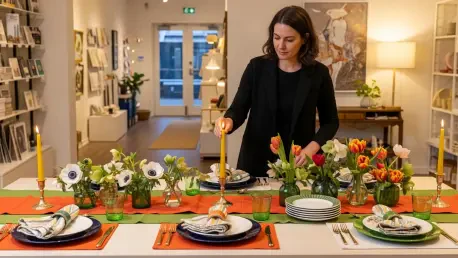
Every spring table needed a firm visual anchor, and the tablecloth set that tone long before a single bloom appeared. Wakefield’s choice—an orange-and-green cloth—did two jobs at once, establishing palette and defining mood. Orange read as optimistic and energizing; green grounded the scheme in foliage and freshness. That palette guided every later decision, from napkin stripes to candle hues, much like a planting plan directs a border’s bloom sequence. A bold cloth also solved a common hosting issue: varied dishware and vases blended more willingly when the base repeated or echoed their shades. To keep the cloth from overwhelming the setting, balancing saturation mattered; combining one saturated hue with a softer partner kept the table buoyant rather than brash.
Building on this foundation, fabric choice influenced perceived temperature and texture. Linen with a dry hand looked relaxed and springlike, while cotton percale felt crisper and more graphic. Scale of pattern played a role too: large repeats read as modern and airy, whereas fine geometrics supported traditional stacks of china. Hosts could pair the cloth with a contrasting runner to create a central “garden bed” for flowers and candles, or skip the runner to let pattern dominate. The key was consistency of intent—bright cloth, bright accents; muted cloth, nuanced accents. For rooms with strong wall color, allowing the cloth to bridge room tones and table accessories avoided visual conflict. The takeaway stayed simple: choose a cloth that declares the season and then let its colors choreograph the rest.
2: Add Tactile Layers
Once the table cover fixed the palette, tactile layers introduced depth, pacing, and function. Wakefield stacked placemats over the cloth to define place settings and add a second texture—think woven rattan for rustic lightness or lacquer for sheen. This layering worked like groundcover in a garden, softening transitions and making negative space useful. Striped napkins entered as the decisive counterpoint to florals, creating a controlled clash that read curated, not chaotic. The stripe acted as a rhythm line, pulling the eye through the table and preventing floral prints from dissolving into a single field. Napkin folds mattered too: loose knots signaled informality; crisp rectangles delivered polish. Metal or ceramic napkin rings echoed stemware finishes and kept the palette coherent.
Moreover, layers carried a practical logic. Mats protected the cloth during multi-course service, and napkins with heft stayed put during outdoor breezes. Pattern ratio could keep the table breathable: one dominant print (the cloth), one strong geometric (the stripe), and one or two quiet solids (mats or runners) typically held the balance. Color temperature alignment kept the mix intentional; cool greens paired comfortably with soft pinks, while warm oranges liked yellows and coral. Subtle material contrasts—matte linen against glazed earthenware—added dimensionality that photographs and in-person views both appreciated. In effect, this step created a stage on which plates and flowers would perform, ensuring that no later element had to work alone to deliver impact or cohesion.
3: Mix-and-Match Dinnerware
With ground and texture set, plates became character actors that enriched the story. Wakefield mixed vintage finds with current pieces, embracing odd sets and solitary standouts. That strategy allowed personal history to share the table with new color notes and silhouettes. An “old-fashioned” green plate—soft, slightly muted—played well against zesty linens and spring florals, adding a familiar tone that tempered bright cloths. The mix worked best when shapes varied but profiles aligned; combining high-rim soup bowls with flat coupe plates, for example, kept stacking tidy while adding visual cadence. Gold-rimmed pieces paired with brass flatware, while pewter accents matched cooler greens or gray-based florals.
Curation remained the differentiator. Hosts selecting across eras could aim for two through-lines: a unifying color echo and a repeating material cue, such as ceramic glazes with similar sheen. Side plates offered an opportunity to insert a graphic flourish without dominating the setting; botanical transfers, scalloped edges, or deco lines all lifted the scheme. Practicality had to be part of the choice: glazed stoneware tolerated heat and made fast work of cleanup, mixing easily with delicate china reserved for dessert. Display decisions mattered too—stacks signaled abundance, while single, centered plates read restrained and gallery-like. Embracing imperfection—chips kept to backs, patina embraced—brought the same lived-in credibility Wakefield used in gardens, where maturity and variety created charm.
4: Feature In-Season Flowers
Seasonal flowers supplied the energy and the sense of place that defined the table as spring-specific. Wakefield’s approach favored locally grown stems in colors that echoed the cloth, translating palette to petals. Structure mattered: tallest stems went in first to set height and thrust, shorter blooms slipped into side pockets to fill mass and soften edges. Odd numbers helped compositions feel natural and lively, a principle borrowed from landscape groupings. Mixing flower forms—spires like foxglove or lupine, rounds like ranunculus or peonies, and airy fillers like dill or ammi—introduced movement and negative space. Vessel selection advanced the look: squat earthenware bowls encouraged low, lush mounds, while mismatched bud vases created a meadow across the table.
Sourcing responsibly anchored both story and sustainability. Growers specializing in spring crops—narcissus, tulips, anemones, fritillaria—offered stems at peak freshness, which translated to longer vase life and better scent. Conditioning improved results: diagonal re-cuts, clean water, and pin-straight placements for fragile stems like parrot tulips prevented droop. Color echoed, rather than copied, the cloth; a zesty green in linens could become hellebores or viburnum, while an orange stripe might appear as tangerine ranunculus. Keeping arrangements below chin level preserved sightlines, and leaving intentional gaps between clusters let candlelight flicker through. The goal was not symmetry; it was harmony, where hue, form, and height made the table feel like a garden caught mid-bloom, generous yet breathable.
5: Finish With Colorful Candles
Candles concluded the composition by setting tempo and time—daylight into dusk, chatter into calm. Wakefield’s colored tapers in yellow and orange echoed the cloth while adding a warm glow that flowers alone could not provide. Height variation created an undulating skyline, mirroring the arrangement’s tallest stems and then dipping to reveal faces across the table. Holders in glass, ceramic, or metal picked up other material cues—transparent glass lightened dense florals, while enamel or lacquer introduced a crisp, contemporary edge. The flame’s vertical draw balanced horizontal plate lines and fabric waves, completing the visual circuit. For placement, alternating tall and short tapers along the table’s center kept the eye moving and prevented a single “wall” of light.
This finishing layer also balanced safety, longevity, and mood. Dripless, slow-burn tapers reduced fuss, and trimming wicks before lighting avoided sooty haze that dulled glassware and plate rims. Color selection followed the table’s established logic: warm hues amplified conviviality, while soft greens and blush tones cooled a more saturated scheme. A few petite votives tucked near bud vases extended sparkle without crowding place settings. As a final note, hosts had tested the full sequence—cloth, layers, plates, flowers, and candles—and then edited one element for clarity, usually removing a competing pattern or an extra vase. With that restraint in place, the table read intentional and generous. The next steps had been clear: source seasonal stems locally, build a coherent palette from the cloth up, and let varied heights—of flowers and flames—carry the conversation into a spring night.