
The architectural character of a living space is fundamentally defined by the constant movement of light, yet traditional interior design has long relied on static color schemes that fail to account for the dramatic shifts occurring between dawn and dusk. This disconnect often leads to environments that feel either overwhelmingly sterile in the afternoon sun or uncomfortably cavernous under artificial evening lighting. In response, a sophisticated design methodology has emerged in 2026, focusing on dual color palettes that adapt to the physiological and psychological needs of inhabitants throughout the day. By treating a home as a chronological narrative rather than a fixed set of coordinates, homeowners can curate environments that transition seamlessly from high-energy functional hubs to restorative evening sanctuaries. This approach represents a departure from the one-dimensional accent wall of the past, embracing a holistic understanding of how pigments react to changing wavelengths of light across a twenty-four-hour cycle. When a designer selects a paint color in a brightly lit showroom, they are only seeing a fraction of that color’s potential life; without considering how a deep teal might look in the morning compared to its appearance under warm LED lamps at night, the resulting space often lacks the emotional resonance required for a truly comfortable home. Implementing a dual-palette strategy ensures that the interior becomes a responsive organism that supports the natural circadian rhythms of its occupants.
Designing for the Morning Glow
Capturing Energy and Vitality in Daytime Spaces
Modern architectural aesthetics in 2026 prioritize the concept of the 10:00 AM palette, a strategic selection of hues designed specifically for spaces that reach their functional peak during the brightest hours of the day. Kitchens, breakfast nooks, and open-concept living rooms benefit immensely from this approach, which focuses on maximizing luminosity and softness through the use of warm whites and low-saturation neutrals. The fundamental goal is to create an environment that feels welcoming and expansive, allowing natural light to move beautifully across the room’s architectural features such as moldings, vaulted ceilings, and window frames. This luminosity is not merely about brightness; it is about the quality of the light as it bounces off surfaces, ensuring that the space remains airy and energized without descending into a cold or clinical atmosphere. By selecting colors that respond positively to high-intensity sunlight, homeowners can foster a sense of vitality that supports morning routines and productive daytime activities, making the home feel like a living sanctuary rather than a static box. This careful calibration of pigment and light ensures that the room maintains its character even as the sun moves across the sky, providing a consistent backdrop that feels both intentional and naturally effortless for the modern family.
Navigating the Influence of Fixed Architectural Elements
The selection of a daytime palette requires a meticulous understanding of how morning light interacts with what interior designers call bossy elements, which are fixed architectural features like stone flooring, hardwood cabinetry, or large-scale tile installations. These permanent fixtures possess inherent undertones that can significantly alter the appearance of paint once the sun reaches a certain angle, often reflecting unwanted hues like yellow or pink onto neutral walls. Because high-noon sunlight is extremely revealing, it has the tendency to magnify any harsh or cool undertones in a paint color, potentially turning a sophisticated gray into a somber, chilly blue. To mitigate this effect, professionals suggest opting for colors that contain a subtle hint of warmth or even a slight muddiness to maintain a sense of calm energy and prevent the room from feeling unintentionally stark. This strategy involves testing large swatches against the specific fixed materials of the room throughout the morning to ensure that the light-reflectance value of the paint remains consistent with the desired mood. By accounting for these environmental variables, a designer creates a space that feels balanced and grounded, where the interaction between the permanent and the transient elements results in a harmonious visual experience that enhances the overall well-being of those within the home during the peak hours of productivity.
Embracing the Evening Shadows
Creating Intimate and Moody Retreats
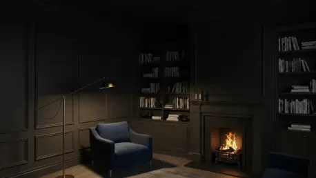
For rooms that serve as sanctuaries after sunset, such as libraries, formal dining rooms, or primary bedrooms, a 10:00 PM palette offers a far more effective solution than traditional bright neutrals. This strategy focuses on deep, saturated shades like charcoal, dark olive, and rich ochre that are designed to absorb light rather than reflect it back into the room. By leaning into these moodier tones, designers create a cocooning effect that helps the inhabitant feel grounded and relaxed as the external world fades into darkness. The psychological impact of these darker pigments is profound, signaling to the brain that it is time to decompress and transition into a restorative state. In these spaces, the goal is not to fight the shadows but to embrace them, using the depth of the color to provide a sense of security and quiet sophistication. This approach turns the perceived limitation of a lack of natural light into a primary design strength, allowing the room to feel intentionally intimate. When the sun goes down, these deep colors provide a velvet-like backdrop that makes even a simple evening at home feel like a curated experience, providing the necessary emotional support for residents to disconnect from the frantic pace of the workday and find solace in their private surroundings.
Enhancing Depth Through Color Drenching Techniques
The emotional transition from day to night is often successfully highlighted through a technique known as color drenching, where the walls, trim, baseboards, and even the ceilings are painted in the same dark, saturated hue. This method is particularly effective in evening-centric rooms because it eliminates the sharp, distracting contrast of a white ceiling, which can often break the immersive feel of a cozy environment and make the walls feel shorter. By wrapping the entire room in a single deep tone, the boundaries of the space seem to recede, creating a high-impact and romantic atmosphere that feels both sophisticated and nurturing under low-light conditions. Deep palettes are especially impactful in smaller spaces used for shorter durations, where the intensity of the color can be enjoyed without the risk of visual fatigue. This design choice encourages a sense of stillness and focus, making it ideal for reading rooms or areas dedicated to conversation and relaxation. Furthermore, color drenching allows architectural details to blend into the overall silhouette of the room, emphasizing the form and volume of the space rather than its individual components. This results in a unified aesthetic that feels incredibly modern yet timeless, providing a luxurious depth that cannot be achieved with standard painting methods, especially when viewed under the soft glow of evening illumination.
The Essential Role of Light and Texture
Balancing Artificial Lighting and Materials
A successful dual color palette relies heavily on the synergy between paint selection and a layered lighting plan that can be adjusted as the day progresses. Designers insist on using a variety of light sources, including architectural pendants, adjustable floor lamps, and even the flicker of candlelight, to manually control the atmosphere of a room as natural light fades. By utilizing dimmers to lower the intensity of artificial light in a room with a dark palette, the shadows become softer and the overall environment becomes more inviting for evening activities. This tactical use of light prevents deep colors from feeling flat or oppressive, instead bringing out the subtle nuances of the pigment that remain hidden during the day. The interplay between the light source and the wall color determines the perceived temperature of the room, allowing a space to feel cool and focused during the morning and warm and enveloping at night. Homeowners who invest in high-quality, high-CRI (Color Rendering Index) lighting will find that their dual palettes perform significantly better, as these bulbs accurately reproduce the intended hues of the paint. This level of control ensures that the home remains functional for tasks like reading or cooking while still being able to pivot instantly into a low-energy mode that facilitates rest and social intimacy.
Leveraging Tactile Richness in Low-Intensity Settings
Materiality plays a critical role in how color palettes are perceived by the human eye, as the texture of a surface dictates how light is scattered or absorbed. Morning rooms benefit immensely from natural, breathable materials like linen, light-toned woods, and matte ceramics that enhance an airy and open feeling. These textures interact with the bright morning sun to create a sense of freshness and clarity, reinforcing the energetic goals of a daytime palette. In contrast, evening spaces are elevated by luxurious and heavy textures such as velvet, mohair, and dark-stained timber, which provide a necessary counterpoint to deep paint colors. These materials interact with low-intensity artificial light to create a sense of depth and a subtle sparkle, adding a tactile layer of richness to the home’s color story. The way a velvet sofa catches the light from a floor lamp can transform a dark room from feeling somber to feeling opulent and cozy. By intentionally pairing light-colored, smooth textures with morning palettes and dark, heavy textures with evening palettes, a designer creates a sensory experience that goes beyond the visual. This multi-dimensional approach to design ensures that every room provides a specific tactile comfort that matches the intended use of the space at different times of the day, making the interior feel truly complete and responsive to the needs of the inhabitants.
Ensuring a Cohesive Whole-Home Flow
Connecting Light and Dark Spaces
One of the primary challenges in contemporary home design is ensuring that the movement between bright morning rooms and moody evening spaces feels seamless and intentional. Designers solve this by utilizing transitional zones, such as hallways, entryways, and stairwells, which are often painted in mid-tone neutrals like sage green, earthy plaster pink, or soft terracotta. These colors act as the essential connective tissue of the home, preventing the contrast between light and dark areas from feeling disjointed or abrupt as one moves from a sun-drenched kitchen to a dark, cozy media room. These transitional hues are selected for their ability to look equally attractive in both high and low light, serving as a visual palette cleanser that prepares the eye for the next atmospheric shift. By maintaining a consistent level of saturation in these connecting spaces, the home feels like a unified whole rather than a collection of unrelated boxes. This strategic use of mid-tones allows for dramatic color shifts in specific rooms without compromising the overall flow of the property. It creates a sense of discovery as one navigates the house, with each room offering a new mood that is nevertheless part of a larger, coherent design language. This balance is key to creating a home that feels both exciting and harmonious, providing a smooth narrative arc as the day transitions from morning activity to evening rest.
Establishing a Foundational Heart for Home Design
To maintain a sense of continuity throughout a property, many professionals recommend building the color story from the heart of the home, whether that is the kitchen, a central lounge, or a main living area. This foundational room sets the tone for the entire interior, allowing other rooms to branch off with their own distinct intensities while remaining complementary to the primary aesthetic. Starting with a quiet, foundational palette for the main arteries of the house ensures that even the most dramatic color shifts feel like a natural progression rather than an unexpected shock. This foundational approach involves identifying a primary color family or a specific set of undertones that will be present in every room, even if only in small amounts. For example, if the central living space features a warm sand tone, the darker evening rooms might utilize a deep chocolate brown that shares those same warm base pigments. This creates a hidden thread of consistency that the brain perceives as harmony, even when the visual difference between rooms is significant. By establishing this baseline, homeowners can experiment with bold, dual-palette choices in secondary rooms with the confidence that the overall home will still feel grounded and well-planned. This method provides a clear roadmap for design decisions, ensuring that every addition to the home’s color scheme supports the central narrative and enhances the lived experience for everyone.
Practical Solutions for Flexible Living
Mastering Versatile and Responsive Rooms
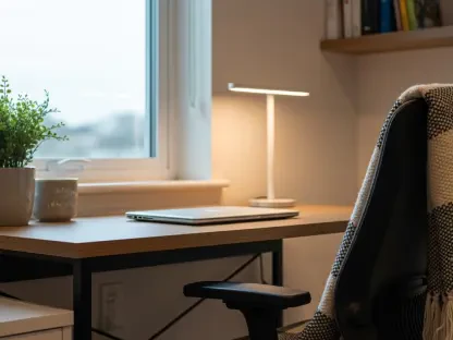
In modern homes, many spaces must function effectively at both 10:00 AM and 10:00 PM, requiring a more adaptive and versatile approach to color selection. Designers often choose chameleon shades, such as creamy whites, soft blues, or complex greiges, which have the unique ability to appear joyful and bright in the morning sun but transform into calm, serene backdrops under warm lamplight. These shades are highly responsive to the Kelvin temperature of the light source, shifting their appearance to match the current environmental conditions. In these multi-use areas, high-quality window treatments are essential tools for managing the atmosphere, as they allow inhabitants to filter harsh midday light or block it out entirely to jumpstart an evening mood. Automated shading systems and layered curtains can provide the necessary flexibility to change the room’s character in an instant, supporting both a focused work session and a relaxed movie night. This adaptability is crucial for the modern lifestyle, where the boundaries between work, play, and rest are often blurred. By selecting colors and tools that can pivot between different roles, homeowners create a more resilient living environment that can meet any demand throughout the day. This focus on versatility ensures that no room is ever wasted and that the home remains a functional partner in the daily lives of its residents, regardless of the hour.
Synthesizing Light and Chronological Narrative
Ultimately, the transformation of a home through dual color palettes depends on the profound understanding that light is the primary driver of the human experience and emotional state. A home that respects the fluid nature of color is one that provides the right psychological support for its residents throughout the entire day, from the first cup of coffee to the final moments before sleep. By viewing the house as a chronological narrative and using the sun’s natural cycle as a guide, homeowners can create a balanced environment that feels perfectly tuned to the rhythms of daily life. This strategy encourages a more mindful way of living, where the visual environment actively participates in the well-being and productivity of the family. The successful implementation of these palettes requires patience and observation, as one must live with the light to truly understand how it moves and changes. When done correctly, the result is an interior that feels alive and responsive, offering a variety of moods and atmospheres that keep the home feeling fresh and engaging. It is an investment in the emotional quality of the domestic space, ensuring that every hour spent at home is enhanced by the colors and light that surround us. This holistic view of interior design as a time-based art form is what truly transforms a house into a home, providing a stage for the diverse activities and emotions that make up a well-lived life.
Strategic Evolution: Integrating New Insights for the Modern Home
The transformation of the residential environment through dual color palettes relied on the fundamental understanding that light functioned as the primary driver of the human experience. In the process of updating these spaces, homeowners successfully identified that a singular, static paint choice often failed to meet the diverse emotional needs of a twenty-four-hour cycle. By conducting thorough light audits and testing pigments across different times of day, residents were able to move beyond traditional design limitations and create rooms that felt both energized and restorative. The integration of layered lighting and responsive materials further solidified this transition, allowing for a level of atmospheric control that was previously reserved for high-end commercial galleries. This shift represented a broader movement toward personalized, high-performance living environments that prioritized mental clarity and physical comfort.
As the implementation of these techniques became more widespread, the focus shifted toward future considerations such as the integration of smart-glass technology and bio-adaptive lighting systems that automatically synced with chosen paint palettes. Homeowners were encouraged to start their journey by selecting one high-traffic room and one evening retreat to test the dual-palette theory before expanding the concept throughout the entire property. This incremental approach allowed for a deeper appreciation of how subtle shifts in saturation and texture could dramatically alter the perception of space. Ultimately, the move toward a more dynamic and light-conscious interior established a new standard for home design, where the beauty of a room was no longer fixed in time but was instead celebrated for its ability to evolve alongside the rising and setting of the sun.