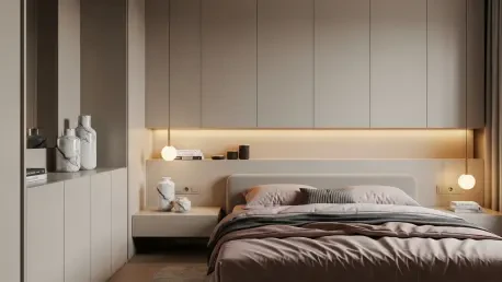

The interior design landscape is currently undergoing a profound transformation as homeowners and designers alike move away from the clinical, often sterile minimalism that dominated the past decade toward a more tactile and emotionally resonant aesthetic. This shift has led to the emergence of “Peige,” a sophisticated hybrid of pink and beige that is rapidly becoming the definitive neutral for high-end modern interiors. Unlike the flat grays or the harsh, stark whites of previous years, Peige offers a sense of grounded stability fused with an inviting warmth that adapts seamlessly to diverse architectural styles. This tertiary earth tone represents a departure from the “lackluster” neutrals that prioritized utility over atmosphere, instead offering a versatile foundation that feels both timeless and fundamentally fresh. By blending the organic depth of clay with a subtle hint of blush, Peige creates a backdrop that feels intentional rather than safe, marking a clear evolution in how color is used to define the modern living experience.
Defining the Rise of the Nuanced Neutral Palette
The transition toward warmer, more complex neutrals reflects a broader cultural desire for comfort and authenticity within the domestic sphere. For years, the industry leaned heavily on “greige” and cool-toned off-whites, which often resulted in environments that felt detached or overly industrial. However, as 2026 unfolds, the preference has swung toward colors that possess a “living” quality, meaning they shift in character based on environmental factors rather than remaining static and one-dimensional. Peige stands at the center of this movement, championed by influential designers who recognize its ability to pull from the natural world’s palette. It sits at the intersection of pink-toned browns and sun-drenched tans, providing enough pigment to give a room a distinct personality while maintaining the quietude required for a functional home. This color does not demand attention; instead, it provides a soft, atmospheric glow that enhances the surrounding decor.
This emergence of the nuanced neutral signifies a sophisticated maturation of interior design preferences where the goal is no longer just to brighten a space, but to enrich it. Designers are increasingly viewing walls not merely as boundaries, but as canvases for subtle emotional expression through color. Peige functions as a bridge between the stark minimalism of the recent past and the bold, maximalist tendencies that occasionally overwhelm contemporary architecture. By providing a middle ground, it allows for a “monochromatic but textured” approach that simplifies the visual language of a room without sacrificing its warmth. This trend is particularly evident in high-end residential projects where the focus is on creating a curated, intentional atmosphere. The move toward these types of tertiary tones suggests that the modern homeowner is looking for longevity—a color that can evolve with their style rather than one that will feel dated when the next major trend cycle begins.
Emotional Resonance and Human-Centric Design
One of the primary reasons top designers are gravitating toward this specific hue is its remarkable capacity to reduce visual noise and soothe the psychological state of the inhabitants. By utilizing Peige in monochromatic schemes, professionals can create environments that help calm a busy brain and simplify the visual language of a room. This approach allows the architecture and the inhabitants to take center stage, fostering a sense of order and tranquility that colder, high-contrast palettes often fail to achieve. The color acts as a buffer against the chaotic outside world, transforming living spaces into sanctuaries where the mind can reset. It is a strategic choice for those who view the home as a place of recovery, where every element contributes to a sense of well-being. This focus on emotional health is a hallmark of current design, placing the human experience at the very heart of aesthetic decisions.
Beyond its mental benefits, this specific color is exceptionally flattering to the people living within it, reflecting a healthy glow that standard cool neutrals or harsh whites cannot replicate. The subtle pink undertones harmonize with human skin tones, creating a visually pleasing environment that feels vibrant and alive. This makes the shade an ideal choice for personal spaces like bedrooms and bathrooms, where creating an inviting and warm atmosphere is essential for a positive start to the day. It transforms a functional room into a retreat, making the space feel more personal and human-centric. Designers note that when a person feels good in a room, the design has succeeded on a level that transcends mere visual appeal. This flattering quality is a major driver of the color’s popularity, as it addresses the physical and psychological needs of the residents while maintaining a high level of aesthetic sophistication in the modern home.
Dynamic Light Interaction and Environmental Adaptability
The true magic of Peige lies in its dynamic relationship with light, as it possesses an inherent ability to transform throughout the day based on the sun’s trajectory and intensity. In a room with plenty of natural exposure, the color appears crisp and uplifting during the morning hours, leaning into its lighter, sandy components. As the day progresses and the light shifts or dims, the color takes on a deeper, more “cocooning” quality, revealing the richness of its pink and brown undertones. Under the soft glow of side lamps or candlelight in the evening, it provides a dense, atmospheric background that makes a room feel layered and intentional rather than flat or lifeless. This adaptability ensures that the interior remains interesting and engaging at all hours, providing a different sensory experience as the environment changes, which is a key requirement for modern high-end residential architecture.
To keep the color from feeling overly sweet or “sickly,” designers emphasize its earthy roots and stony qualities, which provide a necessary sense of gravity. By grounding the pink hues with beige and brown undertones, the color maintains a high level of sophistication that prevents it from appearing juvenile or temporary. This balance ensures that the space feels mature and established, avoiding the pitfalls of more trendy or aggressive pinks that can quickly lose their appeal. It is this specific “stony” quality that allows Peige to function as a true neutral, effectively bridging the gap between a bold color choice and a safe, functional backdrop. This versatility is why the hue is being used across a wide range of settings, from urban lofts to coastal retreats, as it harmonizes with natural light and artificial illumination alike to create a space that feels both grounded and ethereal.
Textural Complexity and Strategic Materiality
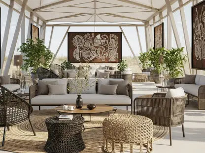
Successfully implementing this neutral in a modern interior requires a rigorous focus on texture and materiality to prevent the space from appearing one-dimensional or bland. Peige performs best when paired with natural elements such as dark timber, linen, wool, and bronze accents, which provide the necessary weight to anchor the softness of the walls. The combination of a “pinky-beige” palette with antique woods or tactile fabrics creates a balanced aesthetic that feels both historic and contemporary. This layering of textures allows the color to recede into the background while the physical materials of the home provide the narrative. By focusing on the interplay between the smooth finish of the paint and the rougher grain of natural materials, designers can achieve a depth that makes the room feel expensive and curated. The goal is to create a tactile environment where the eye is drawn to the richness of the objects within.
This trend also extends beyond traditional wall applications to include architectural details like skirting, cornices, and built-in cabinetry, which are often overlooked in standard designs. By saturating these elements in the same hue, designers can set a mood of contentment and ease throughout the entire space, creating a seamless visual experience. This monochromatic but textured approach prevents the room from feeling disjointed, instead giving it a unified feel that enhances the architectural character of the home. Even functional areas like kitchens and hallways benefit from this saturation, as it provides a sense of continuity that guides the viewer through the house. The use of varied finishes, such as matte for the walls and satin for the trim, adds another layer of subtle complexity. This strategic application ensures that the color remains the star of the show without overwhelming the space, providing a sophisticated framework for modern living.
Shaping the Future of Residential Aesthetics
The transition to Peige reflected a broader movement where color was chosen for its experiential quality rather than just its utility, marking a pivotal shift in interior philosophy. While standard neutrals were often selected because they were considered “safe” or “saleable,” this new hue was embraced because it was inherently “inviting” and human. It functioned as a clever choice that softened the coldness of modern architecture while simultaneously enhancing the impact of natural light within a space. Designers shifted their focus toward creating restful retreats, where the color worked to make a space feel more layered and intentional rather than merely decorated. This evolution suggested that even the most basic elements of home design, such as the neutral backdrop, could be reimagined to provide more comfort, sophistication, and atmospheric beauty. By prioritizing the emotional well-being of the inhabitants, the industry moved toward a more empathetic approach to environmental design.
Homeowners looking to integrate this trend for the period from 2026 to 2028 should focus on a gradual layering of the color through high-quality textiles and artisanal decor. Starting with small-scale additions like muted rose linen quilts, marble ceramics, and vintage-inspired rugs allowed for an immediate elevation of the home’s atmosphere without a permanent commitment. These accents contributed to a sense of luxury and calm, proving that even minor shifts toward more nuanced neutrals could significantly impact the overall feel of a living space. As the design cycle progressed, the adoption of Peige across architectural elements provided a foundation for future renovations, ensuring that the home remained a sanctuary of warmth and light. The ultimate lesson from this shift was that a neutral palette did not have to be boring; instead, it could be the most powerful tool for creating a home that felt truly connected to the people living within it.