
The world of interior design is on the brink of a transformative era as the predicted hottest color palettes for the year 2025 come into focus, reflecting a collective yearning for well-being, harmony, and a deep connection with nature. These emerging color trends are meticulously curated to create environments that are not only visually stunning but also emotionally enriching.
Calming Neutrals for Mindfulness and Relaxation
Harmonizing with Nature: Versatile Tones and Natural Materials
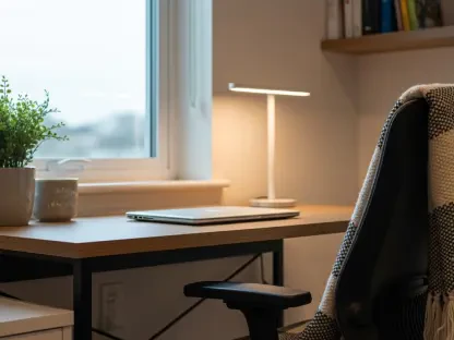
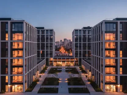
One of the most noteworthy trends in the 2025 color palette centers on calming neutral hues such as sandstone beige, pale sage, soft taupe, and warm ivory. These shades are expected to dominate interior spaces, promoting a sense of relaxation and mindfulness that is essential in today’s fast-paced world. Neutral tones are remarkably versatile, making them ideal for minimalist interiors that seek to highlight the beauty of natural materials.
These comforting hues can transform any space into a sanctuary, fostering a warm and inviting atmosphere. By incorporating elements like wood, stone, and linen, designers can create cohesive environments that ooze tranquility and comfort. Whether in residential homes or wellness-focused branding, these neutral colors offer an effortless elegance. They are perfect for anyone looking to cultivate a peaceful, clutter-free space where the mind can unwind and recharge.
Creating Serene, Balanced Spaces
The significance of these neutral hues extends beyond their aesthetic appeal; they play a crucial role in setting the emotional tone of an environment. When carefully balanced and paired with natural materials, these colors help create a sanctuary of peace and serenity. Sandstone beige and pale sage, for instance, offer a subtle earthiness that can ground the most modern of spaces. Soft taupe and warm ivory, on the other hand, provide a gentle, light backdrop that can make any room feel brighter and more expansive.
Incorporating these shades into interior design can significantly impact well-being, encouraging mindfulness and relaxation. Whether used on walls, furniture, or decorative accents, these versatile tones can harmonize and unify different elements of a space, promoting a sense of balance and cohesion. The subtle sophistication of calming neutral hues creates environments that are not only pleasing to the eye but also conducive to mental clarity and emotional well-being.
Bright Colors for Positivity and Creativity
An Optimistic Palette for Uplifting Spaces
On the other end of the spectrum, the 2025 color trends also spotlight an optimistic palette of bright colors such as transcendent pink, sunset coral, and vivid teals. These vibrant hues are designed to express positivity and creativity, making them perfect for accent walls, bold furniture, striking artwork, and lively furnishings. By infusing spaces with these energetic colors, designers can cultivate environments that spark joy and innovation.
Bright colors like transcendent pink and sunset coral are particularly effective in environments where an uplifting atmosphere is desired. These hues inject confidence and excitement into spaces, making them ideal for lively workplaces, creative studios, and dynamic lounge areas. Vivid teals, with their invigorating qualities, can transform a room into a vibrant hub of activity. The strategic use of these bright colors can help in establishing a more stimulating and motivating atmosphere, catering to spaces that thrive on creativity and optimism.
Balancing Bold Accents
While bright colors bring a sense of excitement, achieving the right balance is essential to avoid overwhelming the senses. These optimistic hues should be used thoughtfully to create focal points that draw the eye without dominating a space. For example, a single vivid teal accent wall in an otherwise neutral room can add a pop of color that energizes and inspires without becoming overwhelming. Similarly, incorporating transcendent pink and sunset coral through accessories and artwork can elevate the overall ambiance.
Bright colors can also be used to enhance specific design elements, such as furniture or decorative pieces, creating interest and visual diversity. These hues can act as catalysts for creativity, encouraging a more playful and imaginative approach to interior design. By thoughtfully balancing bright colors with calming neutrals or moody blues, designers can create dynamic spaces that are both energizing and harmonious, fostering creativity and positivity.
Moody Blues for Calmness and Focus
Reflective and Tranquil Shades
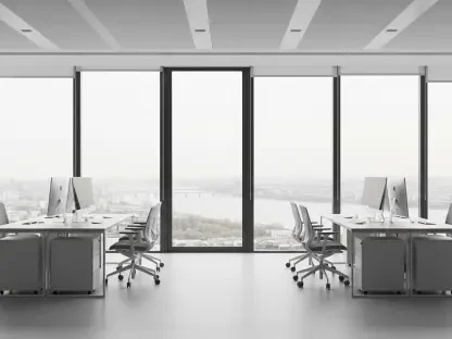
Moody blues will continue their reign in 2025, evolving into more reflective and tranquil shades that convey calmness, focus, security, and authority. With tones such as midnight navy, cobalt, and aquatic awe, these blues are ideal for creating sophisticated and meditative spaces. The psychological impact of blue hues makes them particularly suited for professional settings such as offices and libraries where an ambiance conducive to thoughtfulness and creativity is paramount.
Midnight navy, with its deep and enigmatic presence, can evoke a sense of stability and introspection, perfect for spaces dedicated to focused work or quiet reflection. Cobalt and aquatic awe, with their cooler, more vibrant tones, can bring a refreshing and invigorating energy to a room. Used judiciously, these shades can help foster an environment that balances tranquility with productivity, catering to the needs of modern professionals who seek both clarity and inspiration in their workspaces.
Authority and Sophistication
The use of moody blues is not limited to professional environments; these shades can also add a touch of authority and sophistication to living spaces. Whether through wall colors, upholstery, or decorative accents, moody blues can lend a regal and timeless quality to interiors. The versatility of these shades allows them to harmonize with various design styles, from contemporary to classic.
Incorporating moody blues into interior design can significantly elevate the aesthetic and functional aspects of a space. Midnight navy and cobalt, for instance, can serve as elegant backdrops that highlight other design elements, enhancing the overall composition. Aquatic awe, with its soothing allure, can create a serene and calming atmosphere, ideal for spaces where relaxation is the primary goal. By embracing these reflective shades, designers can craft interiors that exude both sophistication and tranquility, ensuring that spaces are not only visually appealing but also conducive to well-being.
Pastels and Metallics: Charm and Elegance
The Resurgence of Pastels
Pastels are set to make a comeback in 2025, but with a twist. They will evolve into more subdued, dusty, and elegant tones that add charm and warmth to interiors. Soft lavender and dusty pink, in particular, will be popular choices, symbolizing compassion, nurturing energy, and serenity. These colors are perfect for creating cozy and welcoming spaces, especially in bedrooms and peaceful areas.
The gentle allure of pastels allows them to be used in various applications, from wall colors to textiles like curtains and throw cushions. Soft lavender can imbue a room with a sense of calm and relaxation, making it an excellent choice for spaces meant for unwinding. Dusty pink, with its warm and comforting hue, can add a touch of romantic sophistication, making any space feel more intimate and inviting. These pastel shades can create environments that are both beautiful and nurturing, aligning perfectly with the overarching theme of well-being.
Muted Metallic Accents
The interior design world is on the verge of a transformative era, with the anticipated hottest color palettes for 2025 signaling a profound shift. These future trends reveal a collective desire for well-being, harmony, and a stronger connection with nature. Reflecting an increased awareness of the therapeutic impact of color, designers are meticulously curating these palettes to craft spaces that are not only visually captivating but also emotionally uplifting.
Predictions for 2025 point to colors that evoke serenity and balance. Expect to see earthy tones, soothing greens, and ocean-inspired blues dominating interiors, each chosen to promote a sense of calm and tranquility. These hues are intended to foster environments where people can unwind, relax, and feel more at peace.
The integration of these color trends goes beyond mere aesthetics. The aim is to enhance the emotional quality of living spaces, making them sanctuaries of comfort and well-being. As we move closer to 2025, the focus will increasingly be on designing interiors that nurture the soul and make a positive impact on our daily lives.