
Interior designers frequently grapple with the challenge of keeping pace with the swiftly changing color trends in the world of home décor. From bold and vibrant hues to soft and understated pastels, the trending palettes are constantly evolving, which can often leave not just designers but also homeowners feeling overwhelmed and fatigued. Seeking to create spaces that maintain their charm and cohesiveness over time, many turn away from ephemeral trends in favor of colors that offer both aesthetic appeal and enduring longevity. These timeless hues invariably stand the test of time, becoming trusted staples in numerous interior design projects. This article delves into these classic colors, exploring insights from experienced designers on their go-to selections that consistently deliver a sense of timeless elegance and harmonious balance to any space.
Sage Green: A Versatile and Sophisticated Choice
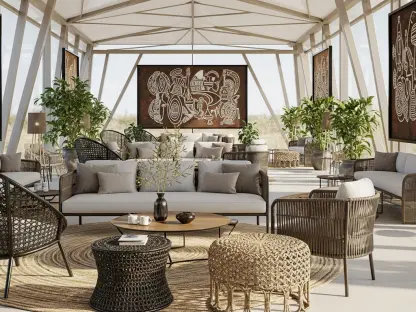
Sage green is a color that consistently finds favor among even the most discerning interior designers, and its appeal is easy to understand. This subtle yet impactful hue embodies sophistication while retaining an earthy quality that lends itself well to a wide array of design styles. Kathy Kuo, an interior designer renowned for her impeccable taste, praises sage green for its dual nature, describing it as both refined and grounded. Sage green integrates seamlessly into diverse aesthetics, ranging from French country charm to modern farmhouse simplicity, providing a harmonious and calming backdrop in any setting. Its close connection to nature ensures its enduring appeal, making it an excellent choice for those seeking a classic yet versatile color.
Among the myriad shades of sage green available, “October Mist” by Benjamin Moore stands out as a favorite. Celebrated designer Sara Malek Barney singles out this particular hue for its ability to impart a polished and put-together look to any room. The versatility of sage green cannot be overstated; it pairs beautifully with a variety of textures and materials, ensuring a cohesive and welcoming environment. Whether used in living rooms, kitchens, or bedrooms, this nature-inspired color continues to captivate and inspire. Its enduring appeal lies in its perfect balance of sophistication and approachability, making it a timeless staple in the world of interior design.
Off-Whites: The Perfect Balance of Warmth and Brightness
Off-whites have long been cherished by interior designers for their timeless and versatile quality. These shades strike a perfect balance between warmth and brightness, making them ideal for creating spaces that feel both airy and inviting. Warm white paints, such as Sherwin-Williams’ “Greek Villa,” are particularly favored by designers like Jessica Dorling, who emphasize their ability to create a light and open scheme while maintaining a cozy ambiance. Off-whites can adapt to a multitude of design styles, serving as a neutral backdrop that enhances the overall aesthetic without overpowering the space.
Another classic choice among off-whites is Benjamin Moore’s “White Dove,” a shade revered by designers Alexis Warren and David Ries for its reliable and timeless appeal. “Fog Mist,” also by Benjamin Moore, is similarly celebrated for its ability to bring brightness into a room while retaining a sense of understated elegance. These off-whites work harmoniously with various fabrics, finishes, and accents, making them a versatile option for any interior. The enduring appeal of off-whites lies in their ability to create a clean, timeless look that remains relevant and stylish, regardless of changing trends. Their neutrality and warmth ensure that they continue to be a favored choice for many interior design projects.
Earthy Tones: Grounded and Livable Colors
Earthy tones are another color family that enjoys perennial popularity among interior designers. These shades offer a grounded and livable quality that infuses a sense of stability and reassurance into any space. Neutral blues and grays, such as Benjamin Moore’s “Cobblestone Path,” are particularly beloved for their serene and calming presence. Designer Jaclyn Isaac advocates for using blues as neutrals, drawing inspiration from the natural world, including the sky and ocean. These blue-grays provide a timeless and tranquil backdrop, making them a reliable choice for creating a peaceful and sophisticated interior.
In addition to neutral blues and grays, richer earth hues like greige and taupe also hold a special place in the hearts of many designers. Vyanca Soto, for instance, is drawn to shades like Portola Paints’ “Piano Room,” which boast a rich, earthy elegance. These hues bring depth and warmth to any setting, adding a layer of timeless sophistication that is both comforting and enduring. Earthy tones are celebrated for their ability to create a cohesive and harmonious environment, effortlessly bridging the gap between tradition and modernity. Their natural inspiration ensures that they remain relevant and appealing, making them a cherished choice for timeless interior design.
Navy Blue: Sophisticated and Moody
Navy blue is a color that consistently exudes sophistication and depth, making it a favored choice among interior designers looking to create a timeless atmosphere. This rich and moody hue conveys a sense of coziness and elegance, effortlessly elevating any space it graces. Designer Nadia Watts highlights the enduring appeal of navy blue, particularly Benjamin Moore’s “Hale Navy.” This bold shade functions almost as a neutral due to its compatibility with a broad spectrum of colors, offering versatility in its application across various design styles. Its deep hue adds character and dimension, ensuring it remains a classic choice for those seeking a rich, enduring aesthetic.
The allure of navy blue extends beyond its versatility, as its moody appeal adds a layer of sophistication that feels both timeless and contemporary. This shade creates a luxurious and slightly dramatic ambiance without feeling overly trendy or fleeting. The ability of navy blue to transform a room with its depth and richness is unparalleled, making it an indispensable color in the arsenal of interior designers. Whether used on walls, cabinetry, or accent pieces, navy blue maintains its status as a perennial favorite, revered for its timeless beauty and adaptability.
Charcoal: Crisp and Timeless
Charcoal is a color that consistently garners appreciation for its crisp and timeless qualities. This versatile shade is celebrated for its ability to create a sophisticated and grounded atmosphere in any interior. Charcoal, with its deep and rich tone, offers a sense of elegance that balances modernity and classic appeal. Designers like Emily Henderson often turn to charcoal for its capacity to add depth and dimension to a space without overwhelming it. This color pairs beautifully with a range of other hues and textures, making it a reliable choice for creating cohesive and timeless interiors. The enduring appeal of charcoal lies in its capacity to create a clean, polished look that stands the test of time. Its adaptability ensures it remains a favorite among interior designers seeking to craft spaces that exude timeless sophistication.