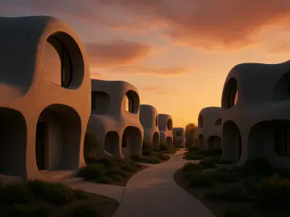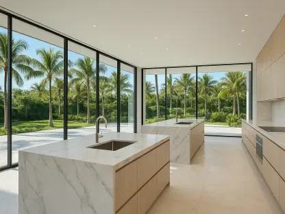

The high-energy schemes of the past decade are being traded for geological tones like clay and terracotta that reflect the soil and stone of specific regions. The landscape of residential architecture is currently witnessing a significant departure from the aesthetic paradigms that have dominated the industry since the mid-2010s. For several years, the design world favored a stark white aesthetic, characterized by crisp lines and high-contrast black accents, often referred to as the modern farmhouse look. While this style became a safe default for homeowners seeking immediate curb appeal, the era of the blank white house is now yielding to more nature-merged palettes. This shift represents a fundamental reimagining of how a home should relate to its immediate environment, favoring tones that are derived from the local landscape. By utilizing sage greens, warm stones, and earthy plasters, designers are ensuring that houses no longer impose themselves upon a lot but rather sit harmoniously within their surroundings. This transition reflects a deeper societal desire for dwellings to feel grounded and integrated with the natural world rather than serving as visual interruptions.
The movement toward nature-merged colors represents a deliberate departure from artificial or clinical tones in favor of shades that possess inherent complexity and nuance. Unlike the flat, one-dimensional quality of a pure white or a cool icy gray, these modern selections mimic the layered textures found in the organic world. The focus is on colors that ground a building, such as botanical greens and geological tones that mirror the soil and stone of specific geographic regions. This overarching philosophy emphasizes belonging over standing out, allowing a home to enhance the natural horticulture and topography of the site. By moving away from one-dimensional palettes, homeowners are creating dwellings that feel like organic extensions of their environments, fostering a sense of permanence and architectural maturity. This approach naturally leads to a more sophisticated aesthetic that respects the history and geology of the land, ensuring that new constructions and renovations alike possess a timeless quality that resists the rapid turnover of fleeting design fads.
Drivers of the Ecological Color Shift
One of the most persistent criticisms of the stark white trend was its tendency to jar against the natural landscape, creating a visual disconnect that often felt sterile. Industry experts now argue that while white was once perceived as an updated and clean look, it eventually became a generic default that fought against the surrounding greenery rather than complementing it. Nature-derived tones possess a complexity that mirrors the organic world, providing a depth that simple pigments cannot achieve. Because colors like stone, clay, and moss are familiar to the human eye, they provide a sense of timelessness that allows the architecture to settle into the site. This is particularly effective for large-scale residences that might otherwise feel overwhelming; the application of earthy tones reduces the perceived mass of the building, making it appear more integrated with the trees and terrain. Consequently, the home becomes a quiet participant in the landscape rather than a loud statement, which aligns with the current preference for understated luxury and environmental mindfulness.
The design world is heavily influenced by a broader cultural move toward wellness and biophilic design, which seeks to reconnect human beings with the natural environment. In a fast-paced and high-stress society, the home is increasingly viewed as a sanctuary and a place for psychological restoration. Colors such as muted sage and soft blue-green are being utilized because they signal stability and calm to the human nervous system. Similarly, earth tones provide a sense of restorative grounding that mimics the experience of being in a forest or a desert. This shift suggests that the color of a home’s exterior is the first step in creating a restorative environment that begins the moment a resident arrives at the property. By selecting palettes that evoke the natural world, designers are able to create a seamless transition between the outdoors and the indoors, reinforcing the home’s role as a protective and peaceful retreat. This focus on emotional well-being is driving the rejection of high-contrast, high-energy schemes that characterized previous years.
Maintenance and longevity have also become primary concerns for modern homeowners, providing a pragmatic reason for moving away from bright white exteriors. Stark white is notoriously high-maintenance because it quickly reveals environmental grime, pollution, dust, and algae growth, especially in humid or coastal climates. In contrast, nature-merged colors—especially those with gray, green, or brown undertones—mask weathering and age far more gracefully. These complex shades look better for longer because their underlying pigments harmonize with the very elements that make white look dirty. By choosing a color that already exists within the local environment, homeowners are reducing the frequency of pressure washing and repainting. This practical benefit is coupled with the fact that these tones do not suffer from the blinding glare that white surfaces produce in direct sunlight. The result is an exterior that remains visually appealing across different seasons and weather conditions, maintaining its integrity and curb appeal without constant intervention.
Trending Nature-Merged Palettes
Green has emerged as a primary choice for nature-merging, specifically through the use of muted and historical variations that evoke a sense of heritage. Sage greens offer a subtle approach that feels light and uplifting without the clinical harshness of traditional white, making them ideal for homes with significant sun exposure. Deeper tones like olive or moss are being frequently applied in woodland settings to allow a house to virtually disappear into a backdrop of trees. This is often achieved through tonal layering, where different shades of green are used for the siding, trim, and accents to create visual depth and interest. This method moves away from the traditional concept of contrasting colors and instead uses shadow and light to define architectural features. The result is a sophisticated, organic look that feels both contemporary and deeply rooted in the environment. These greens act as a bridge between the built structure and the living landscape, creating a cohesive visual experience that is both calming and aesthetically rich.
For those who are not yet ready to commit to bold or dark colors, the transition involves moving toward gentler, muddy whites and warm neutrals. These shades provide the freshness of white without the reflective glare, feeling much softer against natural stone or wood accents. Greige remains a dominant standard in this category, successfully occupying the middle ground between cool gray and warm beige. It acts as a versatile canvas that supports more colorful nature-inspired accents, such as a deep botanical green front door or weathered bronze light fixtures. These softer neutrals are particularly effective in suburban environments where a total departure from traditional colors might feel too radical. By choosing a white with warm, earthy undertones, homeowners can achieve a modern look that still feels approachable and integrated. This approach softens the architectural lines of a house, making it feel more welcoming and less like a sterile monument to modernism.
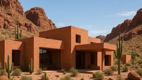
There is a rising interest in Old World finishes that reflect the raw materials of the earth, particularly in regions characterized by desert or Mediterranean-style architecture. Rather than relying on standard exterior paint, many designers are opting for tinted plasters and lime washes to achieve a deep, artisanal quality in shades of ochre and clay. These materials offer a breathable finish that ages beautifully, developing a patina that standard paint cannot replicate. These colors create an inviting, grounded feel that is perceived as personal and full of character, moving away from the mentality of resale-safe neutral grays. In the American Southwest and similar climates, these geological tones allow a home to harmonize with the surrounding red rocks and sandy soil. This regional sensitivity ensures that the architecture feels appropriate for its location, celebrating the unique colors of the local geology. Such palettes offer a sense of permanence and authenticity that resonates with homeowners looking for a deeper connection to their specific geographic setting.
In coastal or lakeside environments, the trend takes the form of weathered blues and atmospheric grays. These are not the bright primary blues of the past but are instead heavily infused with gray or green to mirror the sea and sky on an overcast day. These tones allow a home to feel anchored to its maritime setting, especially when paired with natural materials like cedar shake or weathered stone. They offer a serene, atmospheric quality that feels both sophisticated and organic, avoiding the clichéd bright nautical themes. By mimicking the colors of the water and the horizon, these houses blend into the coastal mist, creating a soft and ethereal presence. This palette is particularly effective for properties located near large bodies of water, as the shifting light of the day interacts with the gray-blue pigments to create a dynamic and ever-changing exterior. This focus on atmospheric color ensures that the home remains a quiet, respectful part of the coastline.
Strategies for Successful Implementation
Selecting a nature-merged palette requires significantly more care and consideration than simply choosing a default white or gray. Homeowners must first perform an audit of the fixed materials that are not changing, such as the roof, existing brickwork, stone foundations, and window frames. The most successful palettes are those that engage in a dialogue with these existing elements. For example, if a house features warm-toned brick, a cool blue-gray will likely feel disconnected and jarring, whereas a warm sage or a stone neutral will feel intentional and balanced. The goal is to create a complementary relationship where the paint makes the existing materials look more vibrant and purposeful. By identifying the dominant undertones in the stone or brick, a designer can select a paint color that enhances those natural hues. This strategy ensures that the entire property feels cohesive, as if all the materials were chosen simultaneously to work together as a single architectural statement.
The success of a nature-merged color also depends on understanding how paint behaves in natural light, which is drastically different from the controlled environment of an interior room. Because exterior paint often washes out in the sun, it is vital to test large patches on different sides of the house before making a final commitment. A color that looks like a deep olive on a small swatch may appear as a light sage when applied to a large exterior wall in direct sunlight. Professionals recommend observing these test patches at various times of the day and under different weather conditions, such as full sun versus an overcast afternoon. This ensures that the selection remains balanced and does not take on unintended undertones, such as appearing too yellow or too blue in certain lights. By taking the time to observe these shifts, homeowners can avoid the costly mistake of choosing a color that only looks good during one specific hour of the day.
A professional exterior in the current market usually consists of a sophisticated hierarchy involving a body color, a trim color, and an accent color. Homeowners are encouraged to avoid the dated practice of using a single flat color for every surface and instead should layer the palette to create architectural interest. By using a primary shade for the siding and closely related, complementary tones for the doors, eaves, and window casings, the property gains a sense of place and depth. This tonal approach allows the natural shadows of the building to provide the necessary contrast, rather than relying on sharp color changes. This methodology ensures that the home honors its surroundings while maintaining a distinct and refined personality. When the trim and siding are within the same color family, the house appears more unified and expansive, highlighting its structural form without the distraction of high-contrast lines. This sophisticated layering is the hallmark of modern nature-merged design.
The Path Toward Contextual Regionalism
The transition toward organic and nature-merged exteriors represented a fundamental maturation of residential design that prioritized context over uniformity. The previous dominance of the stark white farmhouse trend eventually gave way to a more nuanced understanding of how architecture can respect its environment. Homeowners who sought to move away from generic aesthetics found success by looking at the soil, stone, and flora surrounding their properties for color inspiration. This move toward regionalism ensured that a house in the desert looked distinctly different from one in a northern forest, breaking the cycle of nationwide architectural homogeneity. By embracing the complexity of greens, clays, and weathered blues, the industry moved toward a more sustainable and visually restful future. The implementation of these palettes allowed for a greater sense of well-being and a significant reduction in the environmental impact associated with high-maintenance, high-contrast finishes.
For those considering a renovation or a new build, the first step involved a careful observation of the natural landscape before any paint swatches were even considered. Successful projects were those that treated the exterior as a continuation of the local geology and botany. Moving forward, the focus should remain on the durability and psychological impact of color, ensuring that homes serve as grounding anchors in an increasingly digital world. Designers and architects suggested that the best way to start was by gathering samples of local stone and foliage to find the underlying pigments that naturally occur on the site. This practice guaranteed that the resulting palette would feel authentic and timeless. As the trend toward contextualism deepened, the relationship between human dwellings and the earth became more harmonious, proving that the most beautiful homes were not those that stood out the most, but those that belonged the most completely to their land. By following these principles, the residential sector solidified a commitment to architecture that is both beautiful and environmentally sensitive.