The prevailing preference for clinical, stark white interiors that characterized much of the previous decade is finally undergoing a radical transformation as homeowners prioritize emotional resonance. This current shift marks a definitive departure from the cold, gallery-like aesthetics that once dominated residential design, replacing them with environments that emphasize psychological well-being and a deep-seated connection to the natural world. Instead of chasing a purely utilitarian look, the contemporary approach focuses on creating intentional spaces where every chosen hue supports a specific activity or mood. Homeowners are actively seeking out warmth and individuality, moving toward palettes that reflect their personal narratives rather than just following a standardized template of cleanliness. This evolution suggests that the modern residence is no longer just a place to exist but a curated sanctuary that fosters comfort through sophisticated color theory. The goal is to move beyond the superficial and establish a grounded atmosphere that feels both expressive and functional for daily life.
Transforming the Kitchen into a Warm Culinary Hub
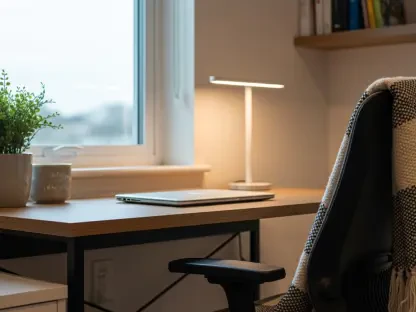
The traditional kitchen, once a bastion of bright and often sterile white paint, is being reimagined as a warm and inviting communal center that acts as the primary heartbeat of the home. Current design philosophies for this space lean heavily into “mushroom” neutrals and nature-inspired greens that provide a sophisticated yet organic backdrop. By incorporating muted olives and sage tones, such as Sherwin-Williams’ Evergreen Fog or Benjamin Moore’s Vale Mist, designers are successfully crafting environments that feel less like industrial workshops and more like cozy gathering areas. These shades offer a grounded sensation that invites long conversations over meals while maintaining a high level of aesthetic refinement. The move toward earthier tones acknowledges that the kitchen is a high-traffic zone that benefits from colors that hide minor wear while simultaneously providing a soothing visual experience. This transition highlights a broader desire for authenticity in the most utilized areas of the modern American household.
Utilizing specific culinary-inspired shades like BEHR’s Caraway Seeds allows for a seamless transition from the workspace to the dining area, ensuring the room remains anchored in comfort. This approach to kitchen design rejects the idea that a clean space must be a white space, opting instead for a rich palette that enhances the textures of natural stone, wood cabinetry, and brass fixtures. The application of these warmer tones creates a sense of history and permanence, making even new builds feel established and welcoming. Furthermore, these nature-centric greens and browns serve to blur the lines between the interior and the surrounding landscape, a technique that has become increasingly popular in open-concept living. By treating the kitchen as a restorative space, homeowners are able to foster a more communal atmosphere that prioritizes the human experience over minimalist trends. This focus on warmth ensures that the kitchen remains a versatile hub capable of supporting both rigorous food preparation and relaxed social interaction with equal grace.
Creating Spa-Like Sanctuaries in the Bathroom
Bathrooms are undergoing a significant evolution, moving away from the traditional bright and airy white-on-white aesthetic in favor of moodier, restorative sanctuaries that prioritize character. A standout technique currently gaining traction is “color drenching,” where the walls, ceilings, and even the trim are painted in a single deep hue to create a striking, cocoon-like effect. This method turns a standard functional room into a sophisticated retreat that offers a sense of privacy and immersion. Rather than relying on stark whites to make small bathrooms appear larger, current trends embrace the depth of earth-inspired tones like Terra Mauve and Sandstone Cove. These colors provide a warm, tactile quality that pairs exceptionally well with modern lighting and natural materials. The shift represents a move toward the bathroom as a high-end spa environment within the home, emphasizing a restorative atmosphere that encourages relaxation and mental clarity after a long day.
For those seeking a more modern and dramatic feel, deep slate blues and charcoals, such as Benjamin Moore’s Kendall Charcoal or Slate Blue, have become the preferred choice for powder rooms and ensuites. These saturated palettes transform what was once a purely utilitarian space into a bold design statement that exudes luxury and intentionality. By using darker colors, designers are able to highlight architectural details and high-quality fixtures that might otherwise be lost in a sea of white. The resulting environment feels curated and intentional, offering a stark contrast to the rest of the home’s more neutral areas. This approach effectively uses color to define the bathroom as a private sanctuary, providing a visual cue for the transition from the busy world outside to a space of personal care. Ultimately, the trend toward deeper, more resonant colors in the bathroom reflects a broader interest in creating specialized environments that support different aspects of personal well-being.
Anchoring Living Spaces with Depth-Filled New Neutrals
In the living room, the focus has shifted toward “new neutrals” that offer significantly more depth and warmth than the standard beiges or stark greys of previous cycles. These soft, chalky off-whites, including Sherwin-Williams’ Alabaster and Benjamin Moore’s Manchester Tan, serve as a modern foundation that allows for seamless transitions across open-concept layouts. The primary objective is to create a versatile backdrop that feels bright and spacious without falling into the trap of looking cold or uninviting. These updated neutrals possess subtle undertones that react beautifully to different lighting conditions throughout the day, providing a dynamic visual experience. By moving away from the blue-toned whites of the past, homeowners can create a more cohesive and snug environment that feels grounded and permanent. This shift acknowledges that the living room must serve as a multipurpose space that is as comfortable for relaxing as it is for entertaining guests.
To prevent these neutral spaces from appearing flat or monotonous, designers are increasingly recommending the use of high-contrast accents on specific architectural features like mantels or window trim. Incorporating grounded shades like Light French Gray or Edgecomb Gray against warmer walls provides a sense of structure and sophistication that elevates the entire room. This strategy allows the neutral walls to act as a gallery space for art, textiles, and furniture, while the darker accents provide the necessary visual weight to anchor the design. This balance of light and shadow ensures that the living room remains bright and open while still feeling architecturally significant and well-defined. The current trend emphasizes that a neutral palette does not have to be boring; rather, it provides a sophisticated canvas for personal expression and high-quality decor. This nuanced approach to color ensures that living spaces remain timeless and adaptable to changing tastes over the coming years.
Designing Restorative Bedrooms with Saturated Hues
The bedroom is witnessing perhaps the most dramatic shift in color philosophy, moving entirely away from pale, icy pastels in favor of deep, restorative, and saturated tones. This change is heavily influenced by the desire for a boutique hotel feel, where the environment is specifically engineered to promote luxury, rest, and complete relaxation. Colors such as Sherwin-Williams’ Expressive Plum and Secret Garden, or Benjamin Moore’s Newburyport Blue, are being used to create an enveloping atmosphere that encourages sleep. When these shades are applied in matte or textured finishes, they provide a sophisticated environment that feels incredibly high-end and private. Contrary to older design myths, these deep palettes do not make a room feel smaller when executed correctly; instead, they add an intentional sense of depth that makes the space feel more secure and peaceful. This focus on restorative depth turns the bedroom into a specialized retreat from the digital noise of the outside world.
Homeowners who successfully implemented these color strategies found that the intentional use of paint significantly altered the emotional resonance of their living spaces. The transition toward natural connections, such as the use of sage and terracotta, reflected a widespread desire to bring the outdoors in, creating a more harmonious living environment. Furthermore, the industry observed that the era of stark, blue-toned whites had effectively ended as people opted for warmer, more human-centric versions of neutrality. Those seeking to update their homes were encouraged to treat each room as an individual emotional project, selecting hues that supported specific activities rather than adhering to a single, monochromatic theme. By focusing on how a room feels rather than just how it looks, the design community moved toward a more mature understanding of domestic space. Future considerations suggested that maintaining this balance of personal expression and natural grounding would remain the most effective way to enhance the longevity of a home’s interior design.