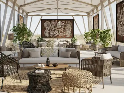

The interior design industry is currently witnessing a profound departure from the predictable, sugary hues that have historically dominated the spring season. For decades, the arrival of warmer weather dictated a near-mandatory transition toward a limited spectrum of pale pinks, baby blues, and mint greens, often resulting in spaces that felt repetitive or overly juvenile. However, the latest color trends for 2026 suggest a more sophisticated evolution, characterized by a philosophy of unconventional balance that prioritizes character and longevity. This shift is not merely about changing a few wall colors but represents a fundamental reimagining of how seasonal aesthetics interact with modern life. By moving beyond these stereotypical decor choices, homeowners are embracing a curated mixture of grounded neutrals and vibrant, unpredictable accents that offer a sense of permanence. This new approach allows a residence to feel refreshed for the spring months while remaining visually relevant throughout the entire year.
Grounding the Palette with Versatile Foundations
To prevent a modern spring palette from feeling too light or untethered, designers are increasingly turning to sophisticated neutrals that provide a warm and crisp anchor for more adventurous colors. Simply White has emerged as the essential foundation within this collection, offering a subtle hint of yellow that avoids the clinical coldness typically associated with stark white paints. This versatile shade is specifically engineered to provide a clean contrast, allowing both the hushed pastels and the deeper, more saturated tones of the room to stand out without competing for attention. It is particularly effective when applied to high-traffic areas such as entryways or central hallways, where its reflective properties can maximize natural light. When paired with warm wood tones or rich, leafy greens, this foundation creates a welcoming atmosphere that feels both expansive and grounded. This architectural approach to color ensures that the home remains a stable environment even as seasonal accents change.
Another critical component of this grounded design philosophy involves the reimagining of traditional yellow and green tones, which are now being infused with more complex undertones. Fresh Air represents a significant move away from the overly sweet, candy-like lemon shades of the past by incorporating subtle brown and gray pigments into its base. The result is a sophisticated buttermilk hue that feels remarkably stable and calm, providing a quietly uplifting backdrop that does not overwhelm the senses. Similarly, Fresh Dew acts as an organic hybrid of soft green and charcoal gray, offering a light and airy feel that remains firmly rooted in modern stability. These specific shades serve as a vital bridge between the more daring, vibrant elements of the palette and the classic neutrals. By using these complex colors, homeowners can achieve a space that feels connected to the natural world without resorting to the fleeting clichés of traditional seasonal decorating.
Introducing Depth and Vibrant Disruptors
The modern spring aesthetic gains much of its unique character from the introduction of unexpected depth through bold, earthy counterpoints that challenge conventional wisdom. Mountain Lane, a deep and saturated olive green, serves as a necessary anchor for the lighter elements of the room, evoking the quiet serenity of a lush hillside or a shaded veranda. By incorporating such a dark and moody hue into a spring-focused collection, designers are proving that richness and freshness are not mutually exclusive concepts. When this shade is paired with soft browns and warm beiges, it creates a sophisticated respite that balances the inherent airiness of the season with a sense of gravity and history. This approach demonstrates that a room can feel revitalized and alive through the use of organic, dark colors that mimic the density of new forest growth. It effectively disrupts the notion that spring must be exclusively bright, offering instead a more nuanced interpretation of seasonal renewal.
Perhaps the most striking departure from traditional design norms is the strategic use of vibrant disruptors like Raspberry Blush to inject personality and charisma into a space. This vivacious coral-pink-red utilizes the principles of the unexpected red theory to unify disparate elements and elevate the overall design of a room. Rather than being relegated to small accessories, this bold choice is increasingly used to accentuate significant architectural features or to revitalize social hubs such as dining rooms. The color reacts dynamically to the sun’s shifting rays, radiating an energy that challenges the quietude typically expected in spring decor. By mixing these high-energy colors with tactile textiles like sage velvet or natural wood grains, the home becomes a vibrant and sophisticated environment. This method of using a singular, powerful accent color provides a focal point that draws the eye and gives the interior a sense of intentionality and modern flair that traditional pastels simply cannot match.
Materiality and Future Design Implementations
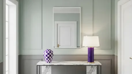
The success of this unconventional color palette is deeply intertwined with the selection of specific materials and textures that enhance the visual impact of the paint. To support the sophisticated pastel and earthy themes of 2026, there is a clear trend toward the integration of tactile textiles that add a layer of physical comfort and luxury. For instance, the use of sage green velvet upholstery or fringed borders on decorative pillows provides a necessary depth that prevents flat surfaces from feeling uninteresting. Warm accents such as exposed wood grain patterns and natural stone help to anchor the lighter yellow and green tones, creating a sensory experience that is both visual and haptic. Additionally, the inclusion of playful hardware and lighting, such as violet-checked ceramics or bold lacquer lamps, mirrors the zingy nature of the palette. These elements allow homeowners to experiment with unconventional colors in smaller, manageable doses before committing to a full-scale renovation of their primary living spaces.
The transition toward a more complex and balanced color strategy provided a clear roadmap for those looking to modernize their interiors without sacrificing the essence of seasonal change. By moving away from juvenile palettes, designers established a new standard that favored longevity and architectural integrity over the fleeting trends of previous years. This evolution encouraged a deeper exploration of how light interacts with multifaceted pigments, leading to the widespread adoption of shades that shifted in character throughout the day. Homeowners found that integrating bold disruptors alongside grounded neutrals created a more authentic reflection of their personal style while maintaining a cohesive aesthetic. The move toward organic hybrids and deep earthy tones effectively bridged the gap between indoor and outdoor environments, fostering a sense of continuity that lasted far beyond the initial months of the year. Ultimately, this shift proved that the end of traditional spring pastels was not a loss of color, but rather an invitation to embrace a more mature and vibrant design language.