
Selecting the perfect neutral shade for a residential interior often feels like an impossible quest for a color that remains constant under shifting light. While many property owners have spent years cycling through stark whites or overly yellow creams, a specific stony hue named after the traditional painter’s utility cloth has redefined the standard for modern sophistication. This particular shade serves as a masterclass in subtlety, bridging the gap between the cool detachment of gray and the warmth of traditional beige. In an era where homeowners seek both comfort and elegance, this mid-tone color provides a grounded foundation that avoids the common pitfalls of being either too clinical or too dated. Its rising popularity signals a significant departure from the minimalist trends of the past decade, favoring instead a layered, “lived-in” aesthetic that feels established and intentional from the moment the brush touches the wall.
The Versatility of a Stony Foundation
Mastering the Balance: Pigment and Light
The inherent complexity of Drop Cloth lies in its ability to adapt to its surroundings, a trait that makes it an exceptional choice for rooms with varied exposures. Unlike flatter pigments that can lose their character in low light, this color maintains a certain depth that professionals often describe as “cocooning.” In north-facing rooms where light is typically blue and cold, the subtle beige undertones prevent the space from feeling damp or gloomy. Conversely, in bright, south-facing areas, the gray components become more prominent, offering a sophisticated coolness that keeps the room from feeling overheated. This dynamic nature allows the paint to function almost as a chameleon, shifting slightly in intensity throughout the day to mirror the natural rhythm of the environment. Consequently, it has become a staple for those who want a neutral that feels active rather than passive, providing a backdrop that evolves with the sun.
Beyond its light-reactive properties, the shade is frequently lauded for its “stony” quality, which lends an air of permanence and weight to any interior. Design experts like Olivia Outred and Laurie Fulkerson have identified this specific depth as the key to its success in high-end residential projects. It provides a tactile presence that thin, watery neutrals simply cannot achieve, creating a sense of history even in newly constructed homes. When applied to large surface areas, it does not overwhelm the senses but instead offers a gentle, muted atmosphere that encourages relaxation. This makes it particularly effective in spaces dedicated to rest, such as primary suites or reading nooks, where the goal is to minimize visual noise without sacrificing style. The color’s unique ability to feel both modern and aged allows it to bridge the gap between contemporary architecture and traditional craftsmanship, making it a reliable asset for designers working across diverse stylistic periods.
Enhancing Details: Architectural Contrast
The application of this neutral extends far beyond simple wall coverage, as it serves as an excellent tool for highlighting the structural nuances of a room. Designers often utilize the shade on baseboards, trim, and architraves to provide a sophisticated contrast against lighter surfaces or warmer whites like Wimborne White. This technique creates a structured, framed look that draws the eye to the architectural details of a home, such as crown molding or intricate paneling. By using a slightly darker neutral on the trim rather than the standard bright white, the room feels more integrated and cohesive. This approach breaks away from the conventional “white-trim-only” rule, allowing the woodwork to become a deliberate design feature rather than an afterthought. The result is a crisp, clean finish that feels grounded and provides a sense of continuity throughout the home, especially when the same palette is carried through hallways and connecting corridors.
In functional spaces like kitchens and mudrooms, the color proves its worth as a durable and aesthetically pleasing alternative to standard cabinetry whites. It offers a substantial feel that hides daily wear better than lighter shades, while still maintaining an airy and open environment. When used on kitchen islands or full cabinetry runs, it pairs beautifully with natural stone countertops, such as honed marble or soapstone. This versatility allows it to thrive in both rustic country settings and sleek modern kitchens, providing a bridge between disparate elements of a home’s design. Experts suggest that the color’s warmth makes it particularly inviting in these high-use areas, where people gather most frequently. By moving away from stark, sterile whites in the kitchen, homeowners can create a space that feels like a natural extension of the living area, reinforcing the current trend toward integrated, multi-functional living spaces that emphasize comfort over formality.
Creating a Cohesive Design Language
Organic Pairings: Natural Textures and Tones
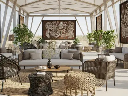
The true strength of a fail-safe neutral is its ability to harmonize with organic materials, a quality that is central to the “effortless” luxury trend. When paired with natural oak flooring, woven linen textiles, or raw stone surfaces, the paint color acts as a unifying thread that enhances the texture of each material. This synergy is particularly evident in bedrooms, where the shade complements khaki, lichen, and rusty red linens to create a serene, layered look. The earthiness of the pigment reinforces the connection to the natural world, a priority that continues to dominate interior design through 2026 and beyond. By focusing on a palette that mirrors the tones found in the landscape, designers can craft interiors that feel grounded and timeless. This strategy relies on the subtle interplay of various shades of white and gray, creating a “timeless gradient” that feels more sophisticated than a monochromatic scheme, ensuring that the space remains visually interesting for years to come.
According to industry leaders like Patrick O’Donnell, the shade works most effectively when integrated into a broader color story involving complementary tones such as Shaded White and Shadow White. These combinations allow for a seamless transition between rooms, maintaining a consistent atmosphere while providing subtle shifts in mood. For instance, using a lighter version of the stony hue in a hallway and transitioning to the deeper Drop Cloth in a living room creates a sense of progression and depth. This layered approach prevents a home from feeling flat or disjointed, providing a professional finish that is easy to live with over time. The focus remains on creating a sense of “understated luxury” where the quality of the light and the materials takes center stage. By utilizing these nuanced gradients, homeowners can achieve a sophisticated aesthetic that feels curated rather than clinical, fostering an environment that is both aesthetically pleasing and deeply comfortable for daily living.
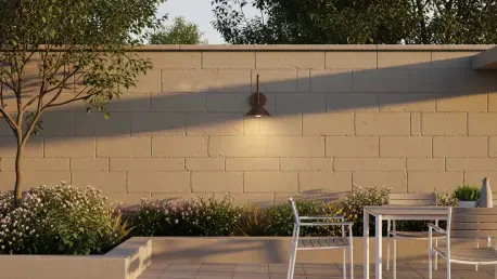
Exterior Applications: Transitioning the Palette
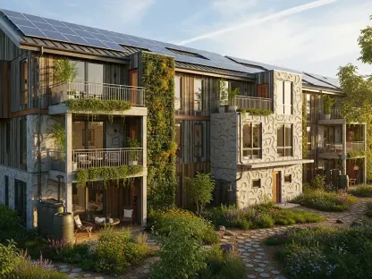
As design philosophies evolve, the application of this versatile neutral is moving outside the home, proving its efficacy on exteriors and transitional spaces. Its stony undertones make it an ideal choice for masonry, stucco, or siding, where it interacts beautifully with natural light and surrounding greenery. When applied to a home’s facade, it provides a sophisticated alternative to traditional grays or beiges, offering a look that is both fresh and established. It pairs exceptionally well with bronze hardware, providing a warm, metallic contrast that enhances the overall curb appeal. Additionally, designers are increasingly pairing this neutral exterior with vibrant accents on windows or doors, such as deep blues or forest greens. This combination creates a balanced aesthetic that feels grounded in tradition but distinctly modern in its execution. The ability of the shade to hold its own against the elements while maintaining its subtle character makes it a frontrunner for exterior projects aiming for a timeless appeal.
Looking toward the horizon from 2026 to 2028, the trend toward adaptable, nature-inspired neutrals shows no signs of slowing down, with this specific shade leading the way. Its reliability across different scales—from a small powder room to a grand exterior—ensures its status as a staple for both DIY enthusiasts and professional architects. The shift toward “fail-safe” colors reflects a broader cultural desire for longevity and sustainability in design, moving away from fast-moving trends in favor of choices that will endure. As homeowners continue to prioritize spaces that offer a sense of calm and retreat, the demand for colors that provide both grounding and uplifting qualities will remain high. This particular neutral serves as a bridge to a more intentional way of decorating, where every choice is made to enhance the inherent beauty of the home’s architecture and its surroundings. By embracing such a versatile foundation, individuals can create a living environment that is resilient to changing tastes and remains beautiful through every season.
Strategic Integration: Future Outlook
To successfully implement this neutral into a design scheme, it was essential to consider the interplay of light and texture from the very beginning of the project. Professionals recommended testing the shade on large sample boards and moving them throughout the space at different times of day to observe the color’s transition between its gray and beige states. This proactive approach allowed for a deeper understanding of how the pigment reacted with existing floorings and furniture. For those looking to elevate their interiors, the next logical step involved layering the shade with complementary whites to create a sophisticated, architectural gradient. Moving forward, the focus should remain on integrating natural materials like unlacquered brass and light-toned woods to reinforce the “stony” essence of the palette. By viewing the paint not just as a wall color but as a structural component of the room, a level of timelessness was achieved that bypassed fleeting trends.