
Designing a narrow or compact room often triggers a reflexive instinct to apply layers of stark white paint in a desperate attempt to make the walls recede and the floor plan appear more expansive. This long-standing architectural convention relies on the assumption that light reflection is the primary tool for combating claustrophobia, yet modern interior design experts are increasingly challenging this traditional wisdom with more sophisticated approaches. By moving away from the safety of clinical neutrals, homeowners can utilize rich, saturated colors to enhance the unique proportions of functional areas such as laundry rooms, sculleries, and powder rooms. The shift toward deeper palettes allows these often-overlooked spaces to transition from purely utilitarian zones into high-impact design statements that offer a sense of enveloping comfort. Rather than highlighting the physical limitations of a lean corridor or a cramped mudroom, a thoughtful selection of pigments can create a level of visual intrigue that white paint simply cannot deliver. This evolution in color theory suggests that the character of a room is defined more by its atmosphere and depth than by its literal square footage, encouraging a departure from functional neutrality toward more expressive and intentional interior environments.
The transformative power of these compact areas is most effectively realized through a specialized technique known as color-drenching, which has become a cornerstone of contemporary luxury renovation. This method involves the meticulous application of a single, consistent shade across the walls, ceilings, baseboards, and even the crown molding to eliminate the jarring visual breaks that typically define a room’s boundaries. By drenching a narrow space in a unified hue, the eye is no longer drawn to the sharp corners or the height of the ceiling, effectively blurring the architectural lines that usually emphasize a lack of space. This strategic application makes the narrowness of a room feel like a deliberate, sophisticated choice rather than an unfortunate structural limitation that needs to be disguised. Furthermore, this approach softens the transitions between different architectural elements, allowing the room to feel like a seamless, three-dimensional envelope. When utilitarian zones are treated with this level of decorative precision, they stop feeling like “back-of-house” necessities and start functioning as cohesive, sophisticated extensions of the home’s primary living areas, proving that small footprints are the perfect canvas for bold experimentation.
Creating Drama With Deep and Enveloping Tones
For narrow rooms that are utilized primarily during the evening hours or those intended to serve as intimate retreats, the application of dark, cool-toned shades provides a level of depth that lighter colors cannot achieve. Hague Blue, characterized by its profound depth and subtle green undertones, is a frequent choice for designers looking to imbue sculleries or walk-in pantries with a moody, high-end aesthetic. When applied with a high-quality finish, this specific blue takes on a lacquered quality that reflects light in a soft, diffused manner, preventing the space from feeling cave-like while adding a layer of undeniable luxury. Similarly, the blue-toned charcoal known as Down Pipe is often utilized to create a “cocooning” effect in small studies or entertainment-adjacent spaces. This shade works in perfect harmony with metallic accents, such as aged brass or polished copper hardware, which pop against the dark background. This contrast emphasizes the specific character and craftsmanship of the room’s fixtures, successfully shifting the observer’s focus away from the tight physical dimensions and toward the high-quality materials and atmospheric richness of the interior environment.
In the context of high-traffic narrow areas like mudrooms or entry vestibules, bold color choices such as the wine-tinted Brinjal offer a rare combination of aesthetic drama and practical durability. While this rich, purple-based hue provides immediate warmth and a sense of historical weight, its high level of saturation is exceptionally effective at disguising the inevitable scuffs, dirt, and general wear associated with outdoor gear and heavy foot traffic. This highlights a significant trend in modern home management where dark, moody colors are recognized for being more functional than lighter neutrals in the busiest and most abrasive parts of a household. By leaning into these saturated tones, a narrow mudroom is transformed from a cluttered transitional zone into a welcoming, atmospheric passage that sets a sophisticated tone for the rest of the residence. The use of such deep pigments demonstrates that functionality does not have to come at the expense of style, and that the most “difficult” rooms in a house are often the ones that benefit the most from a courageous and unapologetic application of color.
Utilizing Heritage Greens for Timeless Appeal
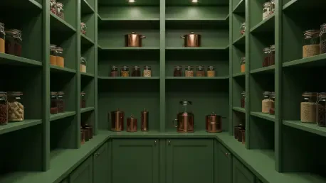
Green tones have long been celebrated for their ability to introduce a sense of organic calm and timelessness, making them essential tools for revitalizing narrow “back-of-house” areas. Card Room Green is a particularly effective example, offering a muted, heritage quality that works exceptionally well in laundry rooms or utility spaces where a balance of freshness and tradition is required. When this color is applied as a cohesive envelope—covering not just the walls but also the custom cabinetry and millwork—it creates a rhythmic continuity that feels both established and modern. This approach turns what could have been a mundane pass-through space into a beautiful and intentional moment within the home’s overall floor plan, providing a visual rest point that feels connected to the natural world. The use of these heritage greens suggests a level of permanence and architectural integrity, ensuring that even the most functional rooms are treated with the same level of care and design consideration as a formal dining room or a primary suite.
For those seeking a more dramatic flair in compact environments, darker options like Duck Green provide a powerful backdrop that allows functional elements to shine as primary focal points. In a butler’s pantry or a narrow bar area, this highly saturated green serves as a magnificent foil for glass-fronted cabinets and sparkling glassware, elevating the entire room’s status through sheer color intensity. Because these spaces are frequently self-contained and can be physically closed off from the rest of the house, they offer a unique and low-risk opportunity for homeowners to experiment with highly saturated palettes that might feel too overwhelming in an open-concept living area. This design strategy effectively elevates the status of utility rooms, ensuring they meet the high standards of the primary living areas while providing a sense of discovery as one moves through the home. By utilizing these deep greens, designers are able to create a sense of historical depth and sophisticated personality in areas that are traditionally ignored, proving that even the smallest square footage can support a complex and rewarding color story.
Softening Spaces With Sophisticated New Neutrals
Not every narrow room requires high-contrast drama to feel successfully redesigned; however, the contemporary definition of a neutral palette has moved significantly away from the flat, uninspired whites of the past. Peignoir, a dusty mauve-pink, serves as a perfect example of a light and airy alternative that provides far more personality and warmth than a standard beige or off-white. This shade is particularly well-suited for small bathrooms, dressing rooms, or walk-in closets where a soft, feminine feel is desired without sacrificing the “design-forward” look of a colored palette. The gray undertones in the pink keep it from feeling overly sweet, allowing it to act as a sophisticated backdrop for modern fixtures and textured textiles. By choosing a nuanced neutral like this, the narrowness of the room is softened by the color’s inherent glow, creating a space that feels breathable and light while still possessing a clear and distinct design identity that feels integrated with the rest of the home.
Elegant blue-grays like Pigeon serve as an equally sophisticated choice for narrow cloakrooms and entryways, especially when the goal is to create a seamless transition between the interior and the exterior. When this muted tone is used to cover both the walls and the ceiling, it eliminates visual fragmentation and allows the inherent architecture of a narrow space—such as high ceilings or unique moldings—to speak for itself. Meanwhile, earthy neutrals like Stony Ground provide a layered and inviting look in long, corridor-like laundry rooms, especially when paired with natural materials like textured stone tiles and warm, incandescent lighting. These colors avoid the coldness often associated with pure white, instead offering a soft, sandy warmth that makes the room feel grounded and substantial. This approach to neutrals emphasizes the importance of undertones and light interaction, proving that a space can feel open and bright while still benefiting from the complexity and character of a well-chosen pigment that responds to the specific lighting conditions of the room.
Achieving Material Harmony in Compact Areas
The ultimate success of a narrow room’s transformation depends heavily on how the chosen paint color interacts with the other high-end finishes and materials present in the space. Professional designers often select specific shades not just for their wall appearance, but for how they complement or contrast with elements like walnut cabinetry, reclaimed brick flooring, or heavy copper countertops. By focusing on the “principle of envelopment,” the paint serves as a unifying backdrop that ties these diverse materials together into a single, seamless narrative. For instance, a deep green on the walls can pull the warmth out of a wooden floor, while a cool gray can make stainless steel appliances feel like an intentional part of the color scheme rather than a jarring interruption. This holistic view of the room ensures that the color does not just sit on the surface but acts as an integral component of the architectural composition, reinforcing the sense of quality and intentionality that defines a well-designed home.
In concluding this exploration of color strategy, it is clear that the most effective way to handle narrow spaces is to lean into their small proportions rather than fighting against them with unsuccessful camouflage. Homeowners should look toward their most compact rooms as opportunities for bold expression, utilizing the self-contained nature of these spaces to test saturated tones like Brinjal or Hague Blue. The next logical step for any renovation project is to consider the “fifth wall”—the ceiling—as a primary surface for color-drenching to maximize the sense of architectural unity. By moving forward with a palette that emphasizes depth, warmth, and material harmony, even the most cramped corridor can be successfully transformed into a thoughtfully designed sanctuary. The shift toward these sophisticated palettes suggests a future where every square inch of a home is treated with artistic respect, proving that atmospheric richness is far more valuable than perceived spaciousness. By embracing these techniques, one can ensure that utilitarian areas provide the same level of daily pleasure and visual satisfaction as the most prominent rooms in the house.