
Imagine stepping into a bedroom that feels like a personal haven, where every detail, especially the color on the walls, wraps you in comfort and style with effortless grace. Farrow & Ball, a brand synonymous with quality and timeless elegance, offers a palette that can transform any sleep space into a breathtaking retreat. Renowned among interior designers for their depth and versatility, these paints bring a unique blend of trend and tradition to bedroom design. This exploration dives into eight exceptional shades from their collection, each chosen for the ability to craft serene, inviting environments that resonate with individual taste.
These colors span a spectrum from soft, calming neutrals to bold, luxurious darks, ensuring there’s a perfect match for every aesthetic vision. Designers highlight how these hues balance tranquility with personality, creating spaces that nurture rest while reflecting character. Beyond mere aesthetics, the interplay of light, room dimensions, and emotional impact plays a crucial role in why these shades stand out. Prepare to uncover how each color works its magic, supported by expert insights and practical applications, to inspire a bedroom redesign that feels both fresh and enduring.
Why Choose Farrow & Ball for Your Bedroom?
The Brand’s Timeless Appeal and Quality
Farrow & Ball has carved a niche as a go-to choice for those seeking paint that transcends fleeting trends, offering a legacy of craftsmanship that elevates bedroom spaces. The brand’s reputation rests on rich, nuanced hues and high-quality finishes that withstand the test of time, delivering sophistication in every stroke. Interior designers frequently turn to these paints for their ability to create polished, lasting looks that don’t require frequent updates. This enduring appeal stems from a carefully curated palette, where each shade is designed to harmonize with a variety of styles, from classic to contemporary, ensuring a bedroom remains stylish for years. Moreover, the durability of the paint means it resists wear, maintaining its vibrancy even in high-use areas, making it a practical yet elegant solution for any home.
The depth of color offered by Farrow & Ball sets it apart from competitors, as each shade carries subtle undertones that add character to walls. Unlike standard paints that may appear flat, these colors seem to shift with changing light, bringing a dynamic quality to the bedroom throughout the day. This complexity allows for a more personalized space, as the paint interacts with furniture, decor, and natural elements in unique ways. Designers also value the eco-friendly formulations, which prioritize low VOC content without compromising on performance. Choosing this brand means investing in a product that not only enhances aesthetic appeal but also aligns with sustainable practices, creating a healthier environment for rest and relaxation.
Impact on Mood and Space
The influence of color on a bedroom’s atmosphere cannot be overstated, and Farrow & Ball shades are masterfully crafted to evoke specific emotions conducive to rest. Soft neutrals can instill a sense of calm, while deeper tones provide a cocooning effect, making the space feel like a safe retreat from the world outside. These paints are designed with the psychology of color in mind, aiming to foster relaxation and comfort, which are essential for a sleep-centric environment. Additionally, the way these colors reflect or absorb light can dramatically alter the perception of space, either opening up a cramped room or adding intimacy to a larger one, tailoring the bedroom to its unique needs.
Beyond emotional resonance, the practical impact on spatial dynamics is a key reason designers favor these paints. Lighter shades have the power to brighten dimly lit areas, creating an illusion of expansiveness in smaller bedrooms or those with limited windows. Conversely, darker hues can lend depth and warmth, making oversized or cold spaces feel more inviting and proportional. This versatility ensures that regardless of a room’s dimensions or orientation, there’s a shade capable of enhancing its best features. The thoughtful selection of pigments also means these colors maintain their integrity under various lighting conditions, preventing unexpected shifts that could disrupt the intended mood or design cohesion.
Exploring the Top 8 Farrow & Ball Shades
White Tie and Setting Plaster: Warm and Soothing Neutrals
White Tie emerges as a warm cream that sidesteps the common pitfall of overly yellow undertones, presenting a cozy yet refined backdrop ideal for bedrooms bathed in natural light. This shade offers a gentle elegance that pairs seamlessly with an array of fabrics and patterns, making it a favorite for creating a welcoming atmosphere. Designers often recommend it for spaces where a subtle warmth is desired without overpowering the room’s other elements. Its ability to reflect light softly enhances the feeling of openness, particularly in rooms that serve as a daytime sanctuary as much as a nighttime retreat. White Tie’s neutral base ensures it complements both bold accents and minimalist decor, providing a canvas that feels both timeless and adaptable to evolving tastes.
Setting Plaster, with its delicate pale pink hue, brings a unique kind of warmth to bedrooms that face north or lack sufficient sunlight, countering cooler tones with understated charm. This shade avoids the saccharine quality of brighter pinks, instead offering a discreet elegance that works beautifully in country-inspired or traditional designs. Experts suggest layering it with complementary blues, greens, or muted browns to craft a cohesive palette that feels both serene and sophisticated. Its versatility allows it to blend into various aesthetics while maintaining a soothing presence that promotes relaxation. For those seeking a bedroom that whispers calm without sacrificing personality, Setting Plaster delivers a balance that feels effortlessly stylish and enduringly relevant.
Pigeon and Oxford Stone: Versatile and Grounding Hues
Pigeon, a gray with remarkable depth, serves as an anchoring element in bedroom design, often used on furniture or built-in cabinetry to ground the overall scheme. Its nuanced tone prevents it from feeling stark, instead offering a restful vibe that pairs well with lighter wall colors for a balanced look. This shade excels in spaces where a touch of personality is desired without veering into overpowering territory, making it ideal for creating focal points that don’t dominate. Designers note how it deepens under evening light, adding a cozy intimacy that enhances the bedroom’s role as a haven. Pigeon’s adaptability ensures it fits into a range of styles, from industrial to rustic, providing a sophisticated edge that elevates the space.
Oxford Stone, a taupe that strikes the perfect midpoint between beige and gray, embodies neutrality with a warm undertone that makes it incredibly versatile for bedroom settings. This shade is celebrated for its soothing nature, reflecting light in a way that can make smaller rooms appear more spacious and airy. Its compatibility with textures like wood, linen, or velvet allows it to act as a harmonious backdrop for diverse decor choices, ensuring a cohesive design. Often chosen for its ability to bridge modern and traditional aesthetics, Oxford Stone offers a calming foundation that supports bolder accents without clashing. For anyone aiming to craft a bedroom that feels both expansive and comforting, this color provides a reliable and stylish solution.
Shaded White and Folly Green: Dynamic and Natural Tones
Shaded White stands out for its almost magical ability to transform with the day’s changing light, casting a warm, enveloping glow that suits even the most challenging bedroom layouts, such as attics. This neutral shade can drench walls and ceilings alike, creating a seamless, open feel that defies spatial constraints and awkward angles. Designers appreciate how it adapts to various conditions, appearing brighter in sunlight and softer in shadow, ensuring the room never feels static. Its understated warmth makes it a perfect choice for those who want a light, airy space without the coldness of stark white. Shaded White’s subtle complexity offers a sanctuary-like quality, turning any bedroom into a hideaway that feels both expansive and intimately personal.
Folly Green introduces a vibrant yet calming green that channels the serenity of nature, making it an inspired pick for bedrooms aiming to evoke outdoor tranquility. This shade balances energy with peace, often paired with playful or softer tones to create a space that feels alive yet restful, ideal for both adult and children’s rooms. Its connection to natural elements fosters a sense of grounding, reminiscent of lush fields or quiet forests, which can significantly enhance relaxation. Designers highlight its ability to blend with a variety of decor, from earthy textures to whimsical patterns, ensuring it never feels out of place. Folly Green offers a refreshing departure from typical neutrals, bringing a breath of fresh air to bedroom design with a tone that soothes while invigorating the senses.
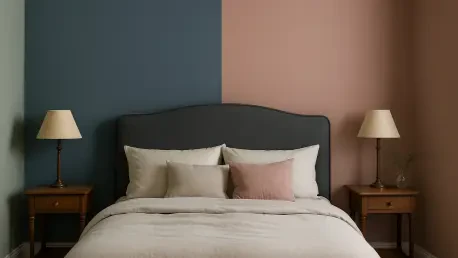
Railings and Hague Blue: Bold and Luxurious Darks
Railings, a charcoal-toned black with subtle blue notes, delivers a luxurious depth that transforms small or dimly lit bedrooms by making walls visually recede, thus enhancing perceived space. This dark shade creates a snug, enveloping atmosphere, perfect for those who crave a sense of intimacy and security in their sleep environment. Often recommended as a backdrop for wall art or statement pieces, it provides a dramatic canvas that highlights decor without overwhelming the room. Its sophisticated undertones prevent it from feeling harsh, instead offering a refined coziness that suits modern or heritage-inspired designs. Railings proves that bold choices can be practical, turning even the most compact bedroom into a striking retreat of elegance and comfort.
Hague Blue, a deep blue with nuanced undertones, injects sophisticated drama into bedrooms, wrapping occupants in a sense of grandeur and luxury that feels both timeless and bold. This shade excels at creating a cocooning effect, ideal for larger spaces where intimacy is desired, or as a feature wall to add depth without overpowering. Designers often pair it with lighter accents to balance its intensity, allowing furniture or textiles to pop against its rich backdrop. Its versatility shines in its ability to adapt to various lighting conditions, maintaining a warm, inviting presence even in low light. Hague Blue caters to those who seek a bedroom with a strong personality, offering a palette that speaks to both opulence and calm in equal measure.
Design Tips for Applying These Colors
Balancing Light and Room Size
Selecting the ideal shade for a bedroom requires a keen understanding of how light and spatial dimensions interact, and Farrow & Ball’s range offers tailored solutions for every scenario. Lighter colors, such as Shaded White or White Tie, excel in smaller or darker rooms by reflecting available light to create a brighter, more open ambiance. These hues can counteract the claustrophobic feel of limited square footage, making the space appear larger and more welcoming. Designers often use these tones on all surfaces, including ceilings, to amplify this effect, ensuring the room feels cohesive and airy. When natural light is scarce, such shades become invaluable tools for transforming a bedroom into a luminous sanctuary that defies its physical constraints.
Conversely, darker shades like Railings or Hague Blue serve a distinct purpose in larger or poorly lit bedrooms, where they add depth and a sense of proportion to prevent the space from feeling cold or cavernous. These deeper tones absorb light, creating a cozy, intimate atmosphere that can make oversized rooms feel more personal and grounded. In compact spaces with low light, they can also be strategically applied to receding walls to enhance depth without shrinking the room further. The key lies in balancing these colors with lighter elements, such as bedding or decor, to avoid a heavy or oppressive feel. By thoughtfully considering a bedroom’s unique light conditions and size, these paints can be used to craft an environment that feels perfectly scaled and emotionally resonant.
Pairing with Decor and Textures
The beauty of Farrow & Ball colors truly emerges when they are paired with complementary decor and textures, creating a bedroom that feels intentional and harmonious in every detail. Neutral shades like Oxford Stone or Setting Plaster provide a versatile foundation that blends effortlessly with rich materials such as velvet drapes or wooden furniture, lending a tactile warmth to the space. These softer hues act as a backdrop that allows statement pieces to shine, whether it’s a bold headboard or an intricate rug, without competing for attention. Designers often layer these colors with varied textures to add depth, ensuring the room feels dynamic yet balanced. This approach works across aesthetics, from minimalist to eclectic, offering endless possibilities for personalization.
For those incorporating more vibrant or darker tones like Folly Green or Hague Blue, the pairing strategy shifts toward enhancing their inherent drama with thoughtful contrasts. Green shades harmonize with natural elements like woven baskets or leafy prints, reinforcing a connection to the outdoors that soothes the senses. Dark blues, on the other hand, pair strikingly with metallic accents or crisp white linens, creating a luxurious interplay that elevates the bedroom’s sophistication. The key is to use these bolder colors as anchors, allowing textures and decor to either complement or counterbalance their intensity for a cohesive design. By experimenting with these combinations, a bedroom can be transformed into a curated space that reflects both style and functionality, tailored to individual preferences.
Emotional and Functional Benefits
Creating a Restful Sanctuary
Color holds immense power in shaping the emotional landscape of a bedroom, and Farrow & Ball’s carefully selected shades are designed to cultivate a profound sense of peace and relaxation. Greens like Folly Green draw inspiration from nature, evoking the calming essence of open fields or quiet woodlands, which can significantly ease stress after a long day. Blues, such as Hague Blue, offer a sophisticated warmth that wraps the room in a comforting embrace, fostering a sense of security. Even neutrals like Shaded White provide a gentle, unassuming backdrop that quiets the mind, making the bedroom a true escape. These emotional benefits are intentional, with each shade chosen to support the primary function of a sleep space as a place for rest and rejuvenation, aligning with the deep human need for tranquility.
The functional aspect of these colors further enhances their role in crafting a sanctuary, as they address both mood and practicality in bedroom design. Darker tones can reduce visual clutter by minimizing the starkness of bright light, aiding in better sleep preparation, especially in rooms exposed to artificial glare. Lighter hues, conversely, promote a sense of clarity and calm during waking hours, supporting activities like morning meditation or reading. This dual focus ensures the bedroom serves as more than just a place to sleep, but as a multifunctional haven that adapts to daily rhythms. By prioritizing colors that resonate emotionally while fulfilling practical needs, these paints help create environments where occupants can fully unwind, recharge, and reconnect with a sense of inner peace.
Longevity and Style in Design
One of the standout qualities of these eight Farrow & Ball shades lies in their enduring style, a feature that sets them apart from more transient color trends in interior design. Their subtle complexity—rooted in layered undertones—ensures they don’t feel dated even as decor fashions shift, allowing a bedroom to remain relevant over many years. This timelessness is a practical advantage, as it means repainting isn’t necessary with every change in taste or trend, saving both time and resources. Designers often select these colors for their ability to act as a stable foundation, around which other elements like textiles or art can be updated without disrupting the overall aesthetic. For anyone investing in a long-term vision for their space, these shades offer reliability alongside beauty.
Additionally, the stylistic versatility of these paints contributes to their longevity, as they seamlessly adapt to evolving design preferences without losing their core appeal. Whether a bedroom leans toward modern simplicity or vintage charm, shades like Pigeon or White Tie can be reimagined with new accessories or furniture to refresh the look entirely. This adaptability extends to seasonal changes as well, where lighter tones can be paired with airy summer linens or darker hues with cozy winter throws, maintaining relevance year-round. The result is a bedroom that not only withstands the passage of time but also grows with its occupants, offering a canvas that supports personal expression while preserving a sense of elegance. Choosing these colors means committing to a design that endures both practically and aesthetically.