
Couch colors play a crucial role in determining the lasting aesthetic appeal of a living room. The right choice can ensure a room remains chic instead of necessitating frequent style overhauls due to fleeting trends. Selecting couch hues with a timeless allure allows homeowners to cultivate a sophisticated living space without constant updates. The decision, rooted in marrying elegance with personal taste, helps in crafting an enduring design fit for evolving lifestyles.
The Appeal of Neutral Shades
Neutral shades have long dominated interior design, revered for their adaptability and timeless elegance. Offering a versatile palette that effortlessly integrates with various design styles, these hues cultivate a stable backdrop for any room. A key strength of neutral colors like cream, beige, and gray lies in their ability to complement changing trends, providing a consistent base that accommodates new decorative elements without requiring drastic changes. Their understated charm enables them to highlight more vivid accents or maintain a minimalist allure.
Versatility in Design
Neutrals transcend fleeting design fads, presenting a solid canvas adaptable to numerous aesthetic directions. The subtle sophistication of cream, beige, and gray provides a consistent atmosphere, capable of both complementing bright accents and standing alone in minimalist setups. Neutral tones facilitate the harmonious blending of different styles and personal tastes, supporting an amalgam of elements that manifest a cohesive, balanced room ambiance. This versatility makes neutrals a favored choice among homeowners looking to refresh their spaces and designers aiming to create durable interiors.
Designers often praise these shades for their empowering simplicity, enabling homeowners to experiment with bold decor without overpowering or mismatching the foundational color. Whether transitioning a room from classic to contemporary themes or integrating a modern twist, neutrals exhibit seamless transition. Furthermore, they accommodate varied materials and textures, fostering an enriched yet cohesive look. Consequently, embracing neutrals allows for inventive exploration of styles and items over time—an aesthetic liberation with steadfast refinement.
Balancing Personal Taste and Functionality
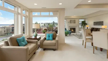
Selecting neutral colors, whether lighter or darker shades, is not merely about aesthetics but also about practicality and functionality. These colors offer an unobtrusive yet elegant backdrop, minimizing visual clutter and amplifying the beauty of other design components. Light neutrals like cream enhance room brightness, evoking warmth and openness, while dark neutrals such as slate or charcoal infuse spaces with depth and sophistication.
Practicality is another factor contributing to the popularity of neutral shades. High-traffic areas, often prone to stains and wear, benefit from colors that easily mask imperfections. This factor makes neutrals an ideal choice for families and pet owners who seek style combined with maintenance simplicity. Moreover, the timeless nature of neutral hues assures consistency through life’s various stages and tastes, offering a longstanding choice that adjusts with personal evolution rather than resisting it.
Exploring Specific Timeless Colors
Diving deeper into specific timeless shades reveals a range of options esteemed by designers for their adaptability and style resilience. These shades consistently find favor amid shifting trends due to their capacity to balance individuality with ageless charm. Understanding these choices equips homeowners with the awareness to select colors conducive to an enduringly chic atmosphere.
Soft Grays and Greige
The subtlety of soft gray and the nuanced elegance of greige have long been celebrated for their versatility and understated appeal. Serving as a shield against passing trends, these hues deliver a calm and neutral base for an array of color schemes. Despite the evolving preferences in the world of interior design, soft gray retains its status as an adaptable choice, effortlessly complementing both bold and muted accent colors.
Greige—an innovative combination of beige and gray—boasts a quiet sophistication that enriches a room’s aesthetic without overwhelming other design features. This malleable hue harmonizes well with various textures and styles, supporting both contemporary and traditional decor. The appeal of these shades is evident in their ability to simultaneously offer warmth and modernity, drawing the eye with their understated elegance. Soft gray and greige provide consistency and neutrality, making them foundational colors that blend effortlessly into a plethora of styles.
Cream’s Bright Integration
Cream stands out for its ability to introduce brightness and freshness into a room without being overly stark or sterile. Its warmth imparts a welcoming atmosphere that integrates with numerous design elements, ranging from rustic to modern. The color’s minimalist charm is a highlight, offering a clean aesthetic appealing to homeowners seeking an uncluttered look. However, its delicate nature demands thoughtful maintenance, especially in households with children and pets.
Despite its upkeep requirements, cream remains a preferred choice due to its charisma and light-reflecting properties. It softens harsh lines, smoothing the transition between diverse decorative accents. The neutrality of cream readily adapts to changing styles and personal tastes, creating a sense of continuity. With its ability to maintain clarity and freshness, cream endures as a favored color choice, exuding a sense of timelessness reflecting an ever-renewing appeal.
Delving into Darker Tones
While neutrals offer a classic foundation for design, darker tones like deep blues and charcoal present an intriguing yet timeless alternative. These colors infuse spaces with personality and depth, showcasing a solid yet flexible backdrop capable of withstanding evolving styles. Unlike transient trends, these shades remain integral elements of sophisticated interiors, welcoming a sense of calm and continuity.
The Tranquility of Deep Blues
Deep blues, particularly shades like navy and indigo, have long captivated designers and homeowners with their tranquil excellence. These colors harness nature’s serene allure, reminiscent of vast skies or ocean’s depths, and render it tangible in interiors. The immense versatility of deep blues allows them to pair elegantly with neutrals and vibrant colors alike, making them a staple in many living spaces seeking sophistication with warmth.
The extraordinary adaptability of deep blues makes them suitable for various styles, from classic and nautical to modern and eclectic. They serve as a versatile backdrop for an array of textures and patterns, refining any environment they occupy. Rich and inviting, hues like navy create cozy, grounded spaces that invite balance and relaxation. Used in accent pieces or as a primary sofa hue, deep blues offer depth and charm, inviting endless possibilities for creative expression.
Charcoal’s Rich Adaptability
Charcoal emerges as a sophisticated, grounding option bridging warmth and depth. This rich neutral holds the practicality of darker shades without the harshness of black, offering a sophisticated touch to interiors seeking elegance with ease. Charcoal’s adaptability stems from its ability to blend with both earthy and metallic tones, injecting spaces with a contemporary edge. Its capability to conceal wear renders it suitable for dynamic, lived-in rooms.
Embodying a delicate balance between strength and subtlety, charcoal offers enduring charm, its timeless aesthetic affording flexibility across changing styles. Exercises in design evolution benefit from charcoal’s resistant yet responsive nature, furnishing bold or minimalist palettes with equal refinement. Its compatibility with natural materials like wood and stone ensures a continued presence in modern interiors, offering sophistication and adaptability to treasured living spaces.
Warm Earthy Tones and Their Benefits
Emerging trends frequently revisit warm, earthy tones such as ochre, mustard, and olive green. These hues supply a heartfelt essence, drawing from the natural world’s intrinsic warmth and stability. Earthy tones exude a timeless allure, inviting creativity and adaptability, enabling dynamic interactions with shifting design transitions.
Ochre and Mustard’s Natural Appeal
Infinite in their diversity, warm shades like ochre and mustard inspire warmth and nostalgia within modern interiors. Echoing natural palettes of sunlit landscapes or autumn’s embrace, these colors impart a comforting familiarity. They blend harmoniously with neutral hues, yet bring forth striking contrast and vibrance against lighter backgrounds.
The compelling nature of these warm tones lies in their dynamic adaptability. Whether enhancing rustic layouts or modern minimalist areas, ochre and mustard add distinctive character and depth. This enduring appeal aligns seamlessly with design concepts relying on earth’s enduring palettes, inviting a sense of warmth and permanence into living areas. Enhancing or maintaining focus, these shades foster unity and coherence while enabling personal and stylistic exploration.
Olive Green’s Inviting Vibrance
Olive green captivates with its vibrant, enveloping serenity glistening with timeless allure. Softly integrated into various settings, olive green preserves intimacy and warmth across numerous color schemes. This adaptable hue gracefully intersects contemporary and classic designs, positioning it as a welcoming addition to evolving interior compositions.
Its unassuming elegance supports an array of palettes, cooperating with muted tones like creams and beiges or standing in striking contrast with lively hues. Olive green’s subdued vibrance allows it to maintain pivotal roles within dynamic design narratives, evolving continually with style transitions. This ability to enrich and diversify space while securing its tasteful calm ensures olive’s perpetual relevance for homeowners.
Beiges and Greiges: A Sophisticated Blend
Beige and greige continue gaining traction as sophisticated neutral options within modern interiors. These shades redefine their previously understated reputations, imbuing spaces with warmth and understated elegance. As foundational colors, beiges and greiges offer stylistic fluidity and unsurpassed harmony, embodying adaptability to numerous decorative endeavors.
Restoration of Beige’s Popularity
In recent years, beige has experienced a resurgence, reclaiming its place as a timeless, versatile favorite. It naturally blends into a patchwork of design elements, serving as a reliable anchor amid varied aesthetics. The inherent warmth and neutrality of beige integrate harmoniously with different textures and styles, promoting a balanced, flowing atmosphere.
Beige’s neutral charm allows it to act as a stabilizing presence, seamlessly connecting bold decorative accents with subtle elements. The tone fosters an inviting environment, underscoring its enduring appeal for contemporary and classic designs alike. Refined in appearance yet adaptable in form, beige persists as a favored component of durable home interiors, encapsulating innovative elegance both new and nostalgic.
Enduring Design Principles
Choosing the right couch color is pivotal in establishing a living room’s enduring aesthetic appeal. The ideal choice can significantly impact the room’s ability to remain stylish, sidestepping the need for frequent updates due to passing trends. By opting for sofa colors that possess a timeless charm, homeowners can effortlessly cultivate a sophisticated living environment that requires minimal changes over time. This decision goes beyond mere decor; it’s about integrating elegance with personal taste to design a living space that aligns with evolving lifestyles.
The selection of couch colors is not just a trend-driven choice but a strategic design decision that reflects one’s personality while ensuring lasting style. Neutral shades like grays, beiges, and creams are often favored for their versatility and staying power, harmonizing with various accessories and colors that may change as seasons or styles evolve. Alternatively, muted blues, greens, and earth tones offer a subtle depth that never goes out of fashion.
Investing in classic colors can transform the living room into a timeless sanctuary, echoing sophistication while accommodating changing tastes and trends of homeowners. Ultimately, the right couch color selection becomes a foundational piece that endures and adapts gracefully as lifestyles evolve, offering a seamless blend of style, comfort, and personal expression.