
The sophisticated application of color within a modern living space transcends mere aesthetic preference to become a vital architectural component that defines the very boundaries of a room. Professionals recognize that a palette functions as a structural tool, dictating how natural and artificial light interacts with various surfaces and how specific furnishings are perceived by the human eye. By strategically selecting a color temperature, a designer establishes the emotional resonance of an environment, creating a specific atmosphere that aligns with the intended use of the space. In social areas like dining rooms or entrance halls, the deployment of warm, earthy tones and soft neutrals serves to foster a sense of hospitality and communal engagement. Conversely, private sanctuaries such as bedrooms or home offices utilize cool blues and sophisticated grays to promote psychological relaxation and mental clarity. This intentional alignment of visual identity with human experience remains the hallmark of a high-end design strategy.
Navigating Harmony: Analogous and Complementary Strategies
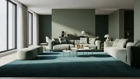
Designers frequently rely on the established principles of the color wheel to achieve a sense of visual cohesion that feels both intentional and effortless. An analogous approach involves the selection of hues that sit adjacent to one another on the wheel, such as various shades of blue, teal, and soft green. This methodology leverages natural harmony to create transitions that are intuitive and soothing to the observer, making it a primary choice for spaces where tranquility is the paramount goal. Because these colors share similar base pigments, they flow into one another without creating the harsh visual breaks that can disrupt the flow of a contemporary open-concept floor plan. The reliability of this strategy ensures a unified atmosphere, providing a stable foundation that allows architectural details to shine without the risk of visual jarring or color clashing that often plagues less structured design attempts.
For residential environments that require a higher degree of energy or visual depth, professional designers turn to complementary color schemes by pairing hues from opposite sides of the color wheel. While traditional color theory might suggest vibrant primary pairings, modern trends in 2026 have seen a sophisticated evolution toward the use of “dusty” or muted versions of these opposites. For example, pairing a mossy green with a deep, rusty terracotta red provides a dynamic, elevated aesthetic that feels contemporary and intentional rather than dated or overwhelming. This refined take on high contrast allows for a vibrant interplay of tones that adds a layer of complexity to a room. By desaturating the colors, the designer achieves a bold look that remains livable and elegant, ensuring that the contrasting elements support one another rather than competing for dominance in a way that would lead to sensory fatigue for the occupants.
Redefining Surfaces: Character Neutrals and Custom Whites
A significant shift in high-end interior design involves the transition away from clinical, stark whites and standard grays toward what specialists call “character neutrals.” Designers now advocate for versatile and complex hues such as soft plaster pink or warm mushroom, which offer a depth and warmth that traditional beige lacks. These modern neutrals function as a sophisticated canvas, remaining subtle enough to recede into the background while providing a forgiving backdrop that allows bold furniture and artwork to stand out. Unlike the cold grays of previous years, these warm-toned neutrals react beautifully to the shifting light throughout the day, maintaining a cozy yet expansive feel. This approach provides a flexible foundation that can adapt to changing seasonal decor or evolving personal tastes, ensuring that the core palette of the home remains relevant and aesthetically pleasing across various design iterations and lifestyles.
To achieve a truly seamless environment, experts utilize the concept of “apparent white” when treating ceilings, moldings, and trim. Rather than reaching for a generic, store-bought white paint, professionals often employ a custom-tinted white that incorporates a microscopic amount of the primary wall color. This technical nuance eliminates the jarring partition between vertical and horizontal surfaces, creating a soft transition that makes the entire room feel enveloped in a single, harmonious palette. By reducing the stark contrast between a colored wall and a pure white ceiling, the designer can effectively “blur” the edges of the room, which helps to minimize the visual weight of architectural boundaries. This strategy is particularly effective in spaces with complex ceiling geometries or numerous door frames, as it creates a continuous visual flow that enhances the overall sense of craftsmanship and deliberate professional curation.
Spatial Mathematics: Balancing Distribution and Vertical Flow
To manipulate the perception of a room’s dimensions and height, designers apply a “nature rule” that mimics the vertical color gradients found in the natural world. This philosophy dictates that the darkest tones, such as deep-colored rugs, dark-stained wood flooring, or heavy furniture pieces, should be positioned at the base of the room to represent the earth. Medium tones are then applied to the mid-section through upholstery, window treatments, and wall art, while the lightest colors are reserved for the ceiling to mimic the sky. This gradient effectively “lifts” the ceiling and expands the perceived volume of the room, making even smaller spaces feel more open and airy. By grounding the space with darker values at floor level, the designer creates a sense of stability and permanence, which allows the lighter elements above to feel weightless and expansive, preventing the room from feeling top-heavy or claustrophobic.
The professional balance of a room is further solidified through the application of the 60-30-10 rule, a mathematical framework that prevents visual chaos. Under this formula, sixty percent of the room is dedicated to a dominant anchor color, typically applied to walls or large area rugs. Thirty percent is allocated to a secondary supporting hue found in textiles or linens, providing necessary contrast without overwhelming the primary theme. The final ten percent is reserved for bold accent pops in accessories like throw pillows, vases, or specialized lighting fixtures. Designers enhance this ratio by introducing varied textures, such as pairing matte-finished walls with velvet upholstery or metallic accents. This layering of materiality ensures that a monochromatic or limited palette does not feel flat or uninspired. These final touches added the necessary depth to ensure the space functioned as a cohesive and professionally finished environment.
Practical Implementation: Light Testing and Environmental Dynamics
The successful realization of a color strategy required a deep understanding of how environmental conditions shifted throughout the day. Experts insisted on large-scale physical testing, placing paint samples on multiple walls to observe how they reacted to natural morning light, harsh midday sun, and artificial evening illumination. This rigorous observation phase was critical, as a hue that appeared warm in a showroom often turned cold or overly saturated under specific residential lighting. By allowing for a full dry-down period, designers ensured that the final value of the color was fully appreciated before committing to a total room application. This methodical approach mitigated the risk of costly repainting and guaranteed that the chosen palette maintained its intended emotional and functional impact. The process highlighted the fact that color is never static, but rather a living element of the design that required careful calibration.
Moving forward, the focus should remain on the integration of smart lighting systems that can be tuned to complement specific paint pigments at various times of the day. Future considerations for a balanced design should include the use of sustainable, mineral-based pigments that offer a unique luminosity and depth not found in traditional synthetic paints. It was established that the most effective interiors resulted from a blend of mathematical precision and environmental sensitivity. To achieve professional results, one must prioritize the testing of textures alongside colors, as the two are inextricably linked in how they reflect light. By adhering to these structured methodologies, it became possible to transform any space into a harmonious sanctuary. The industry recognized that the ultimate goal of interior color design was to create a backdrop that supported the occupant’s well-being while standing the test of evolving trends.