
The traditional expectation that spring interior design must rely solely on sugary pastels and fleeting floral motifs is being systematically dismantled by Farrow & Ball’s latest color strategies. While previous seasons often leaned into predictable palettes of butter yellow and sky blue, the current 2026 approach introduces a much more complex, high-contrast aesthetic that prioritizes longevity over temporary seasonal trends. This shift is not merely a change in hue but a fundamental evolution in how homeowners perceive the intersection of light, shadow, and emotional resonance within their living spaces. By emphasizing “zingy” and “uplifting” tones, the collection seeks to provide a home refresh that feels vibrant during the sun-drenched months of spring but maintains its structural relevance and sophistication throughout the entire year. This new direction allows for creative freedom, moving away from the safe, one-dimensional choices of the past and toward an environment that feels both curated and deeply personal.
Reimagining Pink: The Evolution of Modern Neutrals
The historical perception of pink as a juvenile or overly sentimental choice is undergoing a significant transformation through the introduction of Scallop and Cinder Rose. Scallop represents a masterfully simple yet complex shade, functioning as a pale, plaster-like pink that successfully straddles the line between a traditional pastel and a highly versatile neutral. Its understated elegance makes it an ideal candidate for large-scale applications, particularly in entryways or on expansive ceilings. By utilizing Scallop on a ceiling rather than a standard white, homeowners can introduce a layer of warmth and architectural depth that softens the room without overwhelming the existing decor. This application creates a subtle glow that mimics the soft light of a spring morning, proving that a neutral base can possess a distinct character. It challenges the notion that neutral spaces must be devoid of color, offering a sophisticated foundation that enhances both historic and modern homes.
For those who seek a more grounded and contemporary aesthetic, Cinder Rose provides a compelling alternative to the “blush” stereotypes that have dominated recent years. By incorporating deliberate grayish undertones, this dusty rose achieves a cool, lived-in quality that feels mature and remarkably resilient to changing trends. This shade is particularly effective when positioned against earthy greens or muted blues, establishing a “feminine yet edgy” look that thrives in sophisticated living rooms or intimate bedrooms. The complexity of the pigment ensures that the color does not appear “flat” under artificial lighting, maintaining its depth even as the natural light of the day fades. This shift toward a more anchored pink reflects a broader movement in 2026 design, where colors are expected to provide emotional stability and physical comfort. It moves the conversation away from temporary “pretty” colors toward hues that possess the weight and presence necessary for a permanent home environment.
Bold Interventions: Saturated Yellows and Neon Greens
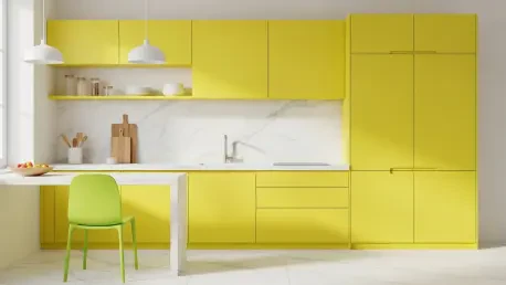
In a notable departure from the pale “butter yellow” trends that once defined the early spring season, the current palette embraces Babouche as a primary source of interior energy. This zingy and cheerful yellow is specifically designed to provide a sense of constant joy, functioning as a powerful tool to brighten somber, north-facing rooms or to further enhance light-filled conservatories. Unlike its more muted predecessors, Babouche does not shrink into the background; instead, it demands attention and radiates a vibrancy that remains effective regardless of the external weather. The transition to such a saturated hue indicates a growing consensus among designers that bolder colors are increasingly preferred over “safe” variations that can often feel dated or uninspired. By choosing a yellow with this level of intensity, homeowners can create a focal point that feels both adventurous and welcoming, effectively capturing the essence of the season without relying on clichés.
Perhaps the most daring and unexpected addition to the 2026 spring collection is Acid Drop, a striking chartreuse green that acts as a modern counterpoint to the softer tones. This “acid-like” hue reflects a sophisticated understanding of color theory, where high-contrast accents are used to prevent a room from feeling overly traditional or stagnant. The inclusion of such a vibrant green allows for a dynamic interplay between furniture and walls, providing a sharp, current edge that balances the plaster-like neutrals found elsewhere in the home. Acid Drop is positioned as a tool for creative experimentation, encouraging people to move beyond the “overdone” color combinations of previous decades. Whether used on a statement piece of furniture or as an accent in a modern kitchen, this shade ensures that the interior environment remains visually stimulating. It represents the pinnacle of the 2026 trend, where the goal is to create spaces that are not just beautiful, but also intellectually and emotionally engaging.
Seasonal Continuity: Sophisticated Blues and Depth
The enduring popularity of powder blue has been recalibrated for the current year through Kittiwake, a shade that masterfully bridges the gap between different seasonal moods. By incorporating a precise amount of black pigment, Farrow & Ball has elevated this blue from a simple, baby-themed tint to a warm and relaxed character suitable for professional offices and formal living rooms alike. This color choice, which began its ascent as a prominent trend in late 2025, continues to dominate the spring landscape because of its incredible versatility and soothing presence. It provides a perfect backdrop for mahogany furniture or contemporary steel fixtures, demonstrating that a well-engineered blue can adapt to various architectural styles. The depth of the pigment prevents it from feeling cold, a common issue with traditional blues, making it an essential component of a home refresh that seeks to be both calming and structurally sound. It is a testament to the power of nuanced mixing in modern paint production.
The implementation of the 2026 spring palette provided a clear roadmap for transforming residential spaces into environments that celebrated both heritage and modern innovation. Designers successfully utilized high-contrast pairings to break the monotony of traditional seasonal updates, ensuring that the results remained visually compelling throughout the following months. Actionable steps involved the revitalization of old furniture with sophisticated blues and the application of plaster-like pinks to ceilings to enhance perceived room height and light diffusion. These strategies moved the focus away from superficial aesthetics toward a more structural understanding of how color affects the human experience. Future considerations now suggest that the most effective home refreshes will continue to prioritize these multi-dimensional pigments over flat, one-dimensional colors. By choosing shades that offered both vibrancy and depth, homeowners secured a timeless quality that allowed their interiors to evolve naturally.