
The endless stream of picture-perfect kitchens across social media platforms has created an unprecedented pressure on homeowners to adopt the latest design fads, often prioritizing photogenic aesthetics over day-to-day functionality. However, a growing number of interior design professionals are now reflecting on the real-world consequences of these viral looks, revealing a significant disconnect between the curated image and the lived experience. Insights from seasoned experts like Shannon Kadwell, Sarah Trop, and Rick Berres serve as a critical reminder that many celebrated trends fail spectacularly when subjected to the rigors of cooking, cleaning, and family life. The consensus is clear: design choices that look stunning in a staged photo can quickly become sources of daily frustration, high maintenance, and ultimately, deep regret. This examination of once-popular features underscores a timeless principle: the most successful and satisfying kitchen designs are those built for longevity and livability, not fleeting online approval.
The Pitfalls of Visuals over Function
The pursuit of a certain look, often at the expense of practicality, has led to some of the most significant design regrets. Features that appear clean, open, or dramatic in isolation can introduce unforeseen complications into the heart of the home, transforming a space meant for creation and connection into one that requires constant upkeep and feels overwhelming.
The Open Shelving Dilemma
The trend of replacing upper cabinets with open shelving was championed for its ability to make a kitchen feel larger, brighter, and more personal, offering a stage to display curated collections of dishware and glassware. In practice, however, this design choice proved to be profoundly impractical for a working kitchen. Design expert Shannon Kadwell notes that these surfaces rapidly transform into “dust traps,” accumulating not just dust but also a fine, sticky layer of airborne grease that is an unavoidable byproduct of cooking. Every plate, bowl, and glass left in the open requires frequent washing, not just after use but before, turning a simple task like setting the table into a preparatory chore. This relentless cleaning cycle directly contradicts the intended “clean, light, open, and calm aesthetic,” instead creating a constant and visible reminder of household labor and maintenance, undermining the very sense of ease the trend was meant to inspire.
Beyond the significant cleaning burden, the aesthetic demands of open shelving introduced a different kind of stress for homeowners. The concept relies on a perfectly curated and consistently tidy display, a standard that is difficult to maintain amidst the chaos of daily life. The reality is that most households own a collection of mismatched mugs, practical but unattractive plasticware, and an array of everyday items that do not contribute to a magazine-worthy vignette. Open shelves eliminate the invaluable function of traditional cabinetry: the ability to conceal clutter and organize items based on function rather than form. This forces homeowners to either invest in a completely new, aesthetically uniform set of dishes or live with the visual noise of their everyday items on constant display. Ultimately, the pressure to maintain a styled appearance can make the kitchen feel less like a comfortable, functional workspace and more like a showroom, adding a layer of psychological strain to the already demanding upkeep.
The Overwhelming Nature of Bold Countertops
Another trend that has fallen from grace involves the use of countertops with ultra-bold, dramatic veining and swirling patterns. While these statement pieces are undeniably striking in photographs and showrooms, their real-world application can be visually overpowering. Shannon Kadwell explains that what appears as a captivating feature online can feel heavy and domineering within the confines of an actual kitchen, consuming the room’s visual energy. This intensity makes it difficult to incorporate other design elements without creating a chaotic, busy environment. Furthermore, the very boldness that makes these countertops trendy also makes them highly susceptible to feeling dated. As stone and surface trends evolve with surprising speed, a significant financial investment in a very specific and dramatic look can become a costly mistake, locking the homeowner into a style that may fall out of favor within just a few years and proving difficult to design around for future updates.
The long-term commitment required for a statement countertop presents a significant challenge to evolving design tastes. Unlike paint colors or cabinet hardware, which can be changed with relative ease, a countertop is a semi-permanent and expensive installation. Its dominant pattern can severely restrict future modifications to backsplashes, flooring, or even appliance finishes, as any new element must be compatible with the existing, unyielding design. This lack of flexibility can lead to “pattern fatigue” for the homeowner, who may grow tired of the commanding visual presence day after day. In contrast, a more classic, neutral countertop provides a versatile foundation that can adapt to changing styles over decades. The intense visual weight of a heavily patterned surface can also make a kitchen feel smaller and more cluttered, working against the common design goal of creating a space that feels open, airy, and inviting for cooking and gathering.
The Trouble with Textures and Tones
The application of color and texture, two fundamental elements of design, has also been a source of regret when taken to extremes. Both the absence of color and its overzealous application have created spaces that miss the mark, while trendy surface finishes have proven to be logistical nightmares.
Navigating the Complexities of Color
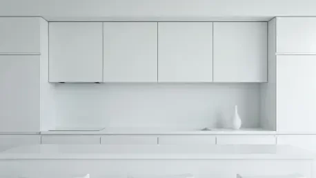
The enduring popularity of the “white on white” kitchen, intended to create a bright, clean, and timeless space, often resulted in an environment that felt cold and sterile. Designer Sarah Trop observed that without sufficient contrast or the integration of natural materials, these kitchens appeared flat and uninviting. When walls, cabinetry, and countertops all share the same stark white hue, the subtle, beautiful details of the room, such as intricate millwork or custom cabinet profiles, can visually disappear. The lack of shadow and depth robs the space of dimension and character, creating a clinical atmosphere rather than a warm, welcoming heart of the home. Achieving a successful white kitchen requires a sophisticated layering of different shades of white, along with a rich mix of textures—such as wood, metal, and stone—to introduce warmth and visual interest that prevent the space from feeling one-dimensional and unwelcoming.
At the opposite end of the spectrum, the “color drenching” trend, where walls, trim, and cabinetry are all painted in the same deeply saturated hue, has also proven to be a misstep. While bold and dramatic, this approach can overwhelm a kitchen, a room that is typically a hub of activity and already filled with visual information. Sarah Trop points out that a highly saturated color, such as a deep red, carries an immense “visual weight” that can make a room feel smaller, darker, and more oppressive, particularly in spaces with limited natural light. Such an intense and all-encompassing color scheme can be fatiguing to the eye and difficult to live with on a daily basis. The expert consensus suggests that bold colors are far more effective and sustainable when used as accents. A vibrant hue can be introduced on a single island, through easily replaceable accessories, or on a backsplash, providing a powerful pop of personality without the overwhelming and permanent commitment of drenching the entire room in a single, heavy shade.
The High-Maintenance Reality of Textured Finishes
A recent trend modernizing older styles with textured wall and ceiling finishes like limewash or Roman clay has become a significant point of regret for design professionals. Designer Rick Berres strongly cautions against this aesthetic, labeling it a “huge mistake” not for its appearance, but for its profound lack of practicality. These finishes are notoriously difficult to work with from the outset, often requiring specialized application techniques that are more costly and time-consuming than standard painting. The real problems arise with long-term maintenance. Unlike a standard painted wall where a scuff or stain can be easily touched up, repairing a textured surface is a complex process. It is nearly impossible to patch a small area without the repair being glaringly obvious, often necessitating that an entire wall be redone to achieve a seamless look. In a high-traffic area like a kitchen, where spills, splatters, and moisture are inevitable, these delicate and hard-to-clean surfaces are a fundamentally poor choice.
The most significant and costly issue with textured finishes, as highlighted by Berres, is the arduous process of removal. When a homeowner inevitably tires of the look or wishes to update the space, they are faced with what he calls the “biggest pain to remove.” Returning a textured wall to a smooth, paintable surface is an intensive, messy, and laborious undertaking that involves extensive scraping, sanding, and often skimming the entire wall with joint compound. This process can be disruptive and expensive, potentially causing damage to the underlying drywall if not done by a skilled professional. The immense difficulty and expense associated with changing or removing these finishes make them a high-risk, low-reward design choice. The fleeting appeal of their unique texture is far outweighed by the long-term commitment and the significant headache they present when it is time for a change, reinforcing the value of classic, easily maintainable wall treatments.
A Foundation for Enduring Design
Ultimately, the collective experience of these design professionals pointed to a foundational truth: the most successful and cherished kitchen designs were those that prioritized long-term functionality and personal comfort over transient, camera-ready aesthetics. The regretted trends shared common flaws, revealing themselves to be either too high-maintenance for the realities of daily life, too visually overpowering for a space meant to be calming, or too difficult and costly to alter as tastes evolved. The crucial lesson learned was not simply to avoid what was popular, but to engage in a more thoughtful design process that began with questions of how the space would be lived in, not just how it would be looked at. This shift in perspective underscored the enduring value of creating a kitchen that served the homeowner’s needs for years to come, proving that true style was found in practicality, not in passing fads.