
Choosing the perfect color for a living room wall often feels like a delicate balancing act, a quest to find a shade that expresses personal style without sacrificing the calm, livable atmosphere essential to a home’s central gathering space. As we navigate the design landscape of 2026, a clear and unified direction has emerged from leading interior designers, signaling a collective shift away from the stark, cold, or overly saturated hues of the past. The consensus points overwhelmingly toward palettes with an inherent and profound connection to the natural world. This movement is not merely about aesthetics; it is a deeper response to a desire for grounding, comfort, and timelessness within our personal sanctuaries. The colors defining this year are nuanced, earthy, and sophisticated, celebrated for their remarkable ability to serve as a flexible foundation for diverse decor styles, rich textures, and vibrant accent pieces. This philosophy champions the creation of layered, collected interiors that can gracefully evolve, ensuring that today’s design choices possess an enduring appeal that transcends fleeting fads.
The New Bolds Saturated Yet Serene
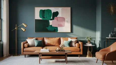
Muted Teals
The re-emergence of teal marks a significant trend, presenting a complex and dynamic blue-green hybrid that offers a sophisticated alternative to the once-ubiquitous dark forest greens. The teals favored for 2026 are not the bright, electric shades of previous eras; instead, they are carefully muted with a significant dose of gray, a quality that dramatically enhances their versatility and livability. This subtle undertone transforms the color into an elegant and adaptable choice, capable of creating moods that range from dark and enveloping to light and tranquil. Interior designer Michelle Gage has become a vocal champion for this hue, describing it as an “excellent backdrop to layer great pattern and color into the room.” This quality allows muted teal to function as a powerful yet harmonious canvas. In one of her projects, she utilized Benjamin Moore’s Atmospheric, a perfect example of a teal that balances depth with softness. The color provides a saturated foundation that doesn’t overwhelm, making it ideal for showcasing art, furniture, and textiles.
This particular shade’s strength lies in its capacity to support a rich and diverse palette of accent colors, fostering a layered and deeply personal aesthetic. Gage often pairs these sophisticated teals, such as Farrow & Ball’s Dix Blue, with complementary tones like deep emeralds, warm caramels, and soothing, dusty pinks. This deliberate layering of both complementary and contrasting colors adds a remarkable depth and personality to a space, preventing it from feeling one-dimensional. The gray undertone in these teals ensures they pair beautifully with natural materials like walnut, oak, and brass, further anchoring the room in an earthy elegance. The result is a living room that feels both bold and calming, a space that is contemporary yet possesses a timeless quality. This duality makes muted teal a compelling choice for homeowners looking to make a statement that is both confident and comforting, creating an environment that is as suitable for quiet reflection as it is for lively entertaining.
Muddy Greens
While the more vibrant and energetic greens are receding from the spotlight, their earthy, muddy counterparts are confidently taking center stage. This trend embraces deep, olive-toned shades that function less as a bold color statement and more as a complex, grounding neutral. Their inherent connection to the natural world imbues them with a sense of calm and stability, making them exceptionally easy to integrate into various design schemes. This quality allows for effortless layering with other colors, textures, and decorative elements, resulting in interiors that feel both cozy and visually interesting. These greens have a unique ability to adapt to their surroundings; they can create a warm, cocooning effect during the winter months while feeling fresh and alive in the brighter light of summer. This adaptability has made them a favorite among designers seeking to create spaces with lasting appeal. Their subdued nature prevents them from overpowering a room, instead providing a rich, organic backdrop that enhances the objects within it.
Designer Jessica Hobson has declared rich olive green as her absolute favorite living room color for 2026, praising it as a “grounding neutral that isn’t boring.” For one of her featured designs, she selected Benjamin Moore’s Gloucester Sage, a shade that perfectly embodies this trend’s depth and warmth. Another of her preferred options is Farrow & Ball’s Bancha, known for its profound, earthy character. Hobson provides valuable styling advice, noting that these muddy greens serve as an exceptional backdrop for artwork, allowing colors and forms to pop with greater intensity. To create a sophisticated palette, she suggests pairing them with accents of plum, dusky pink, or even a pale, ethereal blue. To amplify the inherent warmth of these greens and add a touch of modern elegance, she recommends incorporating burnished brass accents through lighting fixtures, hardware, and decorative objects. This combination of rich color and metallic warmth creates a living space that feels curated, comfortable, and deeply connected to the natural world.
The Modern Neutrals Warmth and Light
Dusky Pinks
Shifting toward warmer palettes, a significant trend is the rise of dusky, plaster-like pinks that offer a sophisticated and mature take on the color. Characterized by their muddy and earthy undertones, these shades masterfully avoid the saccharine sweetness often associated with pink, instead projecting an air of timeless elegance. They are increasingly being used as a “new neutral,” introducing more warmth, depth, and personality than traditional beiges or creams while remaining subtle enough to foster a balanced and serene environment. This ability to act as a neutral with character is their greatest strength. These pinks envelop a room in a soft, gentle glow that feels both comforting and refined, making them an ideal choice for a living space designed for relaxation and conversation. Their complex composition, often a soft blend of pink, brown, and muted earth tones, allows them to shift beautifully with the changing light throughout the day, adding a quiet dynamism to the interior scheme. This subtle complexity makes them a versatile foundation for a wide range of decorating styles, from minimalist to bohemian.
Designer Marie Flanigan has championed this trend, observing that living room colors are leaning toward “warm, nuanced shades that feel both timeless and inviting.” Her top recommendation is Farrow & Ball’s Dead Salmon, a complex and intriguing color that she describes as an “unexpected yet still functions as a neutral.” This shade perfectly illustrates how a color can be both distinctive and understated, providing warmth without overwhelming the space. Flanigan emphasizes that these plaster pinks pair exceptionally well with natural materials, a combination that enhances the room’s relaxed, collected, and highly livable feeling. When set against the textures of raw wood, soft linen, and cool stone, dusky pink walls add a layer of character and depth that feels both organic and intentional. The result is an interior that feels sophisticated yet approachable, a testament to the power of a well-chosen neutral to create a space that is both beautiful and deeply comforting, inviting inhabitants to settle in and stay awhile.
Light and Airy Blues
For homeowners seeking to introduce color while preserving a tranquil and relaxed atmosphere, light and airy blues have become a primary choice for 2026. The focus is squarely on soft, delicate shades that are “rooted in nature,” evoking the calming expanse of a clear sky or the gentle surface of placid water. These blues are distinctly muted, possessing a gentle, almost ethereal quality that sets them apart from more saturated tones. Designers Sydney Foley and Emma Legg of Kindred Interior Studios are strong proponents of this trend, stating, “We’re leaning heavily into soft blues for living rooms, especially shades that feel calm, airy, and rooted in nature.” They view this color family as an ideal and more characterful alternative to standard neutrals like white and beige, as it “adds depth and color while still feeling calm and cohesive.” This approach allows for a space that feels serene but not sterile, colorful but not loud, achieving a perfect equilibrium for a modern living area.
A key characteristic of these light blues is their remarkable ability to interact with natural light, shifting beautifully as the sun moves across the sky throughout the day. This dynamic quality gives a room a palpable sense of dimension and life, preventing the walls from feeling static or flat. While the specific paint used in their featured living room was a custom shade, the designers suggest that it is very similar in tone and feel to popular options like Benjamin Moore’s Quiet Moments and Sherwin-Williams’ Sea Salt. These shades are also incredibly versatile from a design perspective, working harmoniously with a wide range of materials and styles. They pair wonderfully with the warmth of natural woods, the rich patina of antique pieces, the soft gleam of brass finishes, and a diverse array of patterns and textiles. This adaptability ensures that a light blue living room can be styled to feel classic, contemporary, coastal, or eclectic, all while maintaining its core identity as a peaceful and inviting retreat from the outside world.
Reflective Choices for Lasting Spaces
The collective insight from this year’s top designers pointed toward a clear and unified direction for living room color palettes. The emphasis was placed firmly on nuanced, nature-inspired hues that prioritized comfort, warmth, and a timeless aesthetic that could endure beyond fleeting trends. Whether one selected a muted teal, a dusky pink, an earthy green, an airy blue, or a soft, warm white, the ultimate goal was consistent: to create a space that felt both deeply personal and fundamentally livable. The final, critical piece of advice that resonated throughout these expert recommendations was a practical one. It was strongly suggested that homeowners should always test paint samples directly on their walls before committing to a final color. This crucial step allowed them to observe how a particular shade interacted with the unique quality of natural light in their specific space throughout the day, ensuring the final choice perfectly achieved the desired mood and atmosphere for a truly harmonious home.