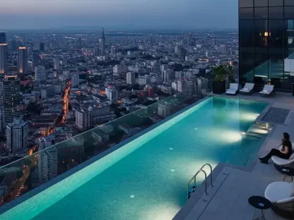

Choosing a color scheme for an entire home often traps homeowners in a cycle of indecision, caught between the desire for vibrant, personality-driven hues and the appeal of serene, calming neutrals. This common decorating challenge can lead to a state of color paralysis, where the fear of making a costly or overwhelming mistake results in no decision at all. However, a refreshingly simple yet highly effective methodology developed by interior designer Melissa Oholendt of Oho Interiors offers a clear path forward. This framework provides a strategic formula designed to create a cohesive and harmonious home that beautifully integrates both bold statements and tranquil moments, resolving the classic design dilemma with an elegant and balanced approach. By shifting the focus from individual rooms to the residence as a whole, this principle empowers homeowners to craft spaces that are not only visually stunning but also psychologically comfortable and deeply personal.
The Core Concept: Achieving Harmony Through Balance
The 1:1 Ratio Explained
The foundational principle of this design philosophy is a holistic sense of balance that extends far beyond a simple color wheel. It is about creating a dynamic interplay between various textures, materials, and even design sensibilities. This approach advocates for the thoughtful juxtaposition of natural elements, like wood and stone, with sleek, man-made construction materials. It also encourages blending traditionally masculine design lines with more feminine forms, fostering a yin-and-yang equilibrium that brings a profound sense of calm and completeness to a space. This broader concept of balance serves as the bedrock for a more specific, actionable strategy for color application. At the heart of this method is the elegantly straightforward 1:1 ratio. The formula posits that for every room saturated in a bold, impactful color, there should be a corresponding room designed with a more subdued, neutral palette. This intentional pairing is the key to preventing the visual fatigue and sensory overload that can occur when too many strong colors compete for attention within a single home.
This strategic allocation of color ensures that the home’s overall design narrative feels deliberate and expertly curated. Rather than a chaotic collection of disparate ideas, the home becomes a testament to thoughtful planning. The 1:1 ratio is not about creating a rigid, checkerboard-like pattern of alternating light and dark rooms. Instead, it is about establishing a rhythm and flow, where moments of high-impact color are given space to breathe, buffered by areas of quiet calm. For instance, a deeply hued study might open into a hallway painted in a soft off-white, which then leads into a living area with a similarly restful palette. This sequence allows the bold color of the study to feel like a special, jewel-box moment rather than the start of an overwhelming trend. This careful modulation of color intensity is what transforms a house into a harmonious sanctuary, ensuring that each design choice contributes positively to the home’s overall atmosphere without detracting from the others. It is a method that champions both courage in color and wisdom in restraint.
The Philosophy Behind the Formula
This design methodology fundamentally redefines the role of neutral spaces within a home, elevating them from their common perception as merely “safe” or unadventurous defaults into critical, functional components of a sophisticated color scheme. Within this framework, pared-back rooms are not an absence of design but a deliberate and strategic choice. They are conceived to act as a “visual palate cleanser,” offering the eye a necessary moment of rest before it moves on to a more color-drenched area. This concept draws a direct parallel to the use of negative space in masterful works of art and literature; just as the empty canvas or the silent pause is essential for making the primary subjects stand out, these quiet rooms are vital for amplifying the impact of the bolder design choices elsewhere in the home. By providing these intentional pauses, the design allows the saturated colors to feel more powerful, purposeful, and appreciated, preventing them from becoming visually monotonous. This strategic restraint is what lends the entire palette its sophisticated and well-considered character.
Embracing this ratio necessitates a shift toward a holistic, “whole home approach,” a perspective that stands in stark contrast to the common practice of making color and design decisions in isolation for each individual room. Homeowners are encouraged to envision their residence as a single, cohesive entity, where the transition from one space to the next is a seamless and logical progression. The guiding idea is that rooms should feel like “individual pages of the same story,” a metaphor that perfectly captures the goal. While each chapter—or room—can and should have its own distinct mood, atmosphere, and function, it must clearly belong to the same overarching narrative of the home. This unified vision ensures that as one moves through the house, the experience is fluid and harmonious rather than jarring and disjointed. Adopting this comprehensive viewpoint transforms the decorating process from a series of unrelated tasks into the thoughtful creation of a unified, narrative-driven environment that supports a more peaceful and psychologically comfortable daily life.
Putting the Formula into Practice
A Flexible Guideline, Not a Rigid Rule
One of the most significant strengths of the 1:1 ratio is its inherent flexibility; it is not intended to be a strict, prescriptive commandment but rather an empowering guideline and an excellent starting point. It grants homeowners “permission to play,” encouraging them to make confident choices that honor the unique architectural character and functional needs of each individual space. When determining whether a room is best suited for a bold statement or a neutral backdrop, several key factors should be considered. Natural light plays a crucial role; a room flooded with sunlight might handle a warm, complex neutral beautifully, while a darker, more intimate space could be intentionally transformed into a cozy retreat with a deep, saturated hue. The home’s existing architecture also provides important clues, as a room’s structural features or historical style can naturally guide color choices. Above all, the intended use and desired mood of the room are paramount. This adaptability ensures the formula can be tailored to any home, style, or lifestyle.
The practical application of these considerations allows for a highly customized and thoughtful design. For example, a small home office, a space dedicated to concentration and deep work, might be the perfect candidate for a moody, enveloping color that minimizes distractions and fosters a sense of focus. In this context, a dark teal or a rich charcoal can create a sanctuary-like atmosphere conducive to productivity. In stark contrast, a central, high-traffic area like a kitchen or main living room, which often serves as the social hub of the home and accommodates a wide range of activities, may be better served by a calming, versatile neutral. A soft greige or a warm white in such a space can create an inviting and flexible backdrop that does not overwhelm daily life and allows for evolving decor. This nuanced approach demonstrates how the formula is not just about balancing color but also about aligning the aesthetic environment with the practical function of each room, resulting in a home that is both beautiful and intuitively livable.
Real-World Application: A Case Study in Color
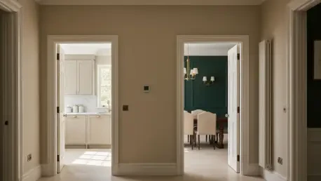
To illustrate this theory in action, specific projects expertly showcase how thoughtful color choices bring the 1:1 formula to life. Saturated spaces are strategically deployed to create a distinct atmosphere and an intimate feel where desired. In one home, a dedicated office is painted in Farrow & Ball’s Inchyra Blue, a deep and moody blue-grey that immediately establishes a scholarly, focused environment ideal for concentration. In another functional yet often overlooked space, a pantry is transformed with Farrow & Ball’s Cola, a deep, warm brown with rich red undertones, which turns the small, utilitarian room into a cozy and enveloping jewel box. Even transitional areas are given careful consideration; a mudroom painted in Sherwin-Williams’ Foggy Day, a calming and sophisticated blue-grey, adds a touch of color and depth that elevates the everyday experience of entering and exiting the home. These examples demonstrate how bold color can be used with precision to enhance a room’s purpose and emotional resonance.
These impactful, saturated rooms are masterfully counterbalanced by an equal number of neutral “rest” spaces that provide visual relief and anchor the home’s overall design. The primary living room, often the heart of the home, is painted in Sherwin-Williams’ Alabaster, a soft, warm white that creates a gentle, airy, and inviting hub for family life. In the kitchen, a space of both function and gathering, Benjamin Moore’s Stone Hearth, a nuanced and versatile neutral teetering between beige and greige, provides an understated richness that complements a wide range of materials and finishes. To complete the serene side of the equation, a primary bathroom is finished in Farrow & Ball’s Shadow White, a soft neutral with a subtle hint of gray, which fosters a tranquil, spa-like retreat perfect for unwinding. Together, these carefully selected neutrals serve as the perfect counterpart to the bolder rooms, completing the home’s harmonious color story and proving the efficacy of a balanced approach.
A New Framework for a Cohesive Home
Ultimately, the successful application of this color strategy revealed that a balanced, whole-home approach was not just a design theory but a practical framework for creating a living space that felt both dynamic and serene. The adoption of the 1:1 ratio transformed the potentially overwhelming task of selecting a full-home color scheme into a more strategic and manageable process. It encouraged a crucial shift in perspective, moving away from a room-by-room focus toward a more cohesive and holistic vision of the home as a single, unified entity. The resulting environment was one where moments of high visual impact were thoughtfully balanced by periods of visual calm, leading to a home that was not only aesthetically pleasing but also psychologically easier and more pleasant to inhabit every day. This experience underscored that the most beautiful homes are often those where both bold expression and quiet restraint are given equal and deliberate consideration.