
The story of a color that was supposed to be a fleeting trend but instead became a defining hue of a generation reveals a fascinating intersection of design, psychology, and societal shifts. When Pantone introduced “Rose Quartz” as its 2016 Color of the Year, the design world largely anticipated its popularity to be short-lived, a passing fancy destined to fade within a season or two. Yet, years later, this soft, dusty shade, now universally known as millennial pink, continues to feature prominently in everything from high-end furniture to mass-market home goods. Its remarkable staying power is not accidental but a testament to a unique combination of aesthetic adaptability and profound emotional resonance. This color has managed to evolve, transcending its initial trend status to become a versatile and sophisticated staple in the modern design lexicon, proving its relevance in design forecasts well into the current year. Its journey from a trendy blush to a timeless neutral offers a compelling case study in how a color can capture and reflect the spirit of its time.
A Master of Adaptation
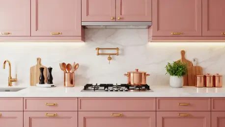
One of the primary drivers behind millennial pink’s longevity is its incredible versatility, allowing it to adapt seamlessly to changing design sensibilities. Unlike many trend colors that are confined to specific pairings, this muted shade has proven its ability to harmonize with a wide and evolving range of palettes. When it first gained prominence, it was commonly seen alongside sage greens, whites, and various textures to create a soft, gentle aesthetic. However, as design tastes have shifted, the color has evolved to sit comfortably with much richer, “dirtier” tones such as chocolate brown, olive green, espresso, and charcoal. These contemporary combinations strip the pink of its traditional sweetness, lending it a more sophisticated, architectural, and modern quality that feels fresh and current. This chameleon-like ability to reinvent itself through new color relationships is central to its enduring appeal, ensuring it never feels static or dated.
The rise of millennial pink also perfectly coincided with a major pivot in interior design philosophy, moving away from the stark, all-white aesthetic of minimalism towards a more layered, colorful, and nuanced style of maximalism. For many who were accustomed to monochrome interiors, this gentle hue provided a perfect gateway to re-embracing color. It offered a way to introduce warmth and personality into a space in a subtle and contemporary manner, feeling less like a risky commitment and more like a sophisticated neutral. This approachable nature helped re-contextualize the color, moving it out of children’s rooms and into chic, adult spaces. Its widespread application across living rooms, bedrooms, kitchens, and bathrooms—on everything from textiles and wall paint to cabinetry and tiles—demonstrates its successful transition from a decorative accent to a foundational element in modern home design.
The Psychology of a Soothing Hue
Beyond its aesthetic flexibility, millennial pink taps into a deep-seated human desire for comfort, safety, and emotional support, making it particularly resonant in today’s world. Design experts connect the color’s sustained popularity to broader societal themes, particularly a collective need for security during uncertain times. The muted blush tone is often described as an “emotional refuge,” evoking a sense of calm and allowing people to create a stable and comforting environment within their own homes. This quality aligns with emerging “sun-drenched” trends inspired by natural landscapes, which aim to foster serene, less over-stimulating home environments. Its inherent warmth makes a room feel more alive and inviting, akin to a “youthful, almost sunset-like glow” that is inherently uplifting. It is a color that feels both protective and positive, a quiet anchor in a busy world.
The shade also serves as a masterful bridge between the past and the present, tapping into a powerful sense of nostalgia while remaining firmly modern. For many, the color evokes a “soft, warm nostalgia,” a source of comfort that recalls simpler times, yet it does so with a “grown-up, design-savvy sensibility” that keeps it from feeling dated or juvenile. This unique duality is key to its broad appeal across different generations and design styles. In practical application, this translates to a color that is well-suited for techniques like “color drenching,” where walls, trims, and even the ceiling are painted in the same hue to create an enveloping and cohesive feel. For a more restrained approach, it works exceptionally well in smaller doses through textiles and soft furnishings, adding a layer of warmth without overwhelming a space. This balance of nostalgic comfort and modern sophistication makes it a uniquely powerful tool in the designer’s palette.
An Evolved and Enduring Staple
Ultimately, the narrative of millennial pink was one of profound redefinition. It successfully shed its historical associations and was re-contextualized as a sophisticated, versatile, and emotionally resonant color fit for the modern era. Its journey from a simple trend into a design staple was secured not by being loud or demanding attention, but through its quiet, adaptive nature. The color’s success was a multifaceted phenomenon, attributable to its aesthetic flexibility that allowed it to evolve with changing palettes, its role as an approachable entry point to color for the risk-averse, and its deep psychological connection to the human need for comfort, joy, and security. By meeting these fundamental needs while remaining stylistically relevant, millennial pink proved its initial death was, as one might say, greatly exaggerated.