
Choosing an exterior paint color is a monumental decision that extends far beyond personal preference, significantly influencing a home’s curb appeal, perceived value, and relationship with its surrounding environment. The facade of a house is its public face, a constant visual statement to the neighborhood and a first impression for every visitor. While the impulse may be to select a color that is unique or expresses individuality, design experts caution that the most successful exteriors are those that achieve a delicate balance between character and context. The wrong choice can not only diminish a property’s aesthetic but can also create visual discord within its landscape. The key lies in understanding which color families tend to clash with natural light and architectural forms, and why timeless, nature-inspired tones almost always prevail. The goal is not to be boring, but to be thoughtful, selecting a palette that enhances a home’s best features and stands the test of time against the elements.
The Perils of Overly Vibrant Hues
Intensely vibrant and bold colors, while captivating on a smaller scale, often prove disastrous when applied across the broad canvas of a home’s exterior. Hues such as pure primary red, electric blue, intense purple, or any neon shade like hot pink can be visually overwhelming in an outdoor setting. These colors lack the subtlety required to harmonize with the natural world of green foliage, earthy tones, and the shifting blue of the sky. Instead of complementing the landscape, they compete with it, resulting in a residence that appears artificial and out of place. Under the full, unfiltered glare of the sun, these shades do not mellow gracefully; they can appear garish and tend to fade unevenly, highlighting imperfections over time. Professional designers strongly advise against these choices, noting that they can make a home look eccentric rather than stylish. A more sophisticated approach involves selecting nuanced versions of these colors. For instance, a rich red with brown undertones or a deep blue muted with gray possesses a depth and complexity that feels more integrated and timeless, adding character without shouting for attention.
The Downside of Dark and Drab Tones
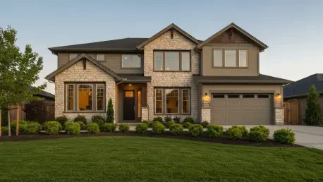
Another category of colors to approach with caution includes dark, drab, and unnatural shades that can detract from a home’s appeal. Dark and muddy browns, for example, can make a structure appear heavy, dated, and unappealing, particularly in regions that do not receive consistent, bright sunlight. These tones can absorb the light rather than reflect it, causing the home to recede into the landscape in a gloomy fashion. Furthermore, these dark colors come with a practical disadvantage: they absorb a significant amount of solar heat. This can lead to increased cooling costs during warmer months, making them a poor choice for homes in hot climates. Similarly, cool grays, despite their popularity in interiors, can translate poorly to exteriors. Without the controlled lighting of an indoor space, cool gray can look lifeless, institutional, and starkly unnatural against a vibrant landscape. The recommended alternatives are warmer, more inviting tones. Sun-washed colors like soft taupes, warm greiges, or creamy off-whites reflect light beautifully, creating an impression of warmth and harmony with the environment and giving the home a welcoming presence.
The Contextual Challenge of Pastels
Pastel colors, such as baby blue, light pink, or soft lavender, occupy a unique space where their suitability is almost entirely dictated by context and architectural style. While these light and airy shades can be perfectly charming and appropriate in specific environments, they often appear discordant and out of place in most residential settings. For instance, a home painted in a cheerful pastel might fit seamlessly into the vibrant, sun-drenched landscape of a coastal beach town or a historic district known for its whimsical Victorian architecture. In these settings, the colors contribute to a well-established local character. However, when the same light pink or baby blue is applied to a home in a wooded, suburban, or rustic area, the effect can be jarring. The color fails to connect with the surrounding natural palette of deep greens and earthy browns, creating a visual clash that feels unintentional and ill-considered. Therefore, the decision to use a pastel exterior should be made with a careful assessment of the home’s style, its immediate surroundings, and the prevailing aesthetic of the neighborhood.
Achieving a Lasting Impression
Ultimately, the selection of a successful exterior color palette was a process guided by principles of harmony, longevity, and environmental context. The goal was never simply to avoid a proscribed list of “bad” colors but to embrace a more holistic design philosophy. The most enduring and aesthetically pleasing homes were those whose colors felt like a natural extension of both the architecture and the landscape. This involved choosing shades that respected the quality of natural light, complemented the textures of building materials, and created a sense of belonging within the neighborhood. By steering clear of tones that were overly aggressive, unnaturally somber, or contextually inappropriate, homeowners made choices that enhanced their property’s value and visual appeal for years to come. The final decision reflected a thoughtful consideration of how a home presents itself to the world, resulting in a timeless statement of sophisticated design.