
Challenging the long-held belief that West Coast interiors are exclusively defined by a sun-bleached palette of whites and beiges, a significant movement among the region’s top designers reveals a deep appreciation for complex, moody, and saturated colors. This shift moves beyond minimalist aesthetics, demonstrating that color is not merely an accessory but a fundamental tool for crafting atmosphere, evoking emotion, and reflecting the diverse natural landscapes of the Pacific coast. Professional designers are now deliberately selecting rich, immersive hues to foster feelings of comfort, sophistication, and tranquility, proving that even the most daring shades can serve as versatile backdrops in a wide array of architectural settings. This evolving design philosophy underscores a departure from predictable neutrals, embracing a more nuanced and character-driven approach to creating spaces that feel both personal and profoundly connected to their environment, from the dramatic coastlines to the serene deserts and lush mountains.
The Sophistication of Shadow and Depth
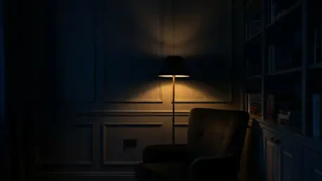
Embracing Dramatic Darks
The allure of deep, atmospheric shades has captivated designers looking to create spaces with a sense of luxury and intimacy. Colors that were once considered risky are now celebrated for their ability to envelop a room, providing a rich and sophisticated canvas. A prime example is Farrow & Ball’s “Down Pipe No. 26,” a lead gray with intricate blue undertones that offers a dramatic yet grounding effect. Designers utilize this shade to craft an environment that feels both historic and contemporary, a backdrop that allows art and furnishings to stand out with greater intensity. This move towards darker palettes is not about shrinking a space but about defining it, creating a cocoon-like atmosphere that encourages relaxation and contemplation. In bedrooms, libraries, and formal living areas, these complex darks absorb light in a way that softens edges and adds an almost velvety texture to the walls, transforming an ordinary room into a sanctuary of style and comfort that feels intentionally curated and deeply personal.
Another prominent choice in this category is Sherwin-Williams’ “Naval SW 6244,” a classic navy blue that proves its versatility across both modern and traditional applications. Its inherent depth allows it to function as a powerful neutral, capable of anchoring a room without overwhelming it. Designers often pair this commanding hue with warm metallics like brass or soft textures such as linen and leather to create a balanced and inviting interior. The use of such a confident color reflects a growing desire for homes that express a distinct personality. For an even more immersive experience, Benjamin Moore’s “Wenge AF-180,” a deep, complex burgundy, is frequently specified for intimate spaces like reading nooks or dining rooms. This shade, with its warm and enveloping quality, fosters a sense of closeness and warmth, making it ideal for areas dedicated to conversation and connection. The strategic application of these bold, dark colors marks a confident departure from ephemeral trends, leaning instead toward timeless elegance and emotional resonance.
The Versatility of Deep Hues
Contrary to the belief that dark colors make rooms feel smaller, professional designers skillfully employ them to add perceived depth and architectural interest. A deep, moody shade can blur the corners of a room, creating an illusion of expanded space and focusing attention on the light and objects within it. This technique is particularly effective in spaces with ample natural light, where the interplay between sun and shadow highlights the complexity of the color throughout the day. For instance, a dark navy or charcoal can make a high ceiling feel more intimate and grounded, while in a smaller powder room, it can create a jewel-box effect that feels unexpectedly grand and luxurious. The success of these colors lies in their application; they are not used indiscriminately but are thoughtfully integrated with lighting, texture, and accent colors to achieve a harmonious and layered design scheme that feels both intentional and effortlessly chic.
Furthermore, the versatility of these deep hues extends to their ability to complement a wide range of materials and styles. A complex gray like “Down Pipe” serves as an elegant backdrop for both rustic wood finishes and sleek, modern furniture, bridging the gap between different design eras. Similarly, a rich navy can enhance the warmth of natural stone or the crispness of white marble, making it a suitable choice for kitchens and bathrooms seeking a touch of drama. The key is in the undertones of the paint; a color with a blue or green undertone can feel cooler and more contemporary, while one with a hint of brown or red can evoke a warmer, more traditional sensibility. This nuanced understanding of color theory allows West Coast designers to use dark, moody palettes not as a monolithic trend but as a highly adaptable tool to customize spaces, reflecting both the home’s architecture and the inhabitant’s personality with remarkable sophistication and nuance.
Inspired by The Natural Landscape
The Calming Power of Earthy Greens
Drawing inspiration from the serene, nature-infused lifestyle of the West Coast, earthy sage greens have become a cornerstone for creating calm and balanced interiors. These muted, sophisticated shades serve as a bridge between the indoors and outdoors, fostering a sense of tranquility that resonates with the region’s emphasis on wellness and relaxation. Benjamin Moore’s “Carolina Gull 2138-40” is a perfect example, offering a harmonious blend of green and gray that is both soothing and grounding. Designers favor this color for its ability to act as a neutral without being bland, providing a soft backdrop that complements natural materials like wood, stone, and linen. It is frequently applied to cabinetry, millwork, and entire rooms to cultivate a zen-like atmosphere that feels restorative and connected to the natural world. This shade is particularly effective in spaces that flow into outdoor areas, creating a seamless visual transition.
Another celebrated hue in this family is Benjamin Moore’s “Rosepine 461,” which captures the soft, dusty green of coastal foliage. Its gentle, calming presence makes it an ideal choice for bedrooms, bathrooms, and living areas where comfort is paramount. Unlike more vibrant greens, these earthy tones do not overwhelm the senses; instead, they provide a quiet, understated elegance that works well within a variety of design aesthetics, from mid-century modern to Southwestern. The popularity of these landscape-driven greens signifies a deeper trend toward biophilic design—the practice of connecting people with nature within built environments. By bringing the colors of the outside world in, designers are crafting spaces that not only look beautiful but also support a more relaxed and mindful way of living, reflecting a core tenet of the West Coast ethos in a sophisticated and enduring manner.
Saturated Tones with Organic Warmth
Beyond the cool serenity of greens, designers are also embracing warm, saturated tones that evoke the earthy richness of the western landscape without resorting to overly bright or distracting palettes. A standout in this category is JH Wall Paint’s “No. 166,” a muted rust that offers a sophisticated and warm alternative to the once-ubiquitous greige. This color brings a unique depth and character to a space, reminiscent of sun-drenched canyons and terracotta pottery. It functions beautifully as a feature wall or as an all-over color in a study or den, creating a cozy and inviting atmosphere. Its muted quality allows it to serve as a new kind of neutral, one that is infused with personality and warmth, pairing effortlessly with both dark wood tones and lighter, more contemporary finishes. This thoughtful use of a saturated yet restrained hue demonstrates a desire for interiors that feel grounded, authentic, and connected to their geographical roots.
On the bolder end of the spectrum, some designers are making fearless choices with rich, personality-filled shades that make a powerful statement. Farrow & Ball’s “Preference Red No. 297,” a deep and complex ruby hue, is a testament to this trend. While a vibrant red might seem intimidating, this particular shade has a historic depth that prevents it from feeling jarring. It has been used to great effect in unexpected places, such as a laundry room or a transitional hallway, transforming a utilitarian area into a memorable design moment. Its application shows that even the most functional spaces can benefit from a dose of strong, confident color. The embrace of such warm, saturated tones, from subtle rust to bold ruby, signaled a move toward creating homes that are not just aesthetically pleasing but also emotionally resonant, filled with colors that tell a story and reflect a vibrant, expressive approach to life and design.
A New Chapter in Coastal Color
The deliberate and skillful use of bold, moody colors by West Coast designers ultimately redefined the region’s design identity. This movement illustrated a sophisticated understanding of how color shapes experience, moving far beyond surface-level aesthetics to create interiors with emotional depth and a strong sense of place. The curated selection of deep navies, complex grays, earthy greens, and saturated reds demonstrated that a home’s atmosphere could be profoundly influenced by a thoughtful and daring color palette. This evolution in design philosophy marked a departure from the safety of neutrals and instead championed a more personalized and expressive approach. The results were spaces that felt not only stylish and contemporary but also timeless and deeply connected to both the natural environment and the unique personalities of those who inhabited them.