
In a world where interior design trends often swing between daring vibrancy and understated calm, Sherwin-Williams has made a striking yet grounded decision by naming Universal Khaki (SW 6150) as the Color of the Year for 2026, signaling a shift toward timeless neutrals. This mid-tone tan, infused with warm, earthy undertones, marks a departure from the bold, saturated hues that have recently captured attention in home decor and instead champions versatility and lasting charm. The announcement has ignited both enthusiasm and debate within the design community, as this shade—positioned between beige and light brown—offers a practical foundation for countless styles while prompting questions about whether a neutral can truly lead as an inspiring choice. As 2026 approaches, this selection reflects a broader movement toward balance and intentionality in creating spaces that feel personal and enduring. Let’s explore the layers of meaning behind this color and its implications for the future of design.
Embracing Timeless Foundations
Universal Khaki emerges as a beacon of “grounded elegance,” a term coined by Sue Wadden, Sherwin-Williams’ director of color marketing, to describe its subtle yet impactful presence. This shade’s strength lies in its adaptability, effortlessly pairing with a spectrum of colors—from crisp whites to deep blues—making it an ideal base for crafting spaces that feel both inviting and resilient. Unlike the fleeting trends of bold reds or bright yellows seen in recent years, this neutral caters to a growing demand for warmer, restorative tones that replace the once-dominant cooler grays. It serves as a quiet supporter of any design vision, allowing other elements to shine while maintaining a cohesive aesthetic. For homeowners and decorators aiming to build environments that withstand the test of time, Universal Khaki offers a dependable starting point that prioritizes comfort over flashiness, aligning perfectly with the ethos of simplicity anticipated for 2026.
Further insight into the shade’s appeal comes from Ashley Banbury, color marketing manager for HGTV Home by Sherwin-Williams, who emphasizes its depth and approachable nature. This isn’t just a safe pick; it’s a deliberate shift toward essentials, countering the high-energy palettes that have often demanded frequent updates to stay relevant. The focus for the upcoming year appears to center on homes that resonate with purpose, drawing inspiration from nature’s calming influence. Universal Khaki embodies this trend, providing a canvas that feels nurturing rather than sterile, and encouraging designs that connect emotionally with inhabitants. Its warm undertones evoke a sense of grounding, making spaces feel like sanctuaries amid a fast-paced world. As design priorities evolve, this color stands out as a tool for creating environments that balance style with a deeper sense of well-being, marking a pivotal moment in how neutrals are perceived.
Navigating Nostalgia and Debate
One of Universal Khaki’s most intriguing aspects is its nostalgic resonance, harking back to the warm beiges and khakis that defined home decor in the ‘90s and early 2000s. For many, this connection sparks a comforting familiarity, recalling a time when interiors prioritized coziness over bold statements. This earthy tone wraps spaces in a sense of simplicity and warmth, offering a retreat from the often overwhelming vibrancy of modern trends. Yet, this very association also fuels criticism, as some see it as a regression to the uninspired “builder beige” looks that once dominated generic designs. The challenge lies in reframing this shade as a contemporary choice rather than a dated relic, a task that Sherwin-Williams seems poised to tackle through innovative styling suggestions. This duality in perception underscores the complexity of choosing a neutral to headline a year’s design narrative.
The divide in opinion becomes even more apparent through reactions on social media and commentary from industry experts. While a segment of decorators and homeowners celebrates Universal Khaki for its practical usability and understated sophistication, others express a longing for the excitement that bolder colors bring to the forefront. Critics argue that spotlighting a neutral feels like a missed opportunity to push creative boundaries, especially following years of dynamic and daring selections. However, supporters counter that its strength is in its subtlety, allowing for personal expression through complementary accents and textures. This tension between tradition and innovation places Universal Khaki at a fascinating intersection, prompting a broader discussion within the design community about the role of risk versus reliability in shaping trends for 2026. The debate itself highlights the shade’s polarizing yet thought-provoking impact.
Versatility in Real-World Design
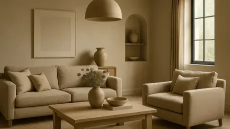
From a hands-on perspective, Universal Khaki proves its worth as an incredibly flexible shade that adapts to a variety of design schemes. It can ground a classic aesthetic when combined with other neutrals like soft creams or warm grays, creating a serene, timeless environment. Alternatively, it transforms into a modern backdrop when paired with trending bold hues such as sky blues or rich burgundies, balancing drama with stability. Sherwin-Williams envisions applications like entire rooms bathed in this tan, accented by contrasting textiles in vibrant tones to craft a space that feels both fresh and inviting. This adaptability positions the color as a bridge between enduring styles and contemporary flair, catering to diverse tastes while maintaining a unified look. For anyone seeking to refresh their home, Universal Khaki offers a practical solution that doesn’t require a complete overhaul to feel impactful.
Beyond wall paint, the shade inspires smaller, accessible updates that allow experimentation without full commitment. Decor items in similar earthy tones—such as throw blankets, cushions, or linen bedding—provide an easy entry point to test the color’s effect in a space. These touches enable homeowners to layer warmth and texture, enhancing the overall ambiance while keeping changes manageable. The color’s ability to blend seamlessly into existing decor makes it a standout for those hesitant to dive into major renovations. Moreover, its alignment with nature-inspired design encourages pairings with organic materials like wood or stone, further amplifying a sense of harmony. As a foundational element, Universal Khaki empowers individuals to evolve their spaces gradually, ensuring that style remains personal and intentional as 2026 unfolds, reflecting a mindful approach to home aesthetics.
Shaping Future Spaces with Balance
Reflecting on Sherwin-Williams’ choice of Universal Khaki for 2026, it becomes clear that this decision captures a defining shift toward neutrals with enduring appeal over transient, bold trends. The mid-tone tan, with its earthy warmth, establishes itself as a versatile anchor for countless design possibilities, resonating with a desire for simplicity and emotional connection in living spaces. Despite sparking debate—where some embrace its practicality and others critique its lack of boldness—it undeniably mirrors a cultural pivot toward intentionality. Looking ahead, the influence of this shade suggests a continued emphasis on crafting homes that prioritize balance, inviting decorators to explore its potential through creative pairings and thoughtful accents. As the design landscape evolves, Universal Khaki stands as a reminder that neutrals can be powerful catalysts for personal expression, encouraging a deeper consideration of how spaces can nurture and adapt over time.