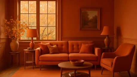

As the crisp air of fall begins to settle in and the landscape transforms with vibrant hues, a fascinating shift is unfolding in the realm of interior design that mirrors nature’s seasonal palette, reflecting a deeper evolution in aesthetic preferences. For the past year, red has held a commanding presence in home decor, its bold and dramatic tones shaping spaces with an unmistakable energy. Now, however, a new contender is emerging—orange, with its warm, inviting shades, is stepping into the spotlight as a potential successor. This transition reflects more than just a fleeting trend; it signals a deeper evolution in aesthetic preferences, driven by the desire for cozier, more approachable environments as the cooler months approach. Orange offers a softer vibrancy compared to red’s intensity, making it an intriguing choice for those eager to refresh their spaces with autumn-inspired warmth.
This burgeoning trend has caught the attention of interior designers and industry experts, who see orange as a natural fit for the season. Its tones echo the golden glow of late summer sunsets and the earthy shades of falling leaves, creating a seamless connection to the outdoors. Unlike red’s often overpowering presence, orange brings a gentler heat to interiors, offering a balance of energy and comfort. As fall decor takes center stage, this color is becoming a go-to for homeowners looking to infuse their spaces with seasonal charm and a welcoming ambiance that feels both fresh and familiar.
Exploring the Rise of Orange in Home Decor
Capturing the Essence of Autumn
Orange’s deep ties to the fall season make it a standout choice for interior design during this time of year. Evoking the rich tones of pumpkin patches, amber landscapes, and harvest celebrations, this color effortlessly mirrors the natural beauty outside. Designer Lauren Gilberthorpe has noted how orange embodies autumn’s spirit, delivering a warmth that feels more grounded than the stark boldness often associated with red. This inherent connection to the changing environment allows orange to transform living spaces into cozy retreats that reflect the season’s tranquil yet vibrant mood. Whether used as an accent or a dominant hue, orange provides a visual bridge between indoor settings and the outdoor world, enhancing the comforting atmosphere that fall inspires in home decor.
Beyond its aesthetic alignment with autumn, orange also serves as an emotional touchstone, stirring feelings of nostalgia and contentment. Its shades remind many of crisp evenings by a fire or the earthy tones of seasonal decor, fostering a sense of familiarity in any room. This emotional resonance sets orange apart from other trendy colors, as it taps into a collective appreciation for fall’s unique ambiance. Designers point out that incorporating orange into spaces—through textiles, wall colors, or decorative accents—can evoke a soothing warmth that invites relaxation during the cooler months. This quality makes orange not just a stylish choice but a meaningful one for creating environments that feel like a true reflection of the season’s spirit.
A Softer Rival to Red’s Dominance
In recent years, red has reigned supreme in interior design, fueled by viral concepts like the ‘unexpected red theory’ circulating on social media platforms. Known for its dramatic impact, red has been a go-to for making bold statements through striking accents or focal pieces. Yet, orange is now emerging as a compelling alternative, offering similar vitality with a less intense, more approachable demeanor. Caroline Milns from Zulufish describes orange as a playful yet sophisticated option, capable of energizing a space without the formality or heaviness that red can sometimes impose. This shift toward a softer tone appeals to those who crave vibrancy in their decor but prefer a hue that feels more inviting and less commanding, positioning orange as a versatile contender in modern design palettes.
The appeal of orange lies in its ability to balance energy with accessibility, making it suitable for a wide range of design sensibilities. Unlike red, which can dominate a room and dictate the mood, orange adapts to its surroundings, complementing other elements without overwhelming them. This flexibility allows it to shine in both minimalist and maximalist settings, depending on how it’s applied. Experts suggest that orange can soften the sharp edges of a space, creating a harmonious atmosphere that feels both lively and livable. As homeowners seek colors that inspire without overpowering, orange’s rise reflects a broader trend toward warmth and approachability in interior aesthetics, challenging red’s long-standing grip on bold decor choices.
Practical Applications and Influences of Orange
Versatility in Shades and Design Styles
One of the most remarkable aspects of orange as a design element is its extraordinary range of shades, spanning from vivid tangerine to muted terracotta and deep chestnut. This diversity allows it to cater to an array of tastes and design approaches, whether aiming for a bold statement or a subtle accent. Kailee Blalock of House of Hive highlights how orange can function almost as a neutral in certain contexts, blending seamlessly into varied aesthetics without clashing. Michael Rolland from The Paint Shed has observed significant interest in chestnut tones, with thousands of online searches in recent months signaling a growing public fascination with these warmer hues. This adaptability makes orange a powerful tool for designers and homeowners alike, offering endless possibilities to craft spaces that feel both personalized and timeless.
The ability of orange to transition across different design styles further underscores its rising popularity in home decor. In contemporary settings, bright citrus shades can inject a burst of modern energy, while deeper tones like burnt orange or amber lend a rustic, grounded feel to traditional spaces. This chameleon-like quality ensures that orange can be tailored to suit any room, from lively living areas to serene bedrooms. Designers note that its compatibility with various materials—such as wood, metal, or fabric—enhances its appeal, allowing for creative experimentation. As more people discover how orange can elevate their interiors without requiring a complete overhaul, its reputation as a flexible and dynamic color continues to grow, solidifying its place in seasonal and year-round design trends.
Tips for Seamlessly Integrating Orange
For those intrigued by orange but cautious about its boldness, designers offer practical guidance on easing into this trend with confidence. Starting with muted or burnt orange tones is a recommended approach, as suggested by Kailee Blalock, allowing for a gradual introduction that doesn’t overwhelm. Pairing orange with complementary colors such as deep blues, earthy greens, or soft creams can create balanced palettes, offering either striking contrasts or understated harmony. Texture plays a pivotal role in ensuring orange feels intentional—think rust-colored velvet cushions or matte terracotta walls, as advised by Lauren Gilberthorpe. These tactile elements help anchor the color, making it a cohesive part of the design rather than a jarring addition, and provide a sophisticated finish to any space.
Beyond initial steps, experimenting with orange through strategic accents can transform a room without committing to a full redesign. Small touches like throws, artwork, or decorative objects in orange hues can test the waters, allowing homeowners to gauge the color’s impact on their space. Experts also emphasize the importance of lighting when working with orange, as it can dramatically alter how the shade appears—warmer under soft, ambient light or more vibrant in natural daylight. Combining orange with neutral backdrops ensures it stands out without clashing, maintaining a sense of balance. By focusing on these thoughtful applications, orange can be woven into interiors in ways that feel both innovative and inviting, encouraging a broader embrace of this trending color during the fall season and beyond.
Cultural Catalysts Behind the Trend
Cultural phenomena are playing a significant role in propelling orange into the forefront of interior design, with notable influences sparking widespread interest. A key driver is Taylor Swift’s announcement of her upcoming album, The Life of a Showgirl, which has been associated with an ‘orange era’ among fans and media. This connection has ignited a surge of online enthusiasm, inspiring design enthusiasts to incorporate orange into their homes as a reflection of this cultural moment. Such intersections between pop culture and decor trends highlight how external influences can shape personal style choices, pushing colors like orange into the mainstream and encouraging experimentation among a diverse audience looking to capture this vibrant energy.
The ripple effects of these cultural shifts extend beyond mere inspiration, influencing how orange is perceived and adopted in everyday settings. Social media platforms amplify this trend, with countless posts and discussions showcasing orange-centric designs that draw from current events in entertainment. This digital momentum creates a feedback loop, where public fascination with orange fuels further exploration in home decor. Designers note that such cultural endorsements often lead to a broader acceptance of colors that might otherwise be overlooked, making orange a symbol of modernity and relevance. As these influences continue to permeate design conversations, orange’s prominence is likely to strengthen, embedding it deeper into the fabric of seasonal and contemporary interior aesthetics.
Curated Recommendations for Orange Accents
Bringing orange into home interiors can be both exciting and accessible with the right guidance on specific shades and products. Michael Rolland suggests exploring Little Greene’s Muscovado for a rich chestnut tone that adds depth to any room, ideal for creating a cozy fall atmosphere. For a slightly different vibe, Lauren Gilberthorpe recommends Farrow & Ball’s Red Earth, which offers a balanced warmth suitable for walls or furniture accents. These curated paint choices provide a starting point for those looking to commit to orange in a meaningful way, ensuring the color integrates seamlessly with existing decor while delivering the desired seasonal impact.
In addition to paint, incorporating orange through decor items offers a low-risk way to embrace the trend. Products like burnt orange velvet pillows from Lulu and Georgia can introduce a luxurious texture, while a terracotta plaid wool throw adds a rustic charm to sofas or beds. These accents allow for flexibility, enabling homeowners to layer orange into their spaces without permanent changes. Such recommendations from experts help demystify the process of adopting a new color, making it approachable for novices and seasoned decorators alike. By focusing on versatile pieces and shades, orange can become a staple in fall decor, enhancing homes with its unique blend of warmth and vibrancy.
Reflecting on Orange’s Impact in Design
A Lasting Shift in Color Preferences
Looking back, the emergence of orange as a formidable player in fall interior design marked a subtle yet significant departure from the long-standing dominance of red. Its ability to offer warmth without the intensity of its predecessor resonated with many, creating spaces that felt both energized and comforting during the autumn months. Designers celebrated orange for capturing the season’s essence, from its earthy tones to its nostalgic associations, which helped redefine cozy living. This shift was not merely a fleeting moment but a reflection of a broader desire for approachable vibrancy in home environments.
Future Directions for Warm Hues
Moving forward, the influence of orange in interior design opens up exciting possibilities for experimentation with warm hues. Homeowners are encouraged to explore how orange can be paired with emerging trends, perhaps blending it with unexpected textures or complementary palettes to keep spaces dynamic. Considering small updates, such as seasonal accents or a fresh coat of paint in a muted shade, can sustain orange’s relevance beyond fall. As design evolves, staying attuned to cultural currents and expert insights will help refine the application of this versatile color, ensuring it continues to inspire and transform interiors in innovative ways.