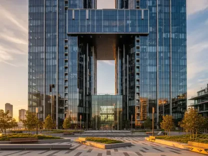

Across the United States, regional distinctions are readily apparent, reflected not only in cultural norms and dialects but also in the aesthetics of home interiors. While these preferences might not always be consciously acknowledged, they are deeply rooted in the geographical landscapes, climates, and architectural styles prevalent in each area. Consequently, this often impacts residents’ selections in color palettes for their homes. From the tranquil blues of the coastal regions to the sun-warmed earth tones of the deserts, the American geographical diversity is mirrored within the walls of its homes, manifesting in unique palettes for various locales.
Color choices are not merely aesthetic decisions; they are imbued with meanings and functions. They often reflect the history and culture of a place, harmonize living spaces with the external environment, and contribute to creating a particular atmosphere within the home. The correlation between a region’s characteristics and the colors commonly used in its interiors can offer insights into broader cultural tendencies and priorities. To better understand these patterns, it is valuable to delve into the specific color inclinations in distinct regions across the United States: the Northeast, Midwest, West Coast, Southeast, and Southwest.
Northeast: Timeless Elegance and Historical Affection
Householders in the northeastern United States often gravitate toward neutral and classic colors, with a prominent use of blues and greens. The design approach in this region owes much of its orientation to the deep appreciation for historical and traditional architectural styles that are widespread here. Such colors are particularly effective in urban dwellings where the emphasis is on a tailored and timeless aesthetic. In historical neighborhoods, homes frequently showcase palettes that reflect a connection to the past, featuring hues that are reminiscent of older design elements. The affinity for shades like creamy whites and subtle grays in smaller urban apartments offers a sense of serenity and expands limited spaces by reflecting light.
In coastal areas like Nantucket, the color scheme is often inspired by the natural landscape, with driftwood grays and crisp whites echoing the surrounding beauty of the waterfront. Designers in the region aim to integrate the indoors seamlessly with the external environment, creating spaces that are in harmony with the vistas common in areas by the sea. The overall design ethos reflects a preference for understated elegance and an emphasis on clean lines, which is emblematic of the northeastern aesthetic. The combination of these factors results in interiors that evoke the timeless beauty and sophistication that has long been associated with this portion of the nation.
Midwest: Embracing Warmth Through Earthy Tones
The Midwest’s color preferences tend to align with the region’s diverse landscapes and architectural influences. Earthy neutrals characterize the palettes here, reflecting the grounded culture and lifestyle. In addition, deeper hues such as muted sage green and burgundy red are prevalent, harmoniously fitting with the architectural elements that dominate the area. These colors enhance the warmth of homes, creating a cozy atmosphere that suits both urban and rural settings. As the Midwest experiences distinct seasonal changes, colors inspired by nature’s cycles make for versatile design choices that adapt to the fluctuations in climate. Midwest designers often draw inspiration from the natural surroundings to create interiors that capture the essence of the region’s changing seasons.
Architectural styles in the Midwest, such as Prairie and Craftsman homes, exemplify strong ties to the land, and the color palettes often resonate with this theme. Tones like warm beige and deep brown are popular for their ability to blend indoor living spaces with the external environment. The use of such colors creates a sense of continuity between a home and its natural surroundings, underscoring the harmony sought by designers in the region. Ultimately, the Midwest’s approach to color in interior design is rooted in creating spaces of refuge and warmth amidst the challenging climate.
West Coast: Relinquishing Restraint for Soothing Hues
The West Coast embodies a distinctive approach to interior design with a repertoire that leans towards soft earth tones, sun-washed aesthetics, and coastal blues. The region’s unique characteristics, from its stunning landscapes to its sunny climate, greatly influence the interior color schemes used throughout. In California, for example, the preference is for an open, airy style that invites a laid-back beachfront ambiance into homes. The color choices, therefore, include off-whites, soft taupes, terracottas, and muted pastels that mimic the soothing aspects of the coastal environment.
The close ties between indoor and outdoor living on the West Coast further shape its interior aesthetic. Designers often opt for “muddy” hues—colors that encapsulate the organic intricacies found in the endless beaches and natural landscapes. This approach not only brings the Californian sun into the interiors but also aligns with the ethic of sustainability and natural harmony that is prevalent in this locale. The result is a carefree, fluid style that capitalizes on the melding of interior and exterior spaces, blurring the lines between human presence and the natural world. The design ethos stands in stark contrast to East Coast sensibilities, pivoting towards a more casual, eclectic, and nature-appreciative approach.
Southeast: Airy Aesthetics and Cultural Influences
In the Southeast, where the pace of life is often slower and the sense of hospitality is strongly emphasized, the interior colors often lean towards soft, airy pastels and delicate powdery blues. These tones imbue homes with the sense of welcome and grace that characterizes the cultural attributes of the region. The humidity and warmth of the climate call for lighter colors that reflect light and maintain cool interiors. Designers in the Southeast often use these tones to create a relaxed and inviting atmosphere that suits the leisurely lifestyle. Additionally, in regions close to the coast, the influence of the ocean is unmistakable, leading to a penchant for blues that mirror the surrounding waters and marshlands.
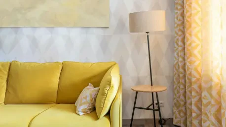
In southern Florida, the vibrant cultural mosaic is reflected in home color choices. Here, palettes are alive with coral pinks, lively turquoises, and zesty citrus hues that revitalize spaces and capture the spirit of the area. These colors embody the vibrancy and dynamism of Florida’s cultural life, offering an expressive and playful ambiance that emphasizes individuality and cultural diversity. Overall, the Southeast’s design palette captures both the elegance of its historic roots and the liveliness of its more modern influences, creating homes that radiate charm and hospitality.
Southwest: Echoes of Desert Splendor
Distinctive for its desert landscapes, the Southwest presents a fascinating approach to interior color preferences that pay homage to its dramatic scenery. This area leans towards a palette of sunbaked colors such as terracotta, ochre, and clay reds. These warm hues reflect the natural desert environment and emphasize the region’s unique substance and texture. Sage green and muted, earthy tones are popular, as they harmonize with both traditional and contemporary Southwestern design styles. This approach not only reinforces a sense of place but also brings an inviting warmth to the interiors, contrasting with the natural aridness outside.
The incorporation of historical influences is also a significant aspect of Southwestern design. Elements like handcrafted decor, tiled floors, and rustic finishes play well with the earthy tones, creating interiors that are reminiscent of indigenous and Spanish colonial history. Deeper accents, such as French blue or olive green, are strategically used to offer contrast and depth within these spaces, further enhancing their aesthetic appeal. The interplay of color and cultural motifs in the Southwest results in interiors that are rich in history, with a texture that echoes the spirit of the desert landscapes surrounding them.
Bridging Geography and Personal Style
The intricate mosaic of color preferences in American homes is largely shaped by regional characteristics, reflecting a profound connection to geography and climate. While trends related to natural landscapes and architectural influences offer a glimpse into cultural predilections, personal style remains an important factor. Homeowners, though often influenced by regional norms, have the capacity to tailor their living environments according to their distinct preferences and aspirations.
Every region brings its exclusive flair to interior design, highlighting the dynamic interplay between environment and individual choice. From the subdued elegance of the Northeast to the organic warmth of the Southwest, these regional preferences underscore the diversity and vibrancy of American interiors. As people continue to explore ways to personalize their spaces, the insights drawn from these geographical predilections can inspire new blends of tradition and innovation. Understanding these nuances presents an opportunity to create spaces that authentically reflect one’s environment and personal taste, leading to homes that are truly expressive and uniquely resonant.