
As May graces homes with a fresh start, an opportunity arises to breathe new life into interiors by embracing a vibrant and rejuvenating color palette. Delving into the dynamic world of interior design, this month offers a canvas to experiment with bold hues that reflect the optimism of the season. Colors possess an extraordinary ability to transform living spaces, conveying emotions and setting the ambiance. Contemporary design trends lean towards more lively and saturated colors, presenting a chance to elevate homes beyond traditional pastels. By incorporating vibrant shades that resonate with the energy of May, individuals can invigorate their surroundings, infusing them with warmth, excitement, and a sense of renewal.
Embracing a Bold Color Palette
Tomato Red: The Unexpected Energy
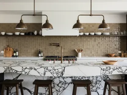
Tomato Red emerges as a definitive choice for infusing interiors with a burst of energy and vitality. Known for its dynamic and bold presence, this hue can transform mundane spaces into vibrant focal points. Experts suggest integrating subtle or bold variations of red to enhance the overall design, creating an ambiance that is both lively and inviting. The adaptability of Tomato Red allows it to cater to spaces where a sense of dynamism is desired, making it ideal for activity-centric areas in the home, such as kitchens or dining rooms.
Interestingly, Tomato Red’s charm lies not only in its vibrant aesthetic appeal but also in its emotional impact. This color is lauded for its ability to stimulate conversation, promote energy, and enhance focus, making it particularly suitable for creative spaces. Whether used as an accent wall, on furniture, or in decorative elements, Tomato Red effectively breaks the monotony and injects vigor into interiors. Additionally, the color harmoniously aligns with May’s transitional phase, marking the shift from spring to summer, as it echoes the renewed energy and hope that the season brings.
Duck Egg Blue: Timeless and Adaptable
Duck Egg Blue stands out for its timeless appeal and its ability to seamlessly blend into different interior styles. With a perfect balance between green and blue, this shade brings freshness and tranquility to spaces, making it popular among homeowners and designers alike. Its versatility extends to adapting to various lighting conditions, changing its appearance and mood as daylight shifts to dusk. This chameleon-like quality ensures Duck Egg Blue remains a perennial favorite, effortlessly capturing classic vibrancy without being tied to any specific season.
Beyond its aesthetic allure, Duck Egg Blue offers a subtle nod to tradition while maintaining a modern edge. Its elegance allows it to complement both contemporary and period designs, providing a sophisticated backdrop that enhances architectural and decorative features. Whether used on walls, furniture, or accessories, this shade transforms environments into serene retreats that promote relaxation and contemplation. Its timeless quality assures that it won’t readily fall out of style, offering longevity in design that resonates with those seeking a classic yet modern aesthetic.
Warm and Inviting Alternatives
Salmon Pink: Sophisticated Warmth
Salmon Pink enters the spotlight as a warm and inviting color, diverging from conventional blush pinks while incorporating a gentle hint of orange. This infusion adds depth and sophistication, allowing for a more nuanced color that evokes warmth without overwhelming. This hue provides a welcoming atmosphere in any room, creating a cozy environment that subtly envelops inhabitants in comfort.
The versatility of Salmon Pink makes it an ideal choice for living rooms, bedrooms, or any space that benefits from comfort and nurturing. It serves as an excellent backdrop for artwork or as an accent color that highlights specific features. By bringing a touch of warmth and elegance, it complements various design elements and can elevate a room’s aura. The subtlety of this color strikes a balance between femininity and sophistication, rendering it approachable yet refined, making it appealing for those looking to create an intimate space.
Moss Green: Earthy and Transformative
Moss Green, contrasting with typical spring pastels, emerges as a deep, comforting color that invites a sense of well-being and grounding. This color excels in bringing the calming essence of nature indoors, bridging contemporary and traditional spaces with its rich, earthy tones. The allure of Moss Green lies in its transformative properties, offering a refreshing departure from more subdued palettes and encouraging a deep connection with the natural world.
Applications of Moss Green prove adventurous, with suggestions to extend its reach beyond mere walls. Consider painting ceilings and woodwork in the same tonal family to create a cohesive and immersive environment. Enlivening spaces with Moss Green infuses elegance and an organic feel, providing tranquility and sophistication. This color harmonizes well with wood, stone, and metal, proving versatile across diverse interior styles and settings, ensuring rooms maintain a feeling of comfort and closeness to nature.
Energetic Choices for a Fresh Look
Tangerine Orange: Playful Optimism
Tangerine Orange challenges its reputation as a difficult color by offering a vibrant dose of optimism and freshness to home interiors. Known for its playful, energetic nature, this hue suits both traditional settings and ultramodern spaces. The color infuses warmth and brightness into a room, drawing on its history of use in 18th-century orangeries, showcasing its enduring appeal.
This shade is ideal for creating eye-catching design elements or for use as an accent in more neutral settings. The application of Tangerine Orange can be seen in accessories, fabrics, or even a feature wall, where its energetic vibrancy and playful energy can breathe new life into spaces. The emphasis, however, remains on moderation—Tangerine Orange is often best used with other colors to achieve harmonious balance and not overwhelm the space with its bold presence.
Barely There Baby Blue: Serene Backdrops
Barely There Baby Blue serves as an ideal serene backdrop, offering lightness and an airy presence to interior spaces. This hue provides a sophisticated alternative to more traditional grays, imparting a cooler tone with an added touch of life and sophistication. As May ushers in a period of calm renewal, this soft yet vitalizing color meets the moment perfectly, evoking a sense of peace and tranquility in bedrooms and relaxed living areas.
The calming nature of this color promotes relaxation and comfort, ideal for sanctuaries within the home where peace is a priority. Its versatility lies in serving as the base for layering other accents or coexisting amiably with a variety of materials, finishes, and styles—from minimalist to eclectic. Popularity in May is driven by its ability to invigorate spaces with freshness and clarity that resonates well with the transformative spirit of the month, encouraging a space where relaxation and introspection can thrive.
By focusing on dynamic colors within interiors, individuals mirror May’s natural renewal, creating harmonious and engaging spaces. The exploration of colors like Tomato Red, Duck Egg Blue, Salmon Pink, Moss Green, Tangerine Orange, and Barely There Baby Blue indicates that the opportunity for interiors to feel invigorated is palpable and exciting. Choosing colors transforms physical spaces and enhances emotional connections, fostering environments bursting with energy, calmness, and seasonal joy.
Closing the Palette
As May brings a sense of renewal, it’s the perfect time to revitalize your home’s interior with a fresh burst of color. This time of year offers a unique opportunity to explore the energetic realm of interior design by weaving in vibrant and refreshing color schemes. Colors have the exceptional power to transform any living space, influencing emotions and setting the tone. With current design trends favoring bold and more saturated hues, there’s a wonderful chance to go beyond the traditional soft pastels usually associated with spring. Embracing these lively shades can elevate home environments, instilling them with warmth, excitement, and a renewed sense of vitality.
Injecting vivid colors that mirror the spirited energy of May can rejuvenate a space, making it feel new and revitalized. Whether it’s a lively shade of green reminiscent of burgeoning plants or a cheerful yellow echoing the sunniest days, these colors can envelop your home with the season’s optimistic appeal. Such an approach not only enhances the visual appeal but also fosters a vibrant atmosphere that reflects the hopefulness of spring. Engaging with bold colors encourages creativity and allows a reflection of personal style while brightening up living spaces in a meaningful way. Embrace this seasonal shift by transforming your interiors into a lively haven filled with the refreshing promise of May.