
When envisioning a serene and tranquil home environment, we often associate calmness with soft, muted tones akin to stone, oatmeal, gray, pale blue, and natural greens. While these shades certainly have their merits, this article explores the potential of bolder hues to evoke a similarly soothing atmosphere if chosen thoughtfully and personally. To reflect this innovative perspective, we showcase ten distinct bold colors that are capable of creating a relaxing ambiance, with expert advice from interior designers on the effectiveness of each color in various home settings.
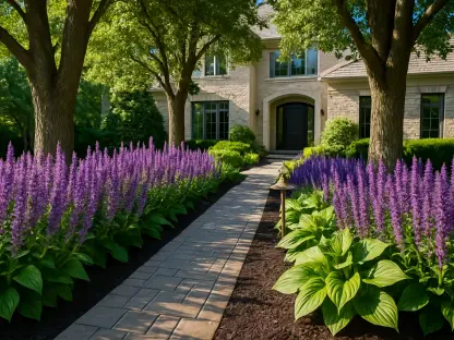
Emerald Green
Emerald green is a rich, vivid shade of green that evokes the lush vegetation and landscapes from which it gets its name. This stunning color has been prized for centuries for its vibrant and eye-catching quality, often being associated with luxury, elegance, and nature. Whether used in fashion, interior design, or art, emerald green brings a dynamic and visually appealing touch to any context. Its versatility allows it to pair beautifully with a wide range of other colors, making it a favorite choice for designers and decorators alike.
Nature-Inspired Serenity
Emerald green, closely related to nature, is widely recognized as a calming color. The intensity of the shade is crucial, as some individuals may find tranquility in subdued hues, whereas others may prefer more pronounced forest greens. Design expert Theresa Butler leveraged her client’s preference for Kelly Green by Benjamin Moore to transform an office space into an inviting, serene working nook. The rich green, complemented by wooden tones, varying textures, and neutral furnishings, creates a grounding effect which enhances calmness through visual contrast.
Emerald green’s versatility allows it to be used in various home settings, from living rooms to bedrooms. Its ability to pair well with both warm and cool tones makes it a flexible choice for creating a cohesive and calming environment. By incorporating natural elements such as plants and wooden furniture, the calming effect of emerald green is further amplified, making it a perfect choice for those seeking a nature-inspired sanctuary.
Versatility in Different Spaces
Incorporating emerald green in various home spaces can breathe life into a room while maintaining a calming ambiance. This color seamlessly integrates into living rooms, where it can be paired with warm lighting and plush seating to create a cozy nook for relaxation. In bedrooms, emerald green can be introduced through accent walls or bedding, working harmoniously with wooden and neutral elements to foster a restorative and peaceful environment.
Additionally, bathrooms and kitchens can benefit from emerald green’s serene qualities. In the bathroom, emerald green tiles or cabinetry can evoke a spa-like atmosphere, giving the space an organic, rejuvenating feel. In the kitchen, incorporating emerald hues into cabinetry or backsplash paired with natural wood finishes provides a refreshing yet balanced appeal. The adaptability of emerald green across different home environments underscores its effectiveness in creating a tranquil yet dynamic interior.
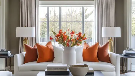
Burnt Orange
Warm and Cozy Ambiance
Creating a warm and cozy ambiance in your home involves more than just adjusting the thermostat. Consider adding soft lighting, plush furnishings, and warm color schemes. Use scented candles and throw blankets to enhance the sense of comfort and invite relaxation into your living space.
Burnt orange, when used effectively, can create a warm, cozy feel in modern living spaces. Andy Greenall of Paint & Paper Library advocates for warm, rich shades like ‘Atlas,’ inspired by the Atlas Mountains, to promote unity and relaxation in communal living areas. When paired with neutral flooring and seating like oatmeal or stone, this color results in an inviting environment that encourages social interaction and family time.
The rich undertones of burnt orange imbue a space with warmth and an inviting character. This vibrancy, when balanced with complementary neutral colors, helps to avoid overwhelming the senses, creating an environment that is both stimulating and comforting. By mixing different shades and textures within the same color palette, homeowners can achieve a layered, cozy aesthetic that enhances social interactions and promotes a sense of well-being.
Enhancing Social Spaces
Burnt orange is particularly effective in enhancing social spaces such as living rooms and dining areas. Its warm undertones create a welcoming atmosphere that encourages conversation and connection. By balancing burnt orange with neutral accents and natural materials, homeowners can achieve a harmonious and inviting space that feels both vibrant and calming.
This color can also be introduced through accessories and textiles, such as cushions, throws, and rugs, which can be easily updated seasonally. Complement burnt orange with earthy tones and tactile fabrics to heighten the sense of comfort and family cohesion within a room. Additionally, integrating burnt orange in dining areas through table linens and wall art can create an appetizing and sociable environment, fostering enjoyable meal times and gatherings.
Teal
Teal is a medium to dark greenish-blue color that is often associated with nature and tranquility. The name comes from the coloration of the common teal bird’s eye feathers. This soothing color is widely used in design and fashion for its versatile and calming presence.
Bold Yet Calming
Teal’s appeal lies in its ability to be bold yet calming when combined with the right complementary colors. Helen Parker of deVOL Kitchens recommends teaming teal with compatible shades such as plaster pink to ground it, suggesting that mixing several bold colors can produce a unique, cheerful home atmosphere that feels both lively and serene.
This jewel-toned color has the unique ability to create deep, tranquil vibes while simultaneously adding vibrancy. Teal can be introduced in various ways, from painted walls and cabinetry to upholstered furniture and decorative accents. The key to maintaining serenity lies in pairing teal with more muted, grounding colors that balance its boldness. For example, mixing teal with soft pinks or neutral tones ensures that the space remains harmonious and not overly stimulating.
Creating a Unique Atmosphere
Teal’s versatility allows it to be used in various home settings, from kitchens to bedrooms. Its ability to pair well with both warm and cool tones makes it a flexible choice for creating a cohesive and calming environment. By incorporating natural elements such as plants and wooden furniture, the calming effect of teal is further amplified, making it a perfect choice for those seeking a unique and personalized sanctuary.
A kitchen with teal cabinets or a backsplash paired with wooden countertops and metallic fixtures creates a warm yet modern vibe. In a bedroom, teal can be introduced through bed linens and accent walls, especially when softened with pastel accessories and warm lighting. Teal’s application extends beyond common living spaces, offering a splash of personality to home offices or reading nooks, where it can stimulate creativity and focus while maintaining a serene backdrop.
Sunshine Yellow
Sunshine yellow is a vibrant and cheerful color that evokes feelings of warmth and positivity. It is commonly associated with happiness, energy, and optimism. This lively hue can brighten up any space or design, making it a popular choice in both fashion and interior decorating. Whether used as an accent or a primary color, sunshine yellow is sure to make a bold statement.
Joyful and Warm
Yellow evokes feelings of joy and is reminiscent of sun-drenched days, providing warmth even in colder months. David Harris of Andrew Martin highlights its versatility, as it pairs well with blues, teals, greens, reds, and crisp white for a fresh take. Used in balance, sunshine yellow can transform spaces with its upbeat yet mellow nature, making rooms feel brighter and more vibrant while maintaining a sense of calm.
The cheerfulness of yellow, when applied thoughtfully, can imbue a space with optimism and energy without overwhelming it. Sunshine yellow can be seamlessly integrated into homes to uplift various spaces, from living rooms to breakfast nooks. The key to its calming effect lies in the balance; pairing yellow with cooler, contrasting hues helps to ground its vibrant presence, ensuring that the overall atmosphere remains serene.
Versatility in Different Spaces
Sunshine yellow’s versatility allows it to be used in various home settings, from living rooms to kitchens. Its ability to pair well with both warm and cool tones makes it a flexible choice for creating a cohesive and calming environment. By incorporating natural elements such as plants and wooden furniture, the calming effect of sunshine yellow is further amplified, making it a perfect choice for those seeking a joyful and warm sanctuary.
In a living room, yellow accents like cushions, wall art, or a statement rug can create a lively yet comfortable atmosphere. Kitchens benefit from yellow’s welcoming energy, with yellow tiles, cabinets, or bar stools infusing the space with a sunny disposition. Bathrooms can also transform into cheerful retreats with yellow accessories and towels, complemented by white or gray tones for an overall balanced feel.
Black
The Impact of Black in Art, Fashion, and Culture
Black has always been a powerful and versatile color, evoking a range of emotions and symbolisms. From the sophistication and elegance it brings to fashion, to its use in art to convey depth and mystery, black plays a significant role in various cultural contexts. Its presence can be seen in formal attire, minimalist design, and even in cultural rituals, reflecting its enduring impact and versatility in expressing both simplicity and complexity.
Cozy and Calming
Black, though unconventional, can be extremely calming when applied correctly. Rebekah Zaveloff of Imparfait Design Studio explains that painting a room all black can create a cozy, cave-like environment that many find deeply soothing. To balance the intensity of black, incorporating contrasting elements such as tan leather and off-white accents along with decorative tiling can offer a sense of stability and charm.
A fully black room can serve as a dramatic yet tranquil setting, creating a sanctuary-like retreat. When combined with textures and warm accents, black spaces become cozy and inviting. It’s crucial to introduce elements that break the monochromatic intensity, such as rich wood furnishings, metallic finishes, and ample lighting to maintain a balanced aesthetic.
Creating a Sophisticated Atmosphere
A sophisticated atmosphere can be achieved by paying careful attention to details such as decor, lighting, and color schemes. Enhanced by elegant furnishings and art pieces, the overall environment should evoke a sense of refinement and style.
Black’s versatility allows it to be used in various home settings, from bedrooms to living rooms. Its ability to pair well with both warm and cool tones makes it a flexible choice for creating a cohesive and calming environment. By incorporating natural elements such as plants and wooden furniture, the calming effect of black is further amplified, making it a perfect choice for those seeking a sophisticated and tranquil sanctuary.
Black works beautifully in living rooms and bedrooms, where it can be used for accent walls or through large furniture pieces. Pairing black with white creates a classic, timeless look, while the addition of greenery brings a touch of nature and softness. In dining areas, black can add a modern, elegant touch, especially when integrated through dining chairs or pendant lights, ultimately resulting in a chic and calming atmosphere.
Purple
Joyful and Abundant
Purple, particularly with magenta undertones, is gaining popularity thanks to its joyful and abundant appeal. Andy Greenall notes its usage in intimate spaces like bathrooms or dressing rooms, where such bold shades can create an indulgent and joyous atmosphere. When paired with soft blush pink and jet black, as illustrated in some examples, purple brings warmth, vibrancy, and an inviting energy to the space.
The richness of purple lends itself well to spaces that benefit from a touch of luxury and comfort. By mixing purple with complementary hues, such as gold or soft pastels, the space can exude both opulence and tranquility. Adding purple through textiles, such as velvet cushions or plush rugs, introduces a tactile, comforting layer that enhances the overall calming ambiance.
Purple’s versatility extends to various areas of the home, from bedrooms to home offices. In bedrooms, combining purple with softer shades creates a serene area perfect for relaxation. For home offices, deeper purples can stimulate creativity and provide a rich, comforting backdrop when paired with natural wood desks and bookshelves. The depth of purple offers an opportunity to create spaces that are both elegant and inviting.
Creating a Luxurious Atmosphere
Purple also shines in spaces seeking a touch of glamour and indulgence. Bathrooms with purple tiles or paint paired with sleek black fixtures and gold accents can feel both contemporary and relaxing. The boldness of the color ensures that the space remains visually striking, while the luxurious undertones maintain calm.
In dining rooms or entertainment spaces, purple as a backdrop can create a sophisticated environment suitable for formal gatherings or intimate dinners. Purple’s luxurious essence, when tempered with metallic finishes and soft textiles, contributes to an inviting yet opulent atmosphere that remains soothing due to well-planned balance and harmony.
Inky Blue
Dramatic Yet Soothing
Deep blue tones are dramatic yet soothing when balanced with warmer elements such as wood. Regan Billingsley suggests that by painting walls, trims, and ceilings in an inky blue color while layering favorite hues, a personalized and inviting space emerges. This approach, supplemented by wood accents like bamboo, imbues the living room with character and comfort.
Inky blue creates a sophisticated, tranquil space that exudes depth and richness. When used on walls, ceilings, or furnishings, it can create an enveloping and soothing atmosphere. The addition of wooden elements and textured fabrics ensures that the room doesn’t become overly somber or chilly. Proper lighting, such as warm floor lamps or pendant lights, can add a gentle glow that highlights the beauty of inky blue interiors.
Creating a Personalized Space
Crafting a personalized space involves much more than selecting furniture or paint colors. It encompasses understanding the essence of what makes you feel comfortable and at home.
Inky blue’s versatility makes it suitable for various home environments. This color is particularly effective in living rooms and bedrooms, where it can be applied to walls or large furniture pieces. In a bedroom, inky blue walls paired with white linens and wooden furniture create a serene sleeping environment. In living areas, combining inky blue with warm woods and metallic finishes adds a touch of refined elegance that feels both modern and timeless.
In dining areas, inky blue can be introduced through cabinetry or accent walls, creating a backdrop for entertaining that feels both rich and welcoming. Complementary colors like soft grays or light beiges can balance the deep hues, ensuring the space remains inviting and not overly dark. The rich, moody tones of inky blue allow for a personalized, comforting space that incorporates individual style seamlessly with broader design objectives.
Scarlett Red
Warmth and Passion
Red, synonymous with energy and passion, can also signify warmth and comfort. Designers note that selecting the right tone is essential—a blue-based red might be too cool, whereas an orange or yellow-based red can offer a warm, welcoming feel suitable for bedrooms, snugs, or entryways. Decorating with red can create protective, cocooning spaces that are both bold and serene.
Scarlet red’s presence within a home lends a dynamic yet comforting aura. It can be balanced with neutral tones and materials to create spaces that feel grounded and inviting. In entryways, a touch of scarlet can make a striking first impression, setting a warm tone for the entire home. Meanwhile, cushions, throws, and wall art in red accent a space, emphasizing warmth and cohesion.
Creating Intimate Spaces
Red is particularly effective in creating intimate or cozy spaces where connection and warmth are key. In bedrooms, red accents, such as bedding or feature walls, can create a cocooning effect that feels both luxurious and comforting. The warmth of red, when balanced appropriately with softer tones and natural materials, results in a restful and inviting sanctuary.
In common areas, such as living rooms or snugs, red can be used to foster a warm, inviting environment. Deep red walls or furnishings can be offset with lighter, neutral accessories to maintain balance. In dining areas, red tones can stimulate appetite and conversation, creating a lively and engaging environment for meals and gatherings. By mixing scarlet red with various textures and neutral elements, spaces achieve a blend of vibrancy and tranquility.
Cerise Pink
Vibrant Yet Soothing
Cerise pink offers a vibrant yet soothing effect, especially when paired with pastels and softer neutrals. In contemporary contexts, cerise pink brings nature into indoor spaces, enhancing character and calmness. Paloma Contreras’ use of this shade, interconnected with white and cream accents, provides a balanced and chic appearance for modern bathrooms.
Cerise pink’s vibrancy makes it an excellent option for spaces that benefit from a touch of playful color without overwhelming the senses. In bathrooms, cerise pink tiles or accents create a fresh, lively environment. The color can be tamed with white or cream fixtures, ensuring a balanced and airy feel. The integration of natural elements, such as plants and wooden finishes, further enhances the harmonious atmosphere cerise pink creates.
Distinctive Elegance
Cerise pink’s sophistication extends to various home spaces, from bedrooms to living rooms. In a bedroom, cerise pink bed linens or an accent wall can create a cheerful yet calming retreat. Paired with neutral tones and natural fibers, the vibrancy of pink is subtly highlighted, contributing to an elegant and restful atmosphere.
In living rooms, cerise pink can be introduced through cushions, throws, or artwork, adding a bright, soothing touch to the space. Combined with lighter woods and soft textiles, cerise pink helps in creating a cozy and stylish space. This color’s flexibility allows homeowners to experiment with various tones and accessories, resulting in a personalized, vibrant yet calming environment that stands out for its distinctive elegance.
Combination of Bold Colors
Dynamic Yet Calming
For those who adore eclectic styles, bold combinations can result in dynamic yet calming environments. Helen Shaw from Benjamin Moore underscores this by advising the use of a muted base highlighted by bolder colors to accent architectural features, thereby creating visually engaging yet tranquil settings. By maintaining harmony through similar tones and incorporating retro touches with gently curved furniture and linen treatments, bold decor remains balanced and fresh.
Integrating multiple bold colors into home spaces can create a unique, personalized ambiance that reflects individual tastes. Combining rich hues like teal, plum, and burnt orange can result in a vibrant yet harmonious space. Using a muted backdrop, such as soft grays or beiges, helps balance the boldness of these colors, ensuring the overall effect is invigorating yet serene. Retro touches in furniture and décor contribute to a cohesive and stylish look.
Creating Cohesive Spaces
When we think of creating a serene and peaceful home, we usually imagine calm colors like stone, oatmeal, gray, pale blue, and natural greens. These soft, muted tones are often linked with tranquility and relaxation. However, there’s much more to consider when it comes to peaceful decor. This article delves into the surprising potential of bold colors to create a soothing environment, provided they are chosen with care and personal taste.
Revealing a fresh perspective, we feature ten bold colors that can also foster a relaxing ambiance. With expert guidance from interior designers, this exploration underscores the versatility and impact of brighter hues in different home settings. These professionals share their insights on how each bold color can be effectively utilized to cultivate a calm and restful atmosphere.
Whether it’s a rich, deep blue, a vibrant coral, or a lush emerald green, the expert advice points out that bolder shades can bring a unique and serene feel to your home while also reflecting your personality. By carefully selecting and harmonizing these bolder hues, you can create a tranquil environment that’s both stylish and soothing.
From lively living rooms to restful bedrooms, the right choice of bold colors can make all the difference in your home’s ambiance. So, don’t shy away from experimenting with more vivid tones; with thoughtful application, they can be just as effective as traditional calming colors in creating a serene and inviting home.