
Imagine walking into a living room where the cool tranquility of blue meets the fiery passion of red, blending into a space that feels both daring and surprisingly cozy. This striking combination, often overlooked due to its bold nature or thematic associations, has the potential to transform home interiors in ways that defy traditional design norms. Inspired by the groundbreaking work of designer Heidi Caillier, this exploration uncovers how these two primary hues can harmonize to create sophisticated, inviting environments. Far from being just a patriotic palette, red and blue can evoke warmth and personality when applied with intention. This article delves into the nuances of this unexpected pairing, examining how balance, texture, and subtle integration can turn a potentially jarring duo into a seamless aesthetic. Prepare to challenge preconceived ideas about color in decor and discover practical ways to bring this dynamic combination into any living space with confidence and style.
Shattering Color Stereotypes
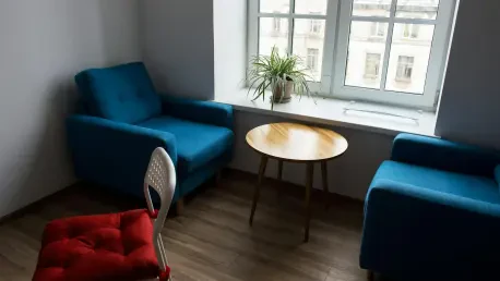
The allure of combining red and blue in interior design lies in its ability to break away from conventional expectations and inject a fresh sense of individuality into a room. Blue often reigns as a go-to choice for its calming, timeless quality, frequently used as a foundation for layering various shades and textures. However, introducing red—a hue that can initially seem overpowering or out of place—creates a striking contrast that energizes the space. Heidi Caillier’s innovative designs, such as a Colorado living room where a red gingham sofa pairs with denim-blue limewashed walls, demonstrate how this duo can feel balanced with thoughtful accents like soft throws and patterned ottomans. The result is a setting that feels neither overly bold nor predictable, but rather uniquely personal. This approach shows that stepping beyond familiar color schemes can lead to captivating environments that resonate with character, proving that even the most unexpected pairings hold transformative potential when executed with care.
Exploring further, the impact of red and blue extends beyond mere aesthetics to influence the emotional tone of a space. While blue often evokes serenity and stability, red introduces warmth and vibrancy, creating a dynamic interplay that can invigorate a room without overwhelming it. Caillier’s work highlights this synergy in varied settings, showing how a bold red piece can anchor a predominantly blue palette, preventing it from feeling monotonous. The key lies in intentional placement—using red as a focal point while allowing blue to provide a soothing backdrop ensures the combination feels cohesive. This method challenges the notion that high-contrast colors must clash, offering instead a pathway to create interiors that are both stimulating and harmonious. For those hesitant to embrace such a pairing, these examples serve as a reminder that color in design is not just about appearance, but about crafting an atmosphere that reflects depth and emotion in equal measure.
Mastering the Balance of Bold Hues
Achieving a seamless blend of red and blue in interior spaces demands a keen sense of balance to avoid visual discord. High-contrast colors like these can easily dominate if not handled with restraint, but Caillier’s approach offers a masterclass in subtlety. By opting for muted or softened shades of both hues, the intensity is dialed back, allowing the palette to feel enveloping rather than abrasive. Textures play a pivotal role here—think plush pillows, woven throws, or vintage-inspired furniture that temper the starkness of the colors. In one notable project, a monochrome rug cuts through the softness of floral patterns, adding a modern edge while maintaining overall harmony. This careful layering ensures that the space feels curated and intentional, striking a perfect equilibrium between boldness and comfort. Homeowners looking to adopt this style can take confidence in knowing that such balance prevents the palette from overwhelming, creating rooms that invite relaxation alongside visual interest.
Delving deeper into the art of balance, the strategic use of scale and proportion cannot be overlooked when working with red and blue. Rather than committing to large, overpowering elements right away, incorporating these colors through smaller accents can ease the transition into a bolder aesthetic. For instance, a single red ottoman or a set of blue-patterned cushions can introduce the pairing without dominating the existing decor. This gradual approach allows for experimentation while maintaining control over the room’s overall vibe. Caillier’s designs often reflect this principle, using statement pieces like a red sofa as a centerpiece, while surrounding elements in blue provide a calming counterpoint. The result is a space that feels neither too aggressive nor too subdued, but rather thoughtfully composed. This method underscores the importance of pacing in design, ensuring that high-energy colors enhance rather than disrupt the intended ambiance of a living area.
Finding Inspiration for Bold Moves
For those intrigued yet cautious about adopting red and blue, inspiration can be the key to taking the first step toward transformation. Observing successful implementations, such as those in Caillier’s portfolio, can shift perspectives from skepticism to enthusiasm. Starting with small, low-commitment additions offers a practical entry point—consider a red gingham pouf or a patterned pillow to test the waters in a predominantly blue space. These subtle touches can reveal how the pairing interacts with existing decor, building confidence to explore further. Products like the HomeRoots Red and White Cotton Gingham Pouf Cover provide accessible options that echo Caillier’s layered, textured style without requiring a significant investment. This approach not only minimizes risk but also allows for personal expression, encouraging a slow build toward a bolder aesthetic that feels authentic to the homeowner’s vision and comfort level.
Beyond initial steps, inspiration can also stem from understanding the emotional impact of this color duo within different contexts. Red and blue together can evoke a spectrum of feelings, from cozy warmth to vibrant energy, depending on their application. Studying varied designs—like a wood-paneled room with a red sofa and indigo rug—demonstrates the versatility of this palette across modern and rustic settings alike. Such examples encourage experimentation with different shades and intensities to suit specific moods or room functions. A pale blue backdrop with deep crimson accents might create a serene yet striking lounge area, while brighter tones could energize a creative workspace. Drawing from these diverse applications, it becomes clear that red and blue are not a one-size-fits-all solution but a flexible framework for crafting spaces with distinct personality. This adaptability inspires confidence to adapt the combination in ways that resonate with individual tastes and spatial needs.
The Power of Texture and Materiality
Texture and materiality serve as essential tools in grounding the bold interplay of red and blue, transforming potential harshness into tactile warmth. Natural elements, such as wood or woven fabrics, can soften the visual impact of these colors, creating a lived-in feel that prioritizes comfort over stark minimalism. In Caillier’s designs, a red sofa paired with an indigo striped rug in a wood-heavy room exemplifies how materiality can balance vibrancy with approachability. These choices reflect a broader design trend favoring environments that feel personal and welcoming rather than overly polished. By integrating soft fabrics or vintage pieces, the stark contrast of the hues is tempered, resulting in spaces that invite lingering. This focus on texture ensures that the palette doesn’t just catch the eye but also engages the senses, making rooms feel as comforting as they are visually striking, a crucial consideration for any interior update.
Expanding on this concept, the role of materiality extends to how it shapes the perception of color within a space. Different textures can alter how red and blue are experienced—matte finishes might mute their intensity, while glossy surfaces could amplify their boldness. Incorporating a variety of materials, such as a rough-hewn wooden table alongside a plush red cushion, adds layers of depth that prevent the palette from feeling flat or one-dimensional. Caillier’s projects often showcase this interplay, using elements like limewashed walls or mohair throws to create a dialogue between color and texture. This thoughtful combination not only mitigates any potential clash but also aligns with contemporary design values that emphasize authenticity and warmth. For those considering this color duo, focusing on diverse materials offers a pathway to craft interiors that feel cohesive and intentional, bridging the gap between daring aesthetics and everyday livability.
Crafting a Lasting Impact
Reflecting on the journey through Heidi Caillier’s visionary designs, it’s evident that the pairing of red and blue redefines perceptions of what interior spaces can achieve. The balance of bold contrasts with subtle textures carves out rooms that are as inviting as they are striking. Each project, from the Colorado living room to the wood-paneled retreat, showcases a meticulous approach to color integration that turns skepticism into admiration. Looking ahead, the practical lessons gleaned—starting small with accents, prioritizing balance, and leveraging materiality—offer a clear roadmap for anyone eager to refresh their home. Experimenting with this palette doesn’t require a complete overhaul; even minor additions can spark significant transformation. As design continues to evolve, embracing such unconventional pairings with intention promises to keep spaces dynamic and deeply personal, ensuring that every room tells a unique story of style and comfort.